Sometimes, an idea takes years to develop. It lingers in your mind, appears in sketches during a commute… until it finally finds its place. The starting point for the typeface I’m introducing this month was a designer I greatly admire: Mario Eskenazi—especially his use of stencil typography in branding projects.
Eskenazi’s work masterfully employs stencil typefaces with a distinctly contemporary feel, as seen in projects like Barcelona’s TMB signage or the striking typography for the restaurant Mordisco.
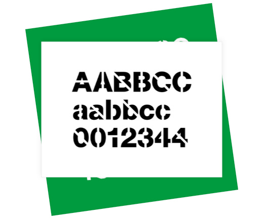
Stencil typefaces originally emerged as a quick and efficient way to communicate in industrial and military contexts. Their distinctive cuts and open spaces were designed to facilitate painting on large surfaces with minimal tools.
I wanted to approach it differently. My goal was to apply variable font technology to stencil typography—not just that, but to integrate both stencil and non-stencil versions within a single file, offering different widths.
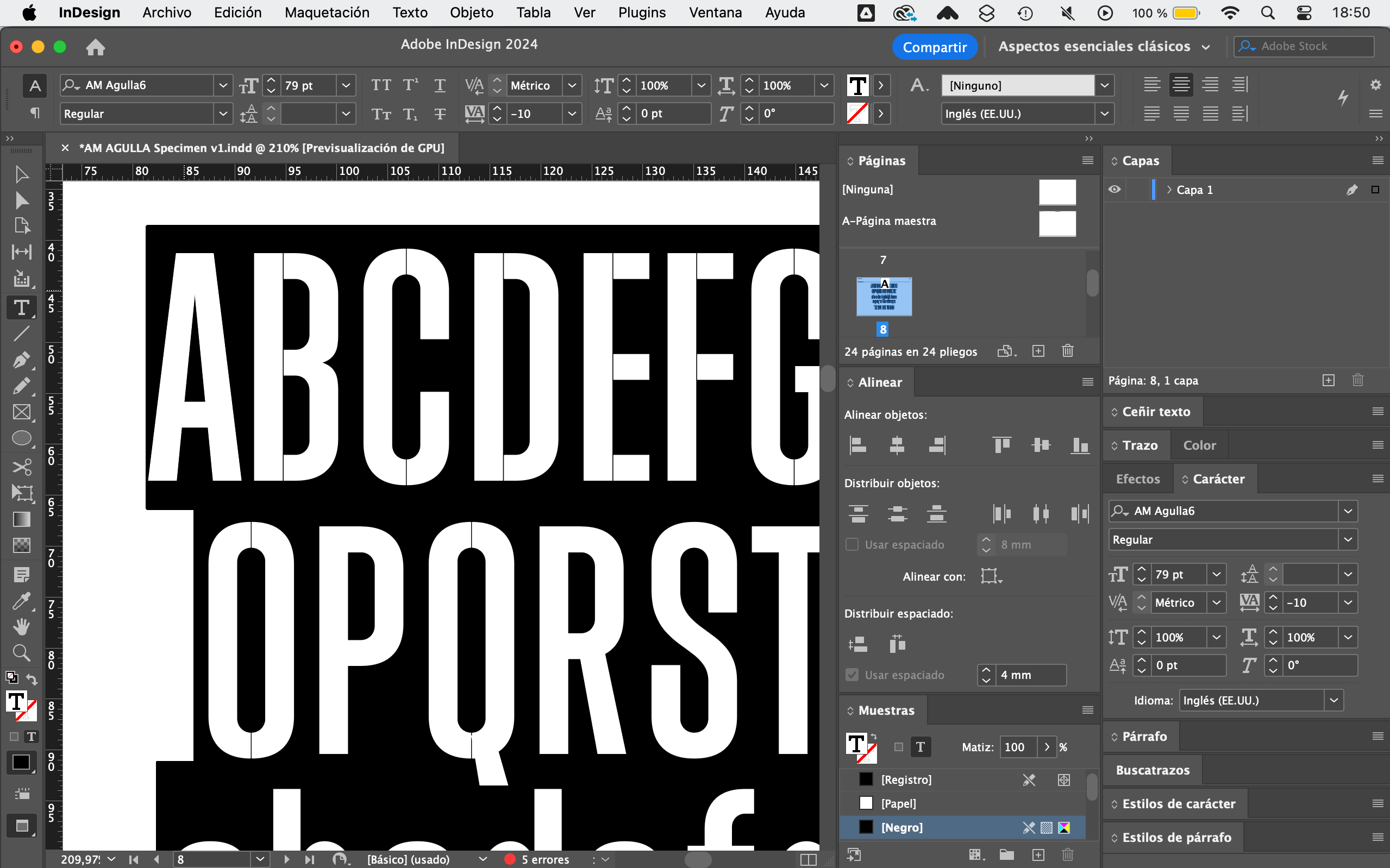
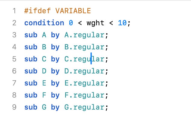
The challenge was technical. Combining stencil and non-stencil versions into a single variable typeface wasn’t easy. With help from the Glyphs type community, I used the Switching Shapes technique to achieve my goal. The idea is that you can control the stencil effect (from 0 to 200), and if you select a value below 2, the character automatically switches to a non-stencil version.
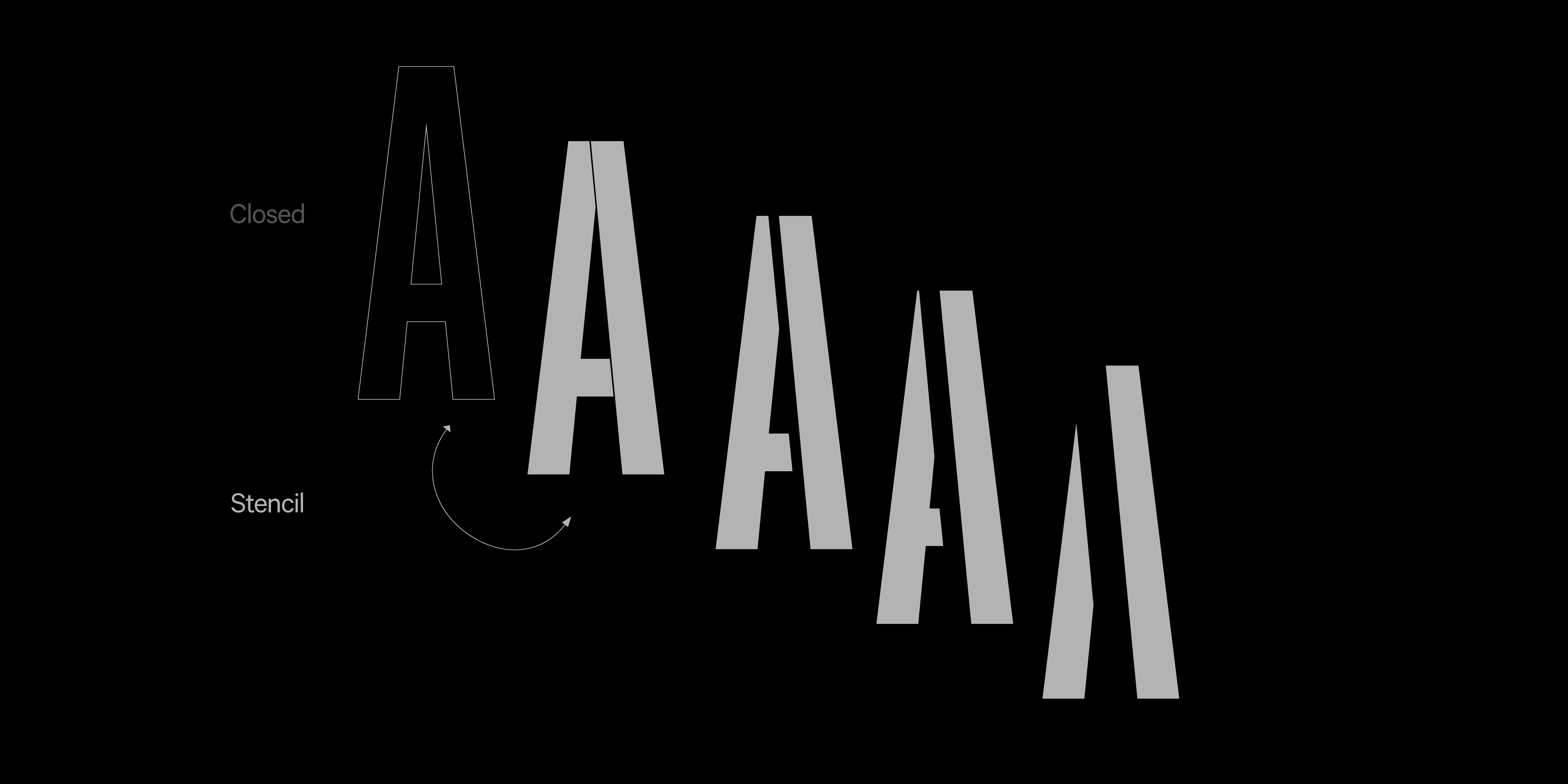
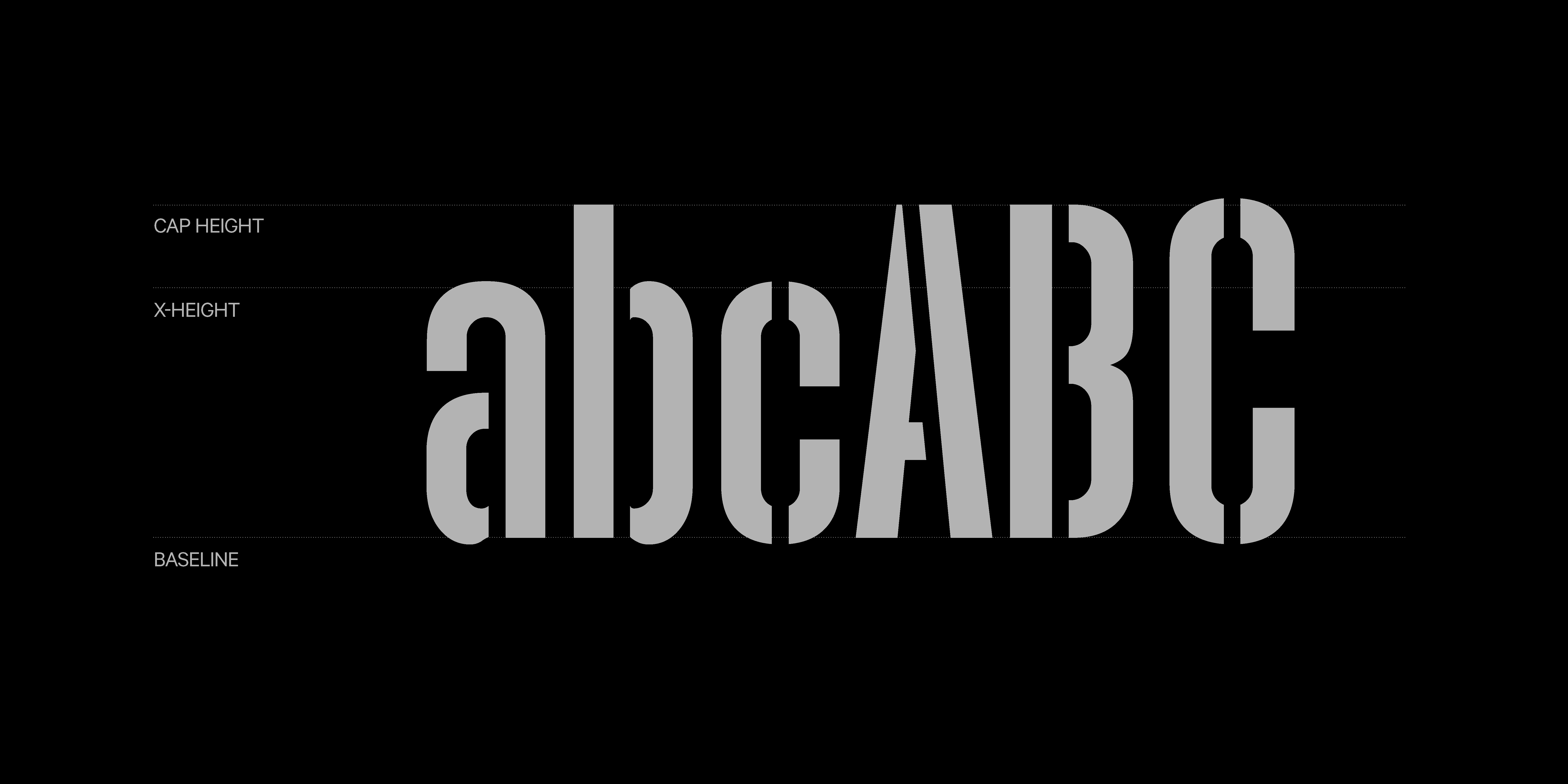
This trick led to the creation of Agulla, a variable font with the essence of a stencil.
As for the name, I wanted something that referenced the small openings defining the style. Agulla means “needle” in Catalan, which I found subtly poetic for an industrial typeface.
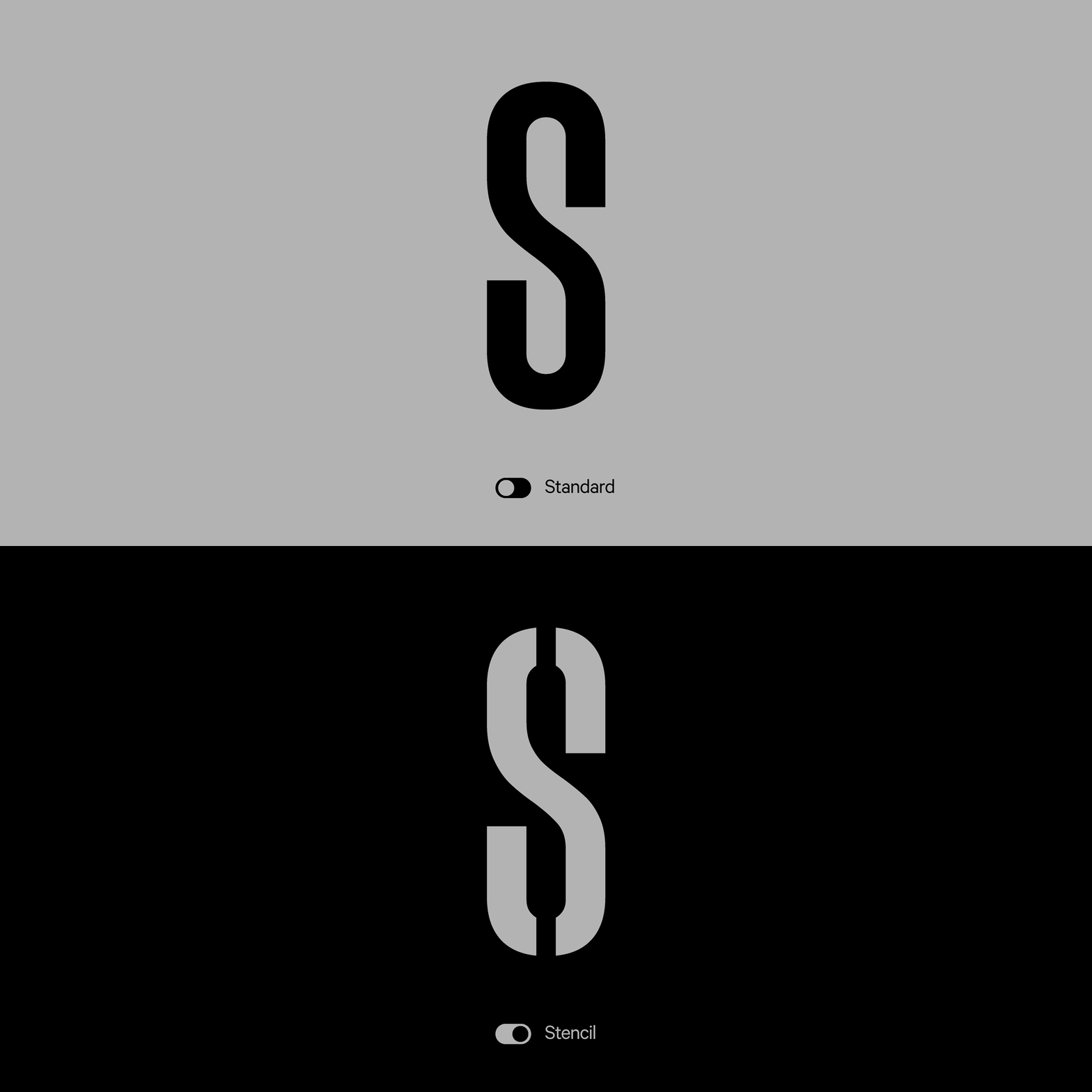
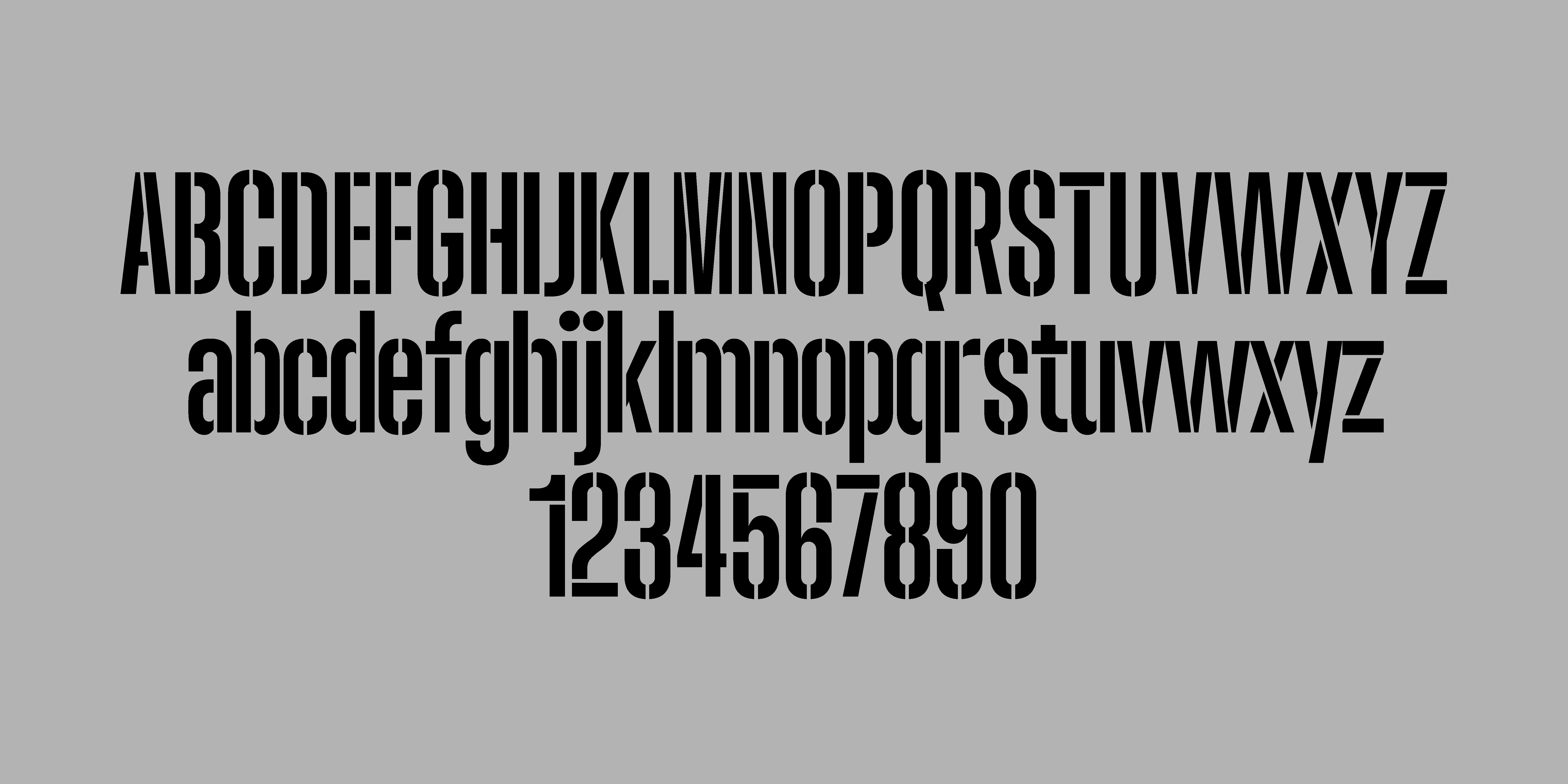
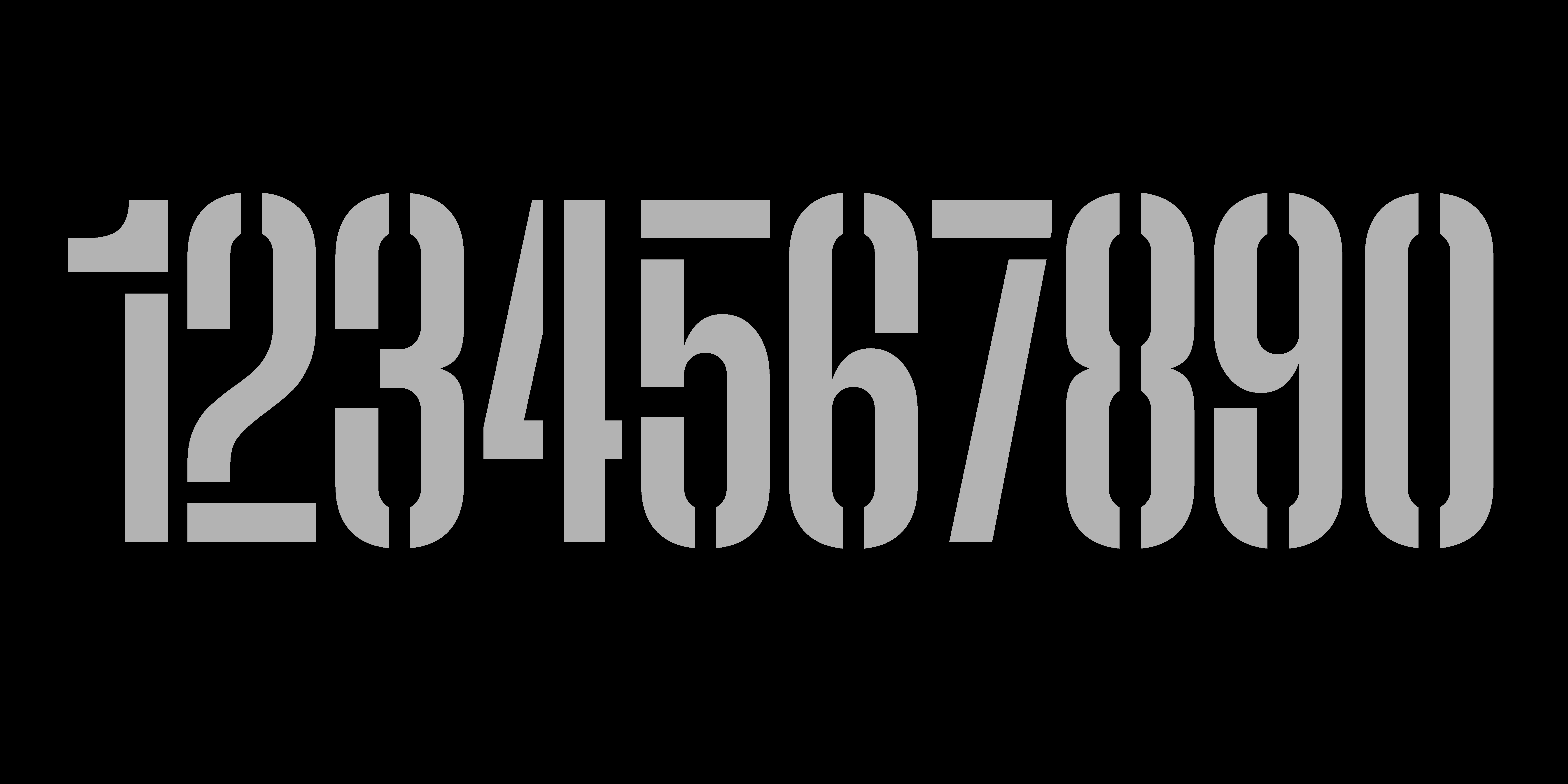
When designing the stencil gaps, I discussed it with a friend: How open should they be? Does such a wide cut serve a purpose? Is it still readable?
My take is that it’s all about pushing the extremes. It depends on its use. In the specimen, you can see how a minimal stencil effect works well at large sizes, but at smaller sizes, the typeface demands wider stencil cuts.