Since January, I’ve been releasing a new typeface every month as part of an ongoing personal project FontMonth — a way to explore different aspects of type design: form, rhythm, process.
If you’re new here, you can check out (and try) all the previous releases on the website — which, by the way, just got a fresh redesign.
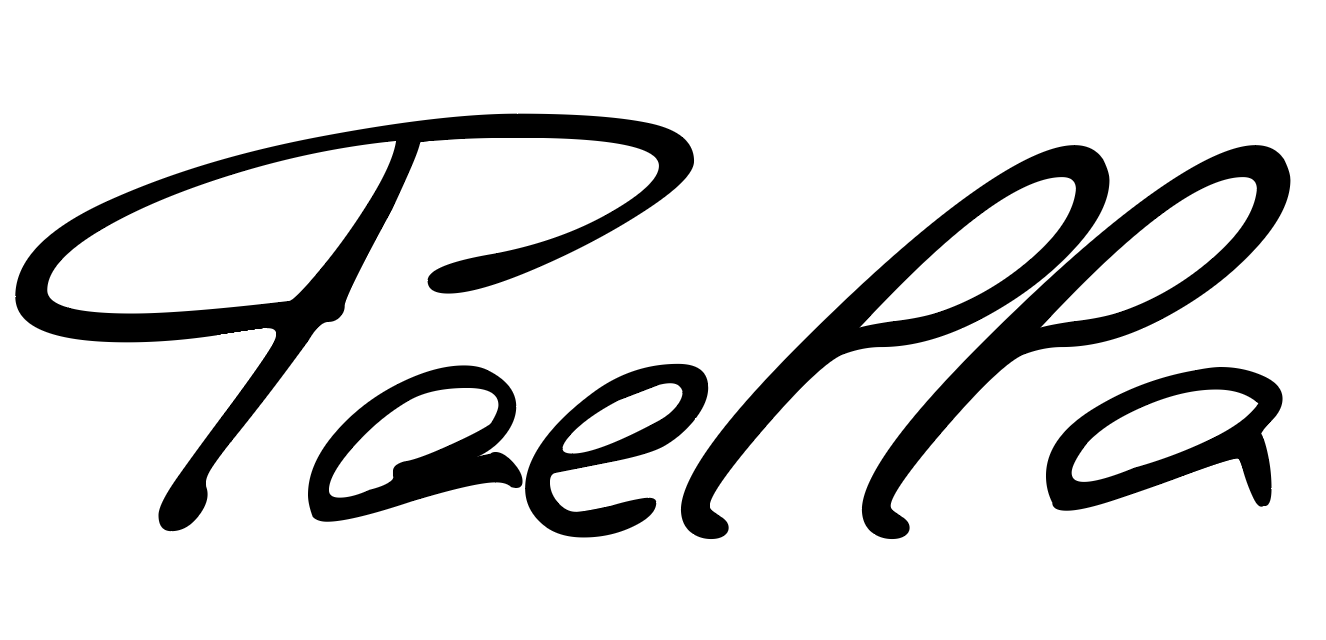
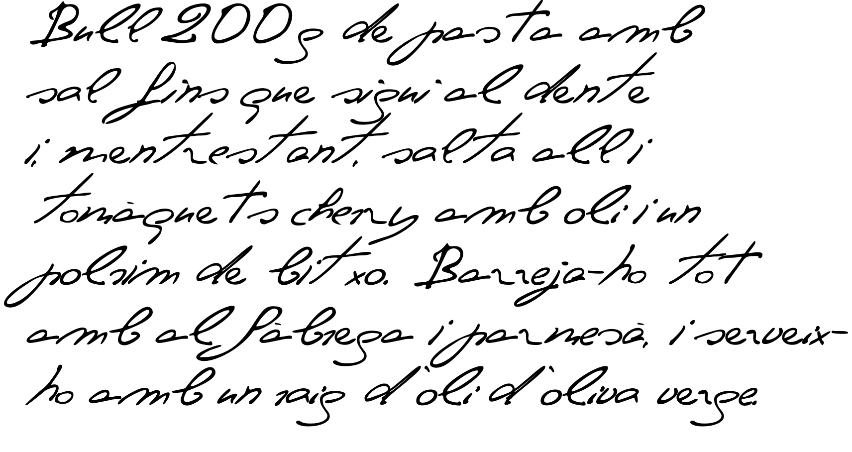
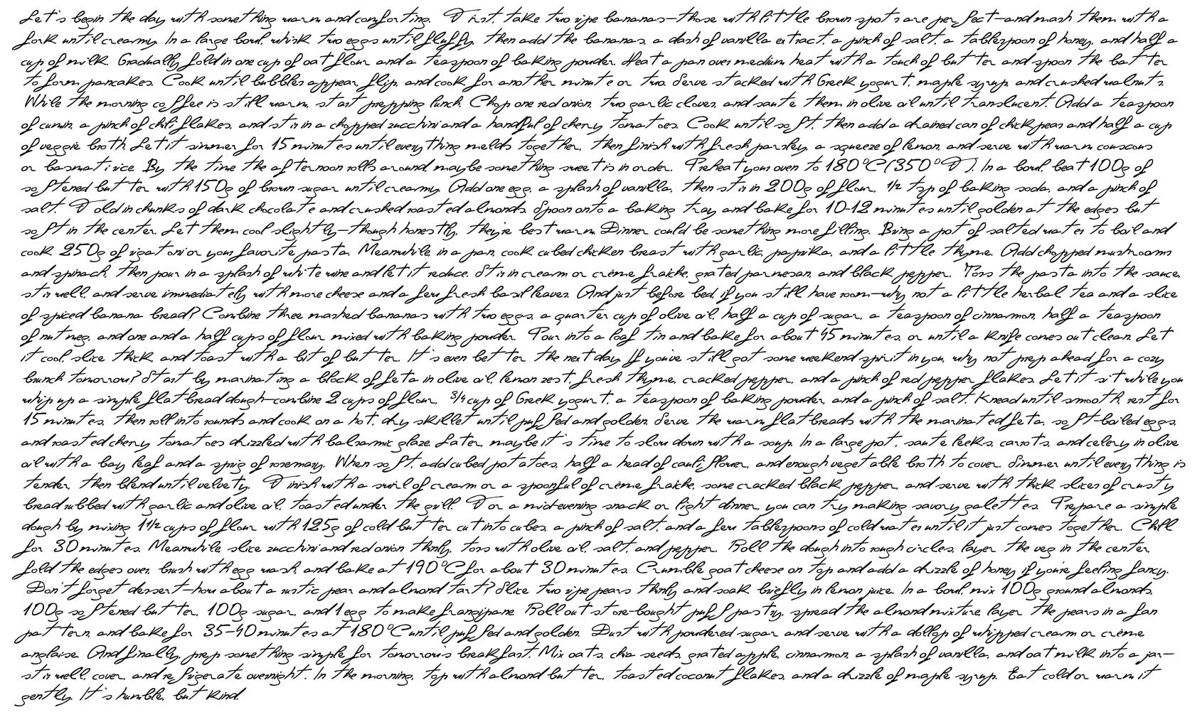
This month’s release is Fina, a handwriting typeface based on the natural script of my grandmother, Josefina — known to everyone simply as Fina.
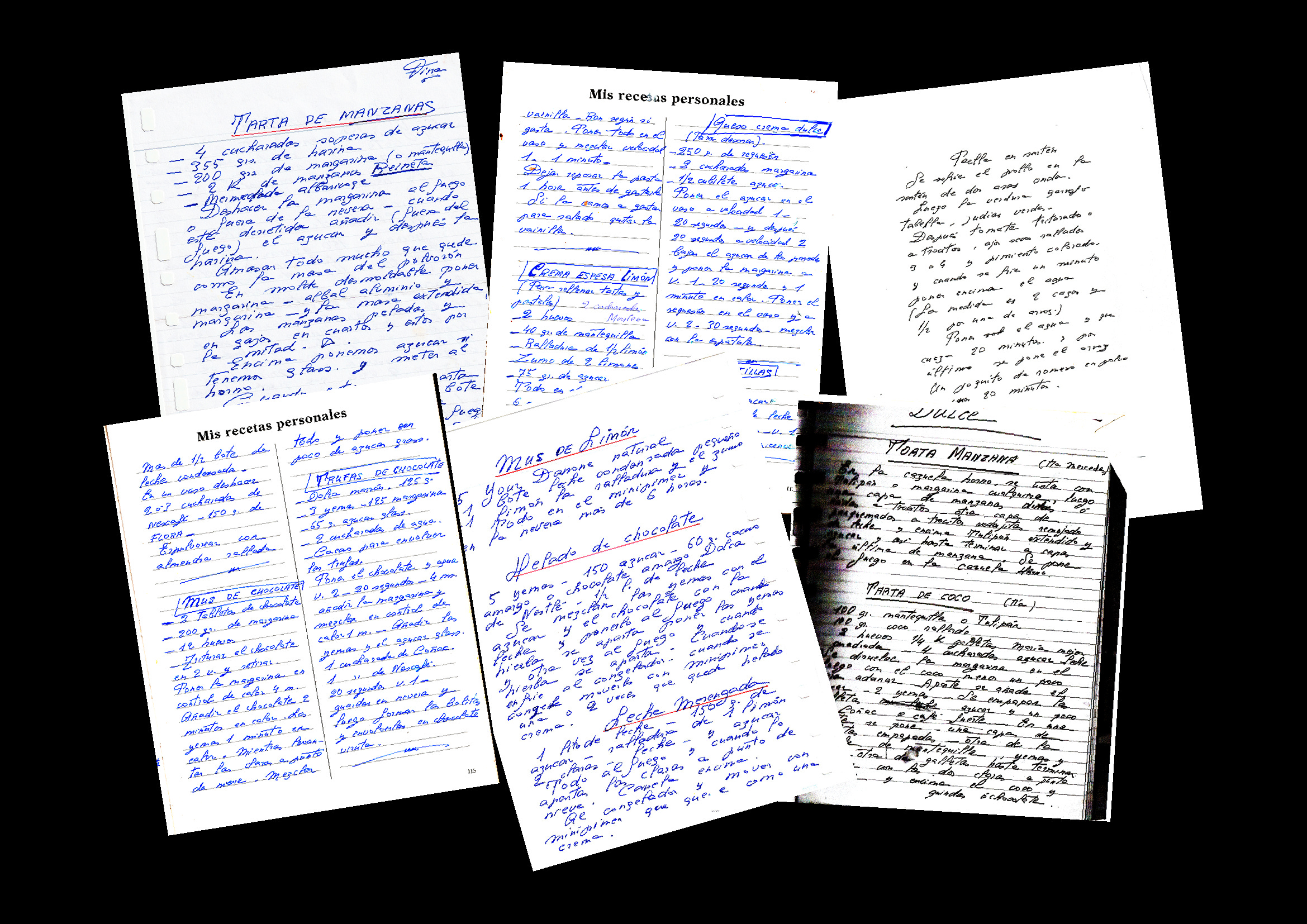
The process started by scanning pages from her handwritten recipe notebooks, which she had carefully kept over the years. I cleaned and enhanced the scans using an image-editing tool, then vectorized them through Inkscape—surprisingly the software that gave the most faithful translation of her pen strokes. From there, I traced, refined and adjusted each letter with care, shaping her writing into Glyphs.
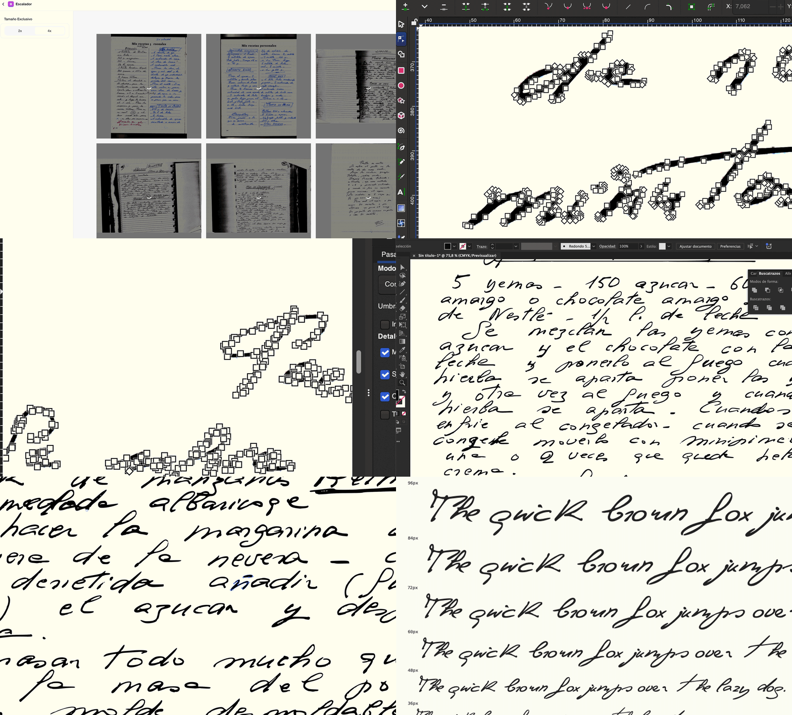
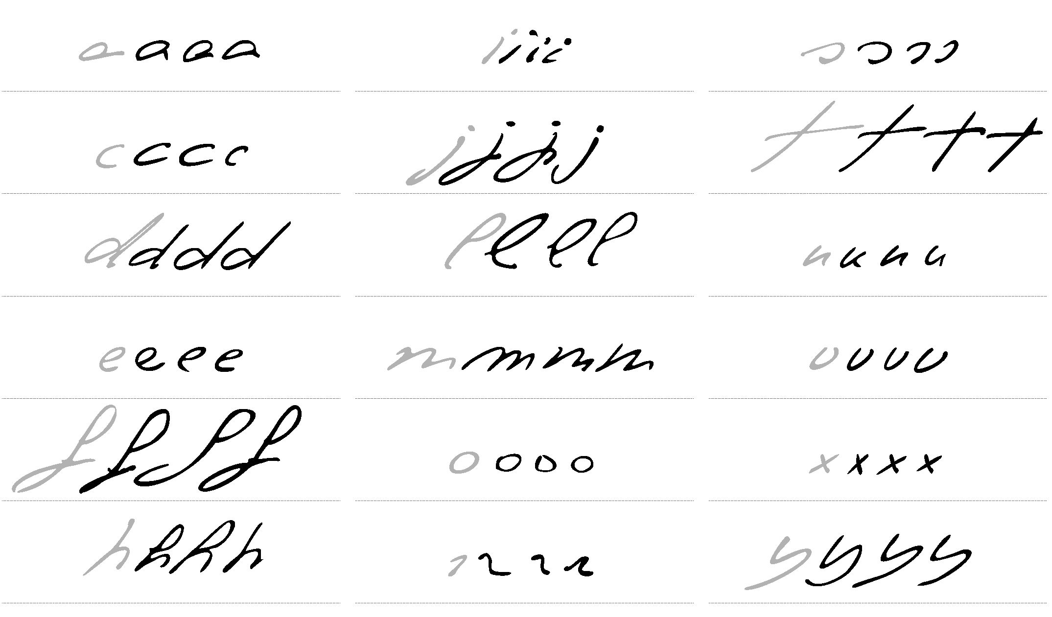
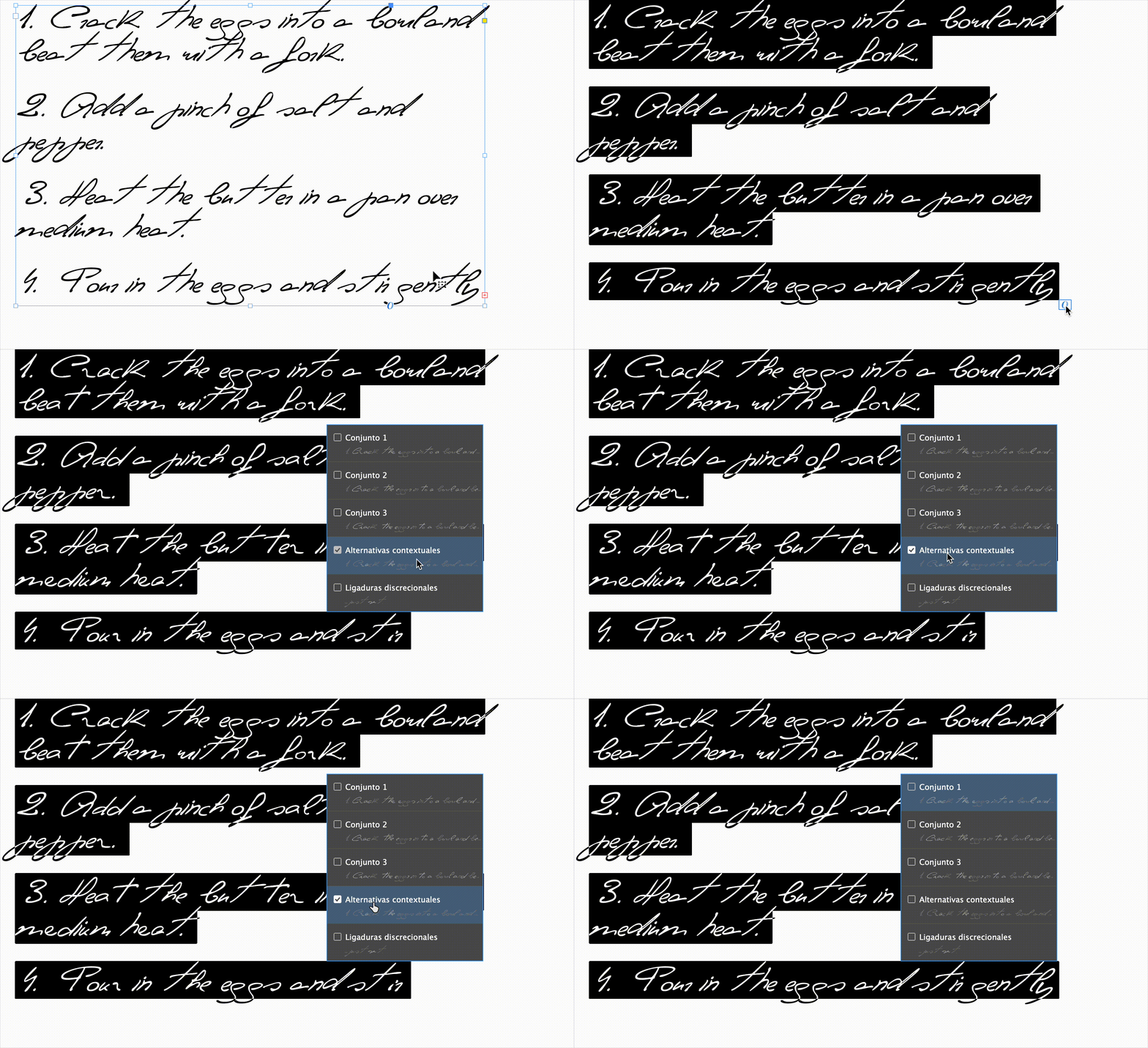
To preserve the natural feel of handwriting, many lowercase letters come with multiple alternates that swap in automatically (contextual alternatives), adding rhythm and imperfection to the text.
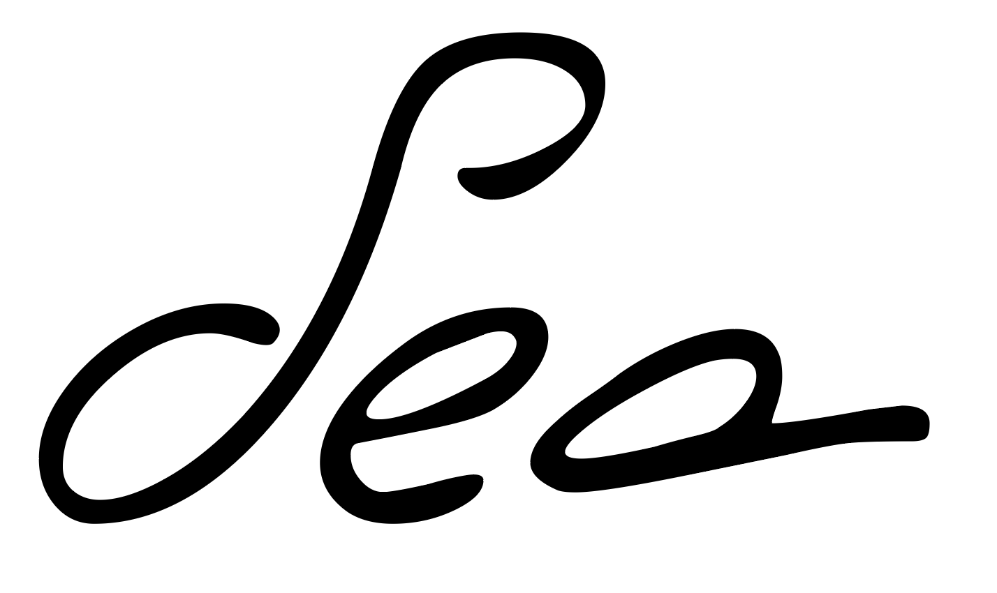
This first version captures the warmth and elegance of her script: almost drawn rather than written, full of flourishes—especially in the uppercase letters. The kerning still needs work, and some spacing quirks remain. But this first release is here for you to try, test, and play with—an early step in what will be an evolving design.
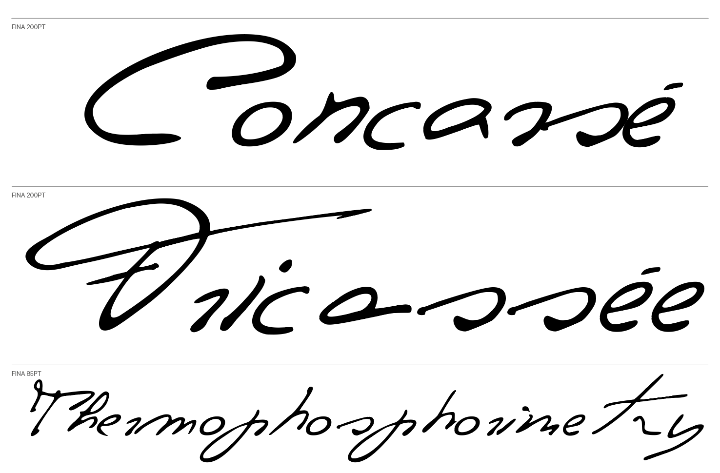
Fina is a delicate and expressive typeface, deeply personal. It will continue to evolve with new styles and weights in future versions, but its heart will always remain the same: a tribute to her.