When I first started learning how to design typefaces, we were in the middle of the pandemic. I spent my days drawing letters while listening to the typography Clubhouse sessions hosted by Ale Paul. Typographers, artists, designers… all kinds of voices passed through those tiny microphones. They felt more like group calls than formal talks.
I remember one session in particular: the guest had a football match on in the background and kept interrupting the conversation every time something happened on the field. A wonderful kind of imperfection.
During one of those calls, I began sketching the letters that would later become Frannie. There was something about that thin stroke that captivated me. For some reason, it felt connected to the botanical world. It reminded me of that Loewe campaign inspired by Karl Blossfeldt’s plant studies.
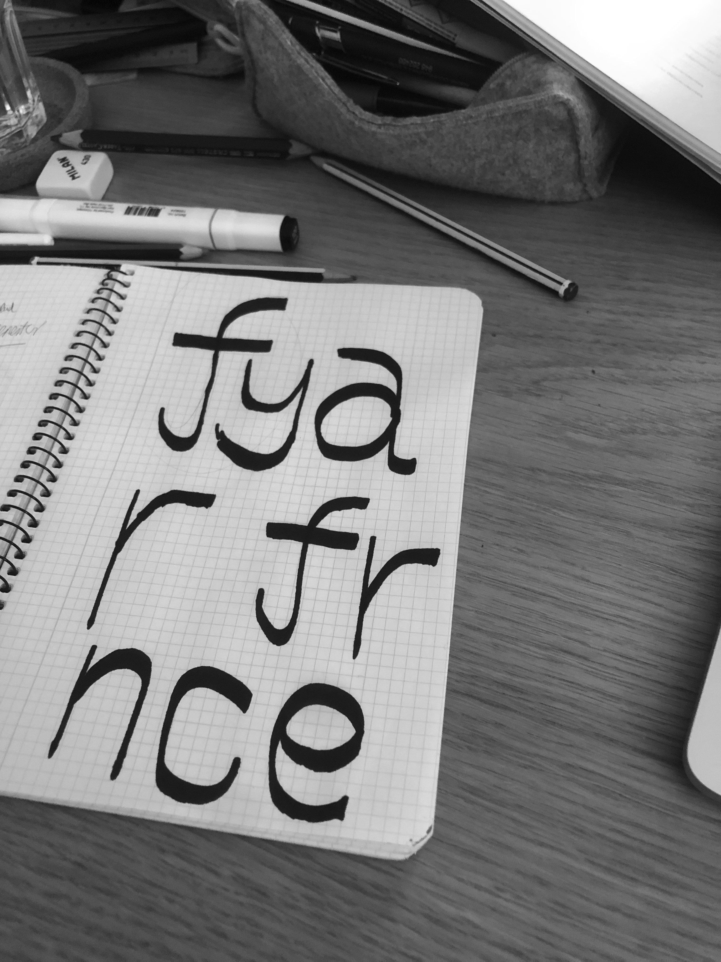
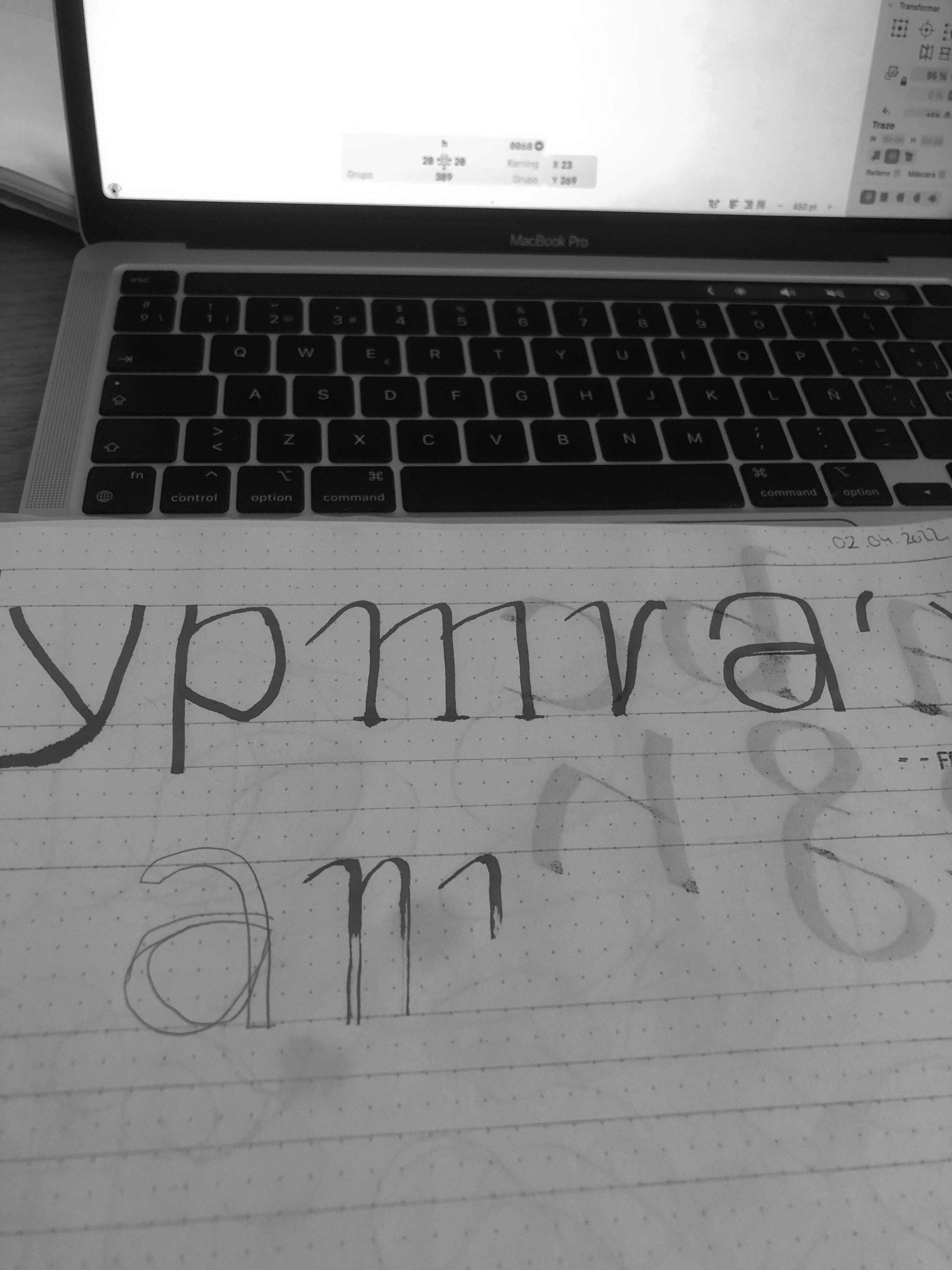
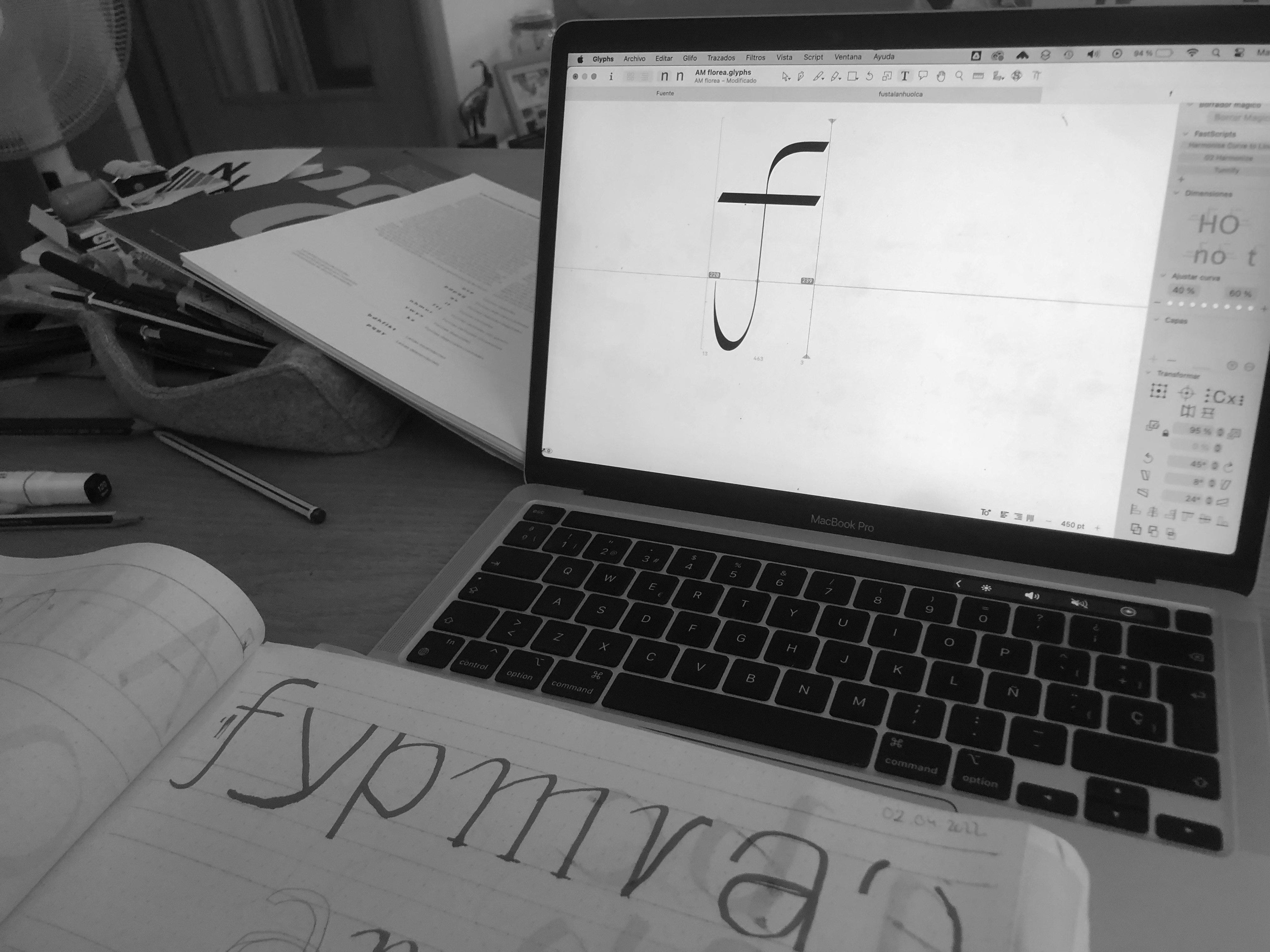
There was a delicacy there that I wanted to explore.
That’s how Frannie was born.
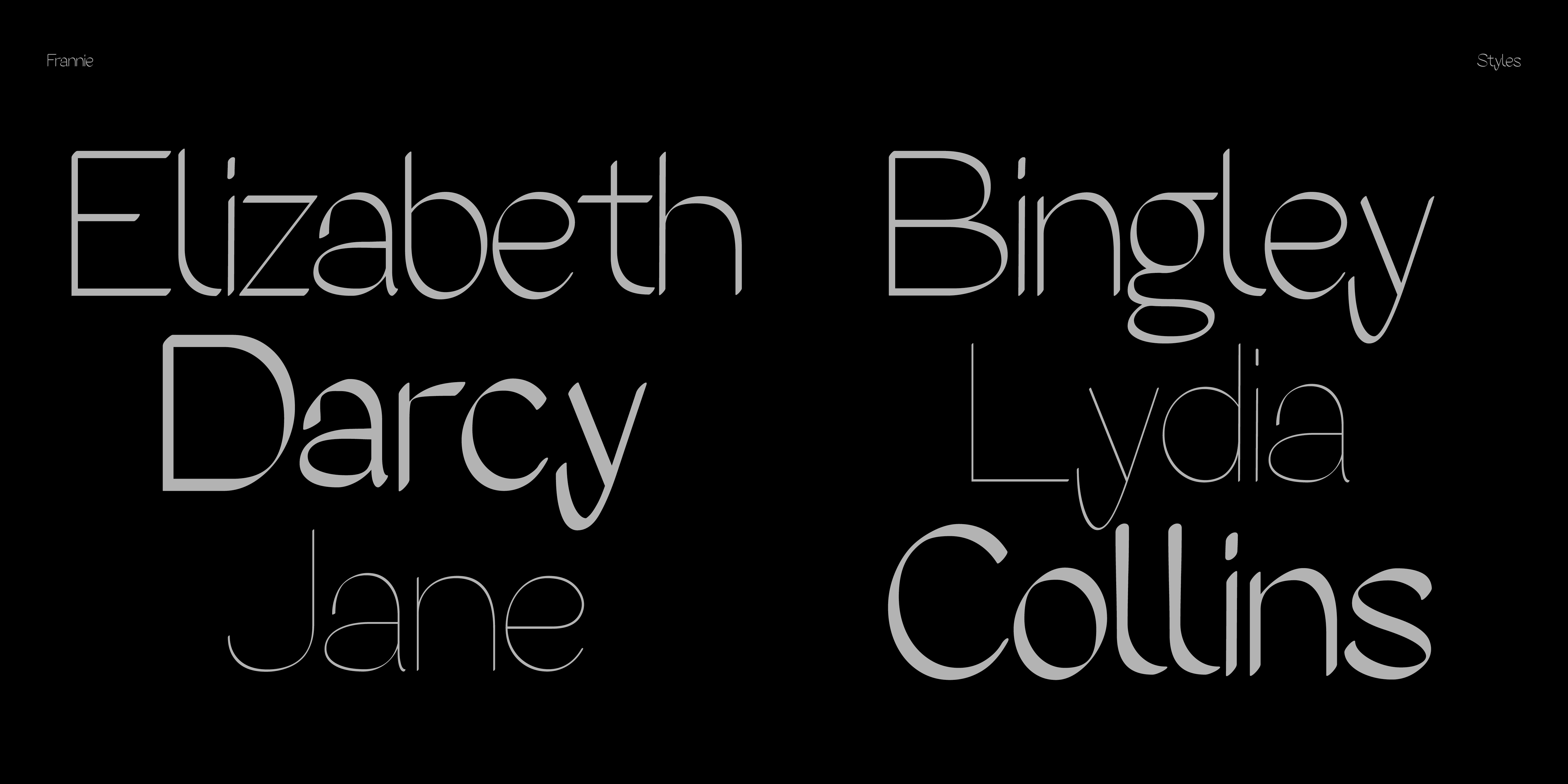
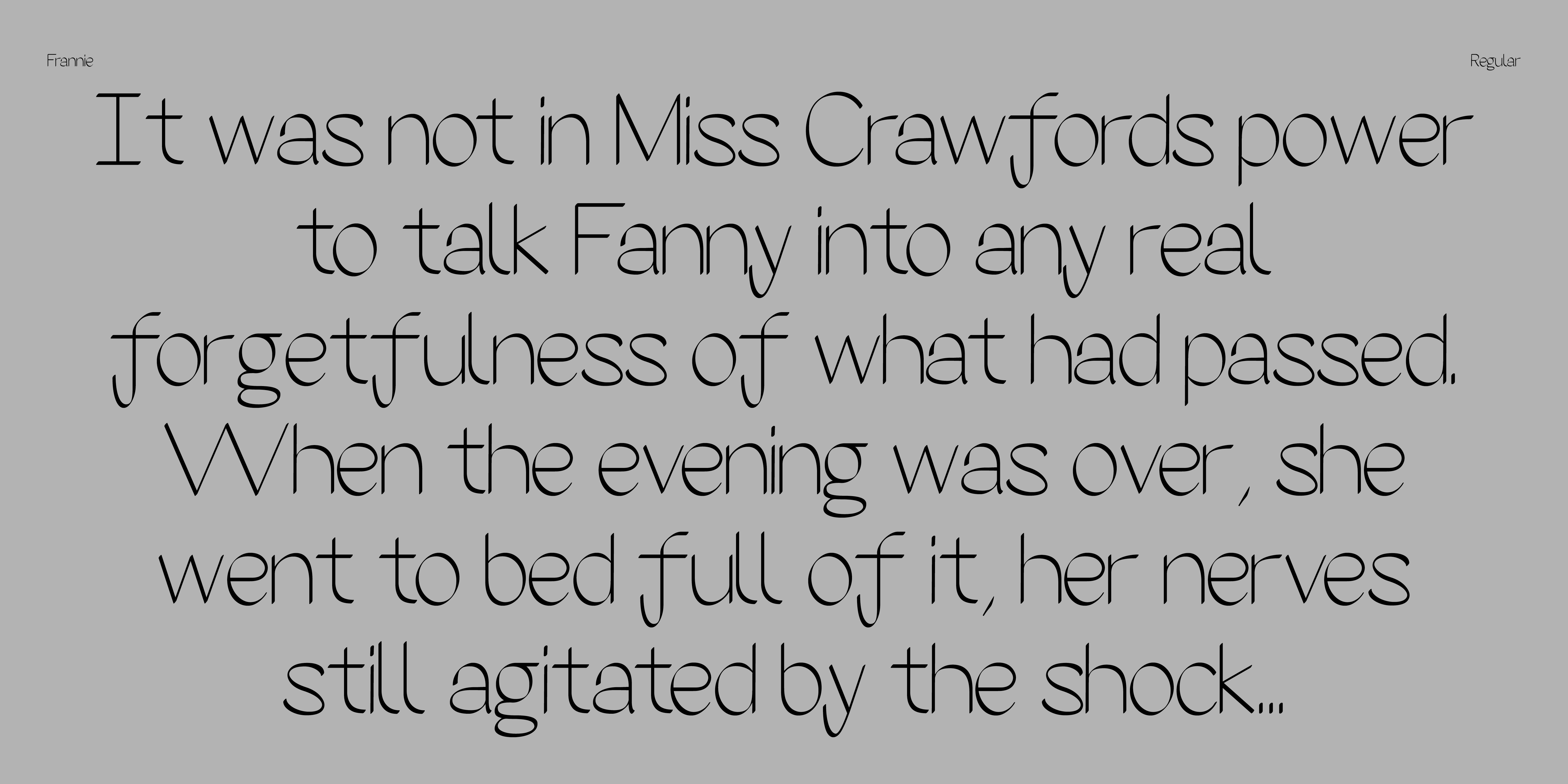
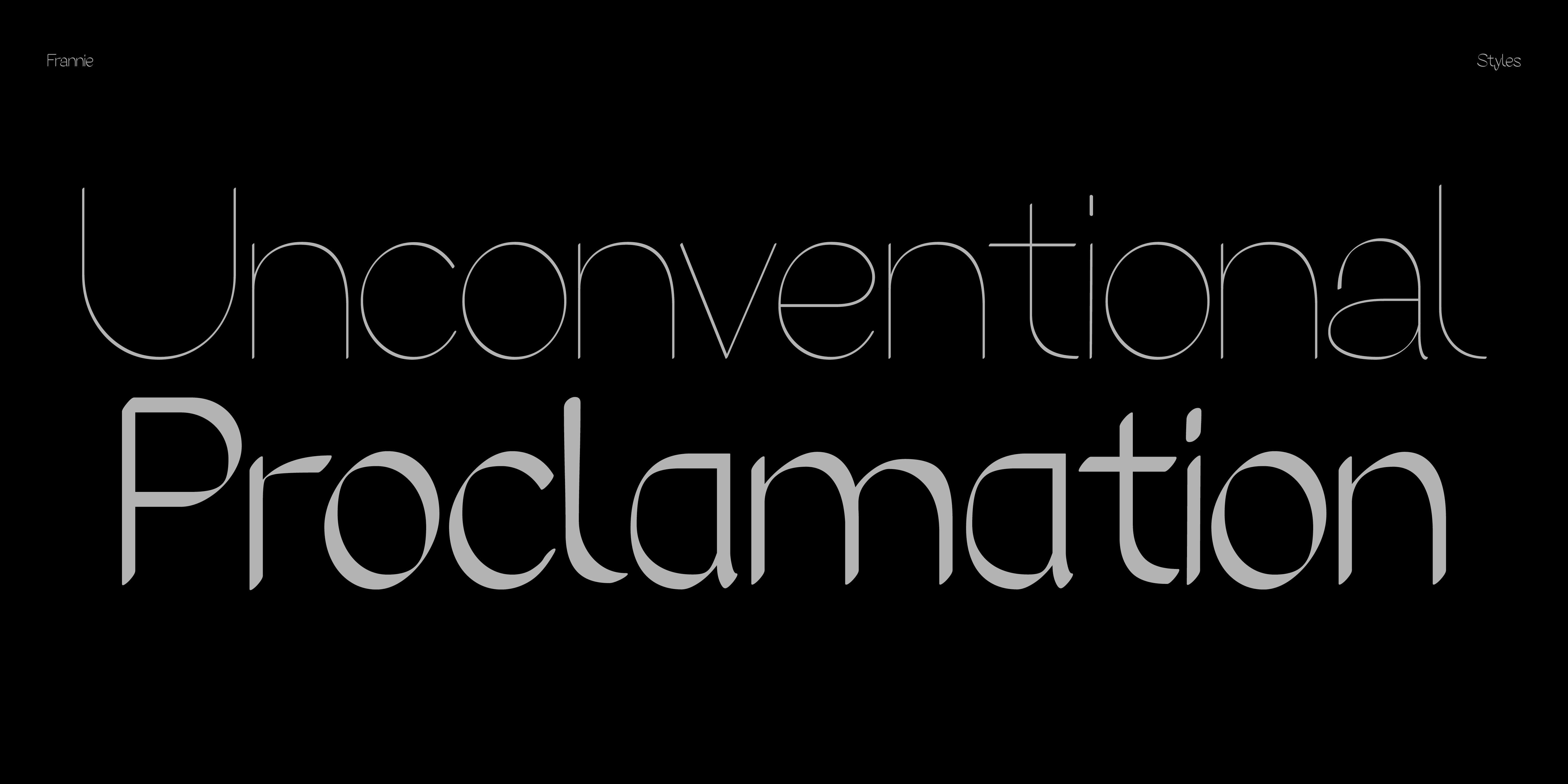
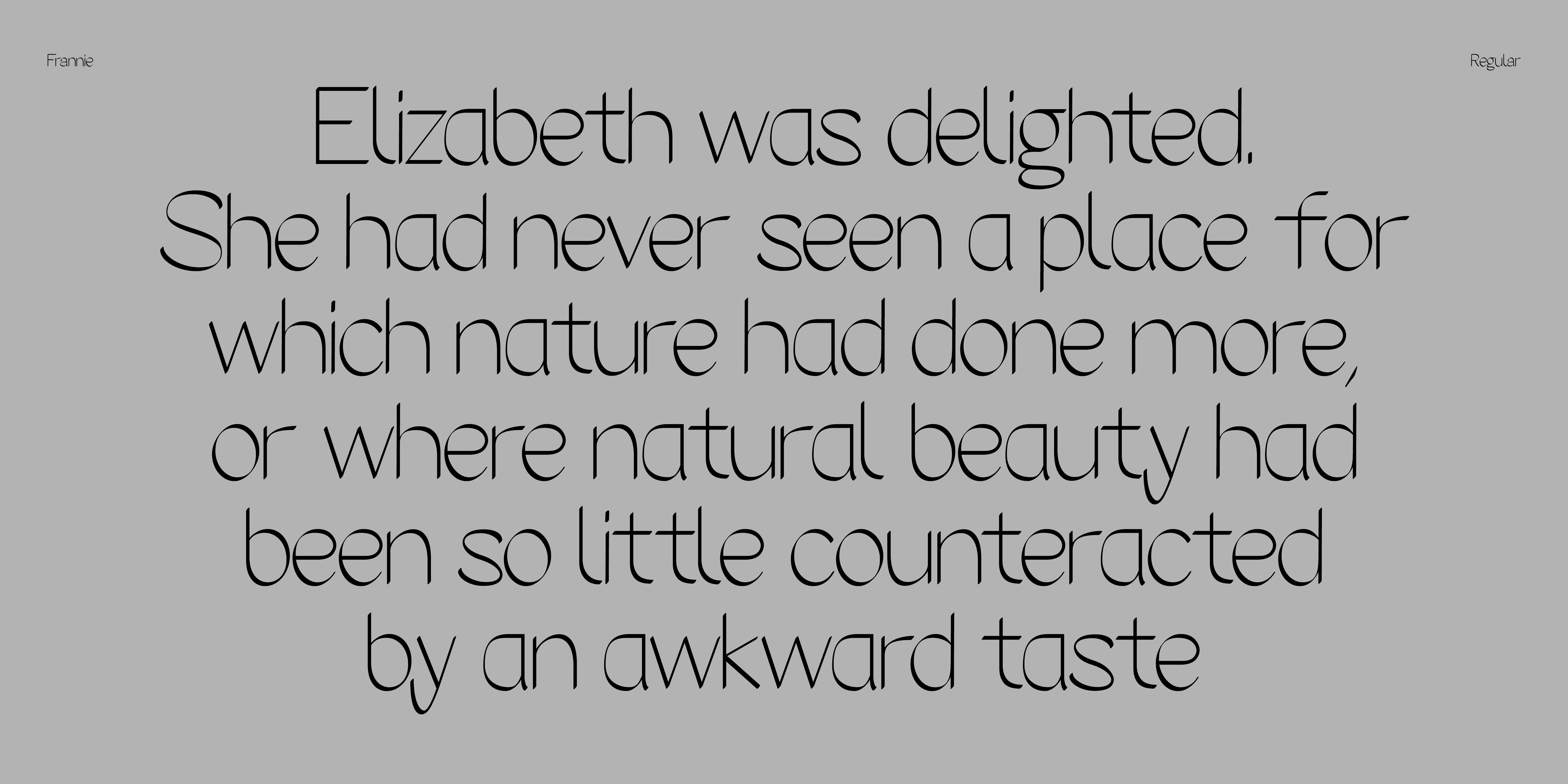
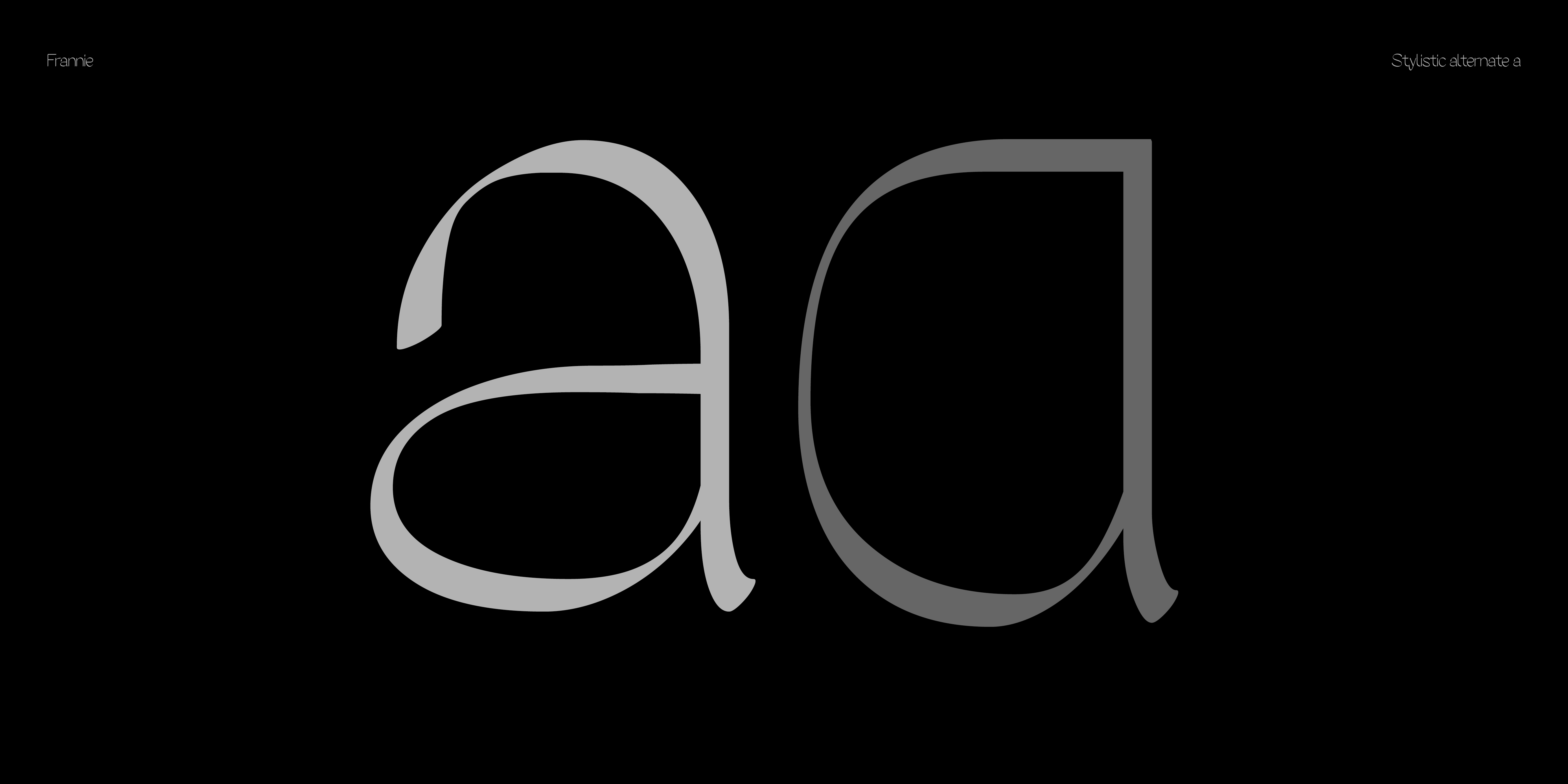
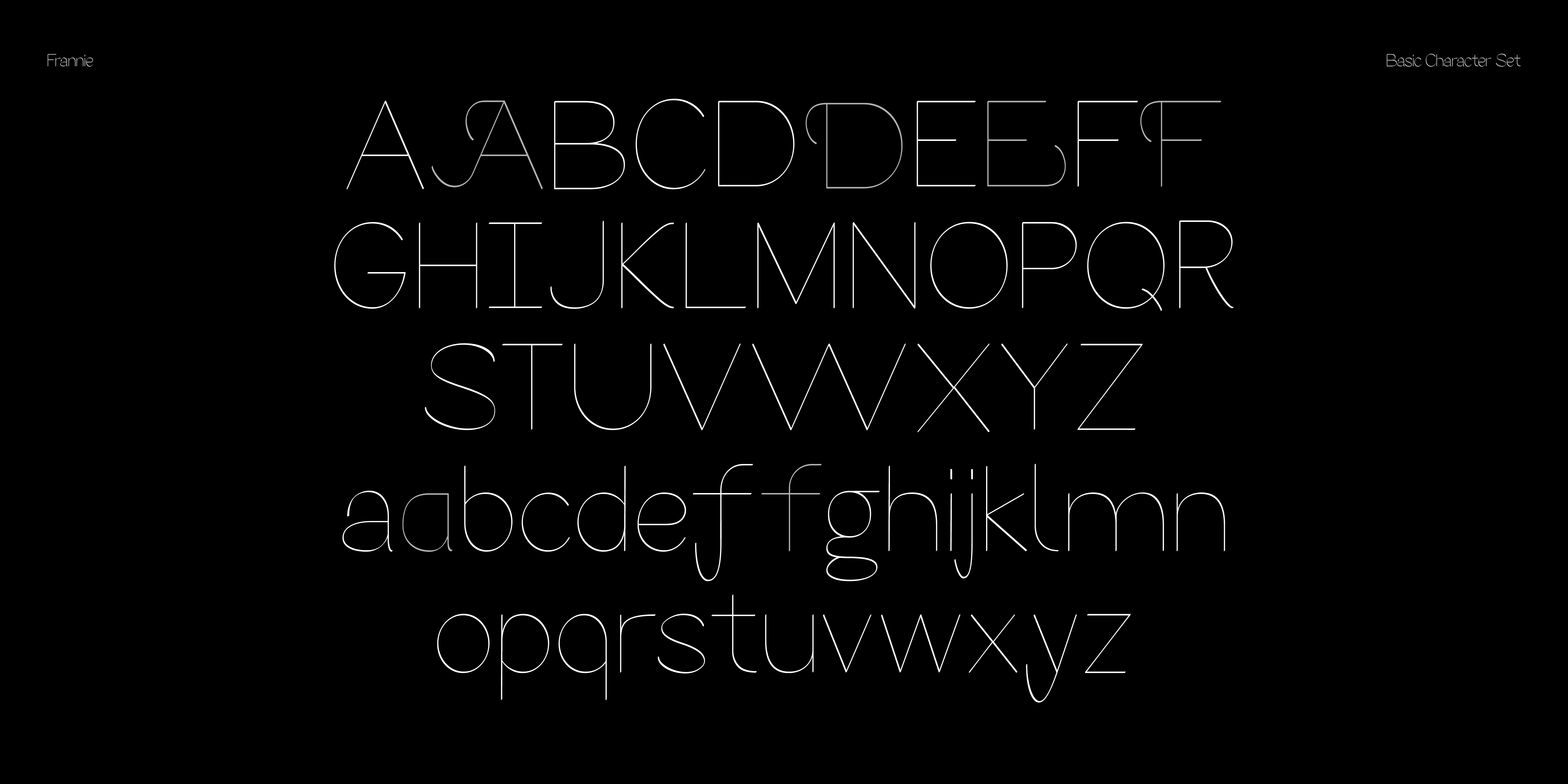
Frannie is a modulated sans built from a 50-degree stroke. Its structure comes from a continuous, brush-like gesture translated into a clean sans-serif system. The typeface includes three predefined styles —Thin, Regular, and Semibold— as well as a variable version that allows gradual weight control. Unlike calligraphic models with strong contrast or decorative tension, Frannie reduces the gesture to a simple, consistent modulation. The result is a typeface shaped by a clear axis and stable proportions, keeping the character of the original stroke without excess.