This month, I’ve been thinking about circles.
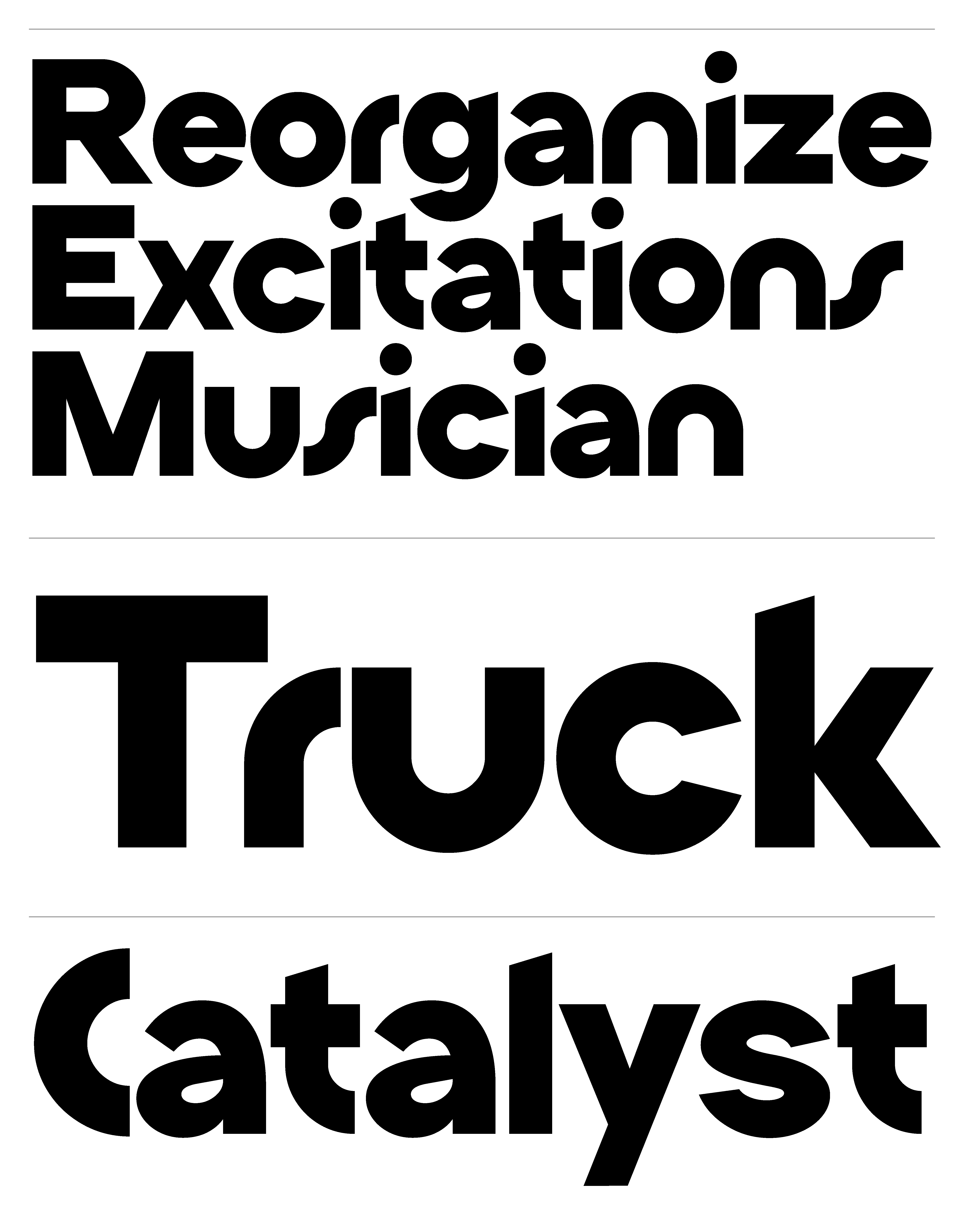
Specifically, how much a single shape—the “o”—can influence the entire character of a typeface.
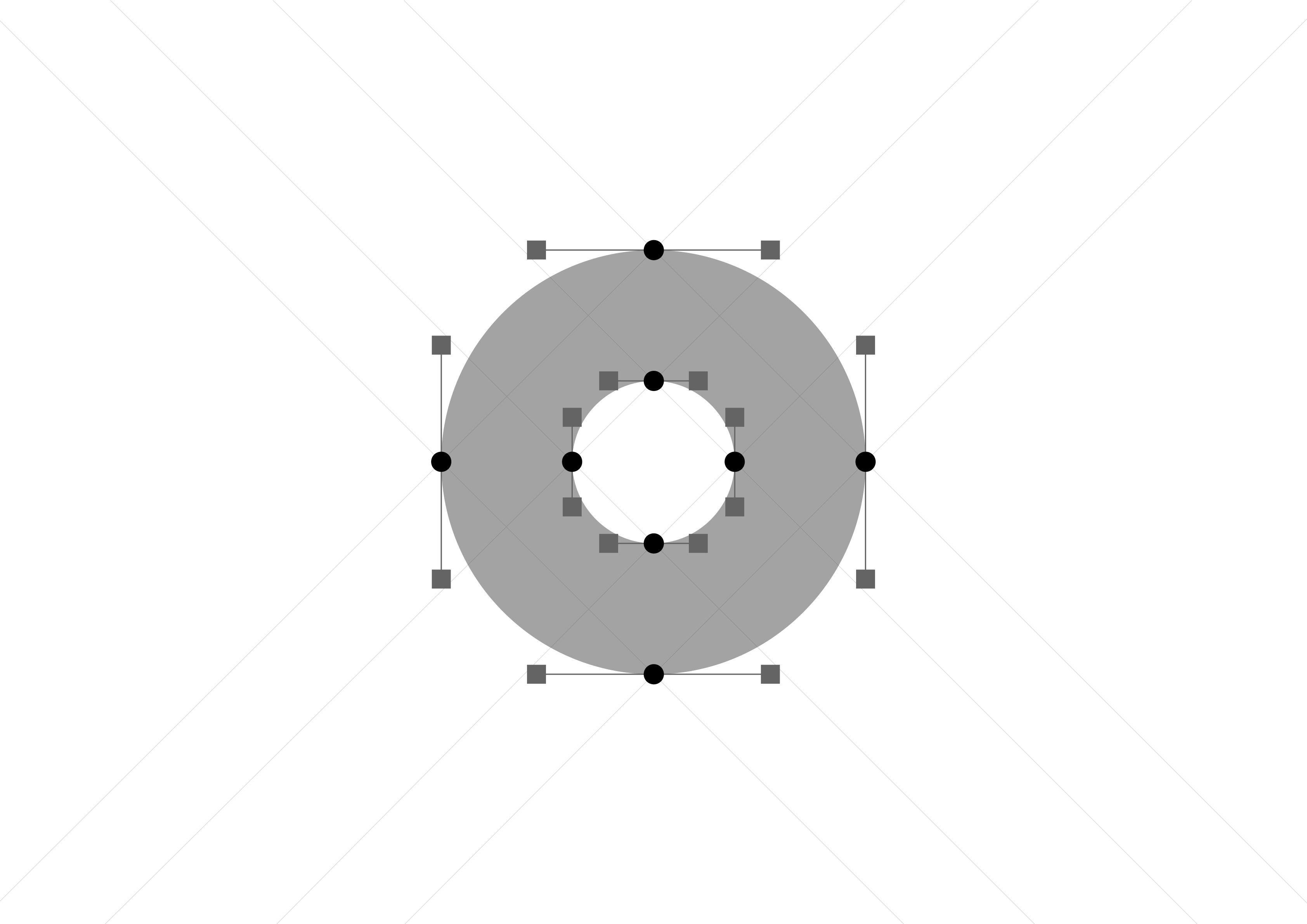
That’s how halone was born: from a geometric experiment where the “o” became the seed for everything else. I wanted to explore what happens when you treat one form as the core module, and let it guide the construction of every letter.

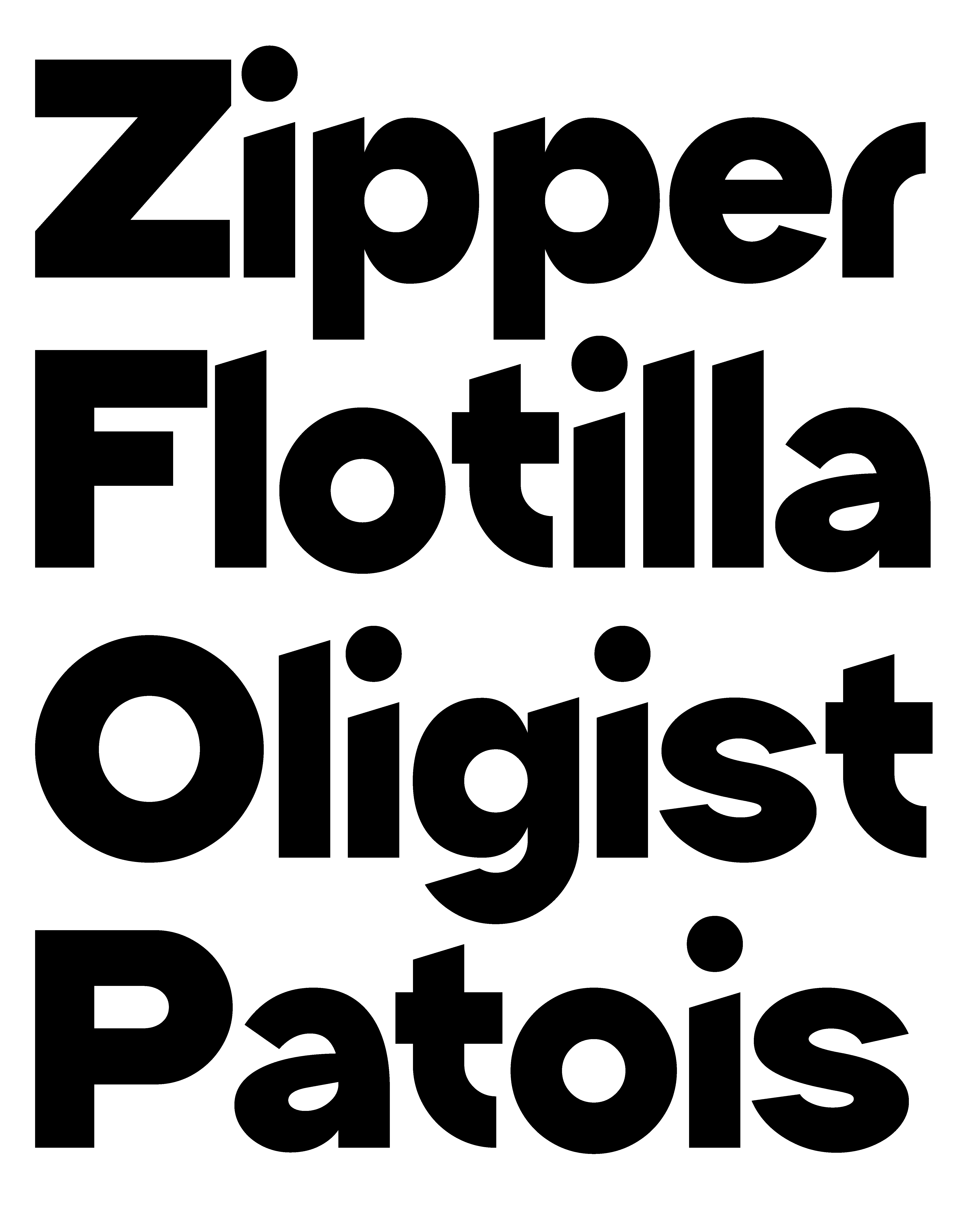
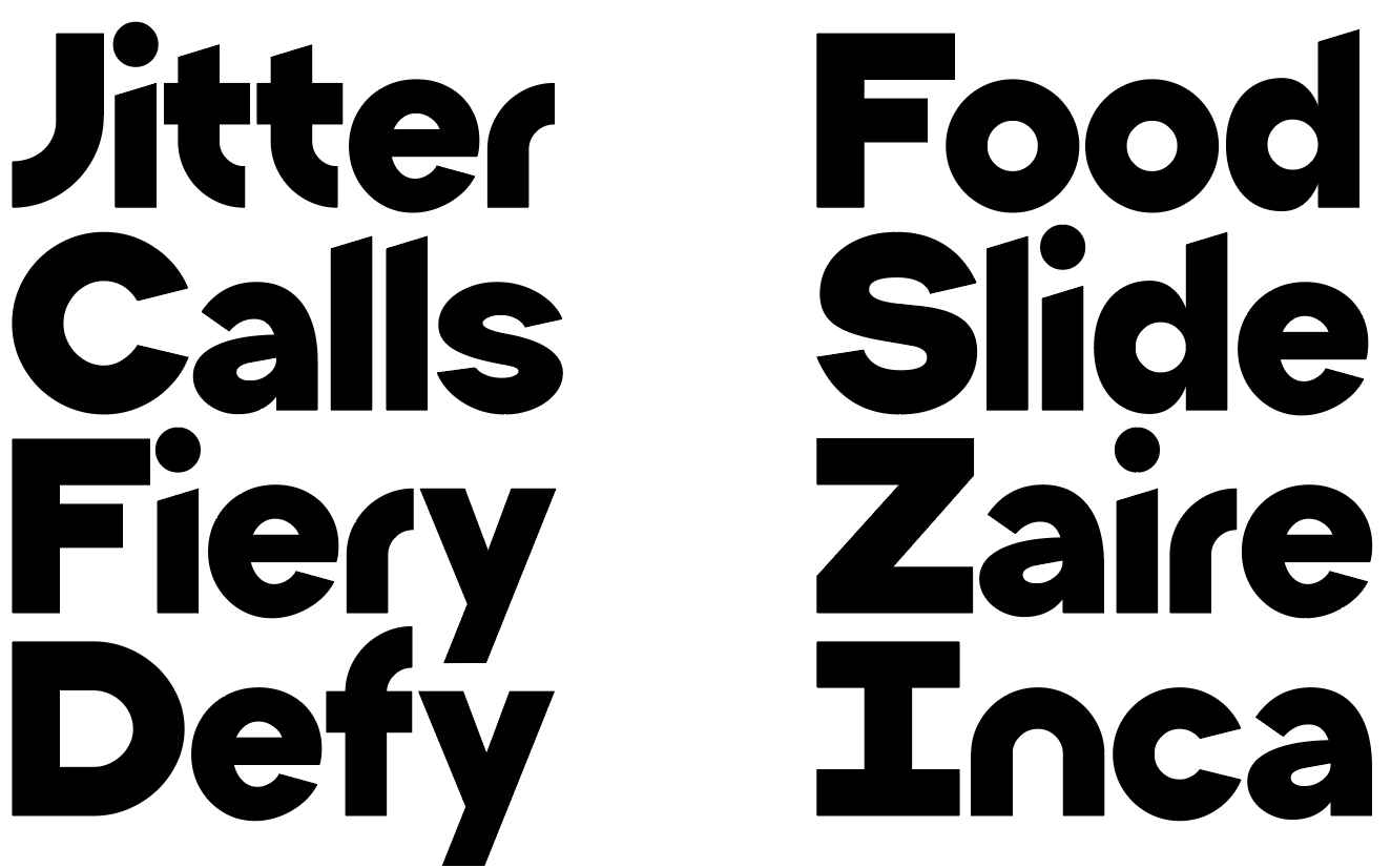
One of the ongoing questions during the process was how to connect uppercase and lowercase forms. At first, they felt like two separate systems—but through constant testing and refinement, I started to find rhythms and echoes between them. It became less about strict consistency, and more about finding a shared tone of voice. Some shapes needed to bend, others to hold firm, until they spoke the same visual language.
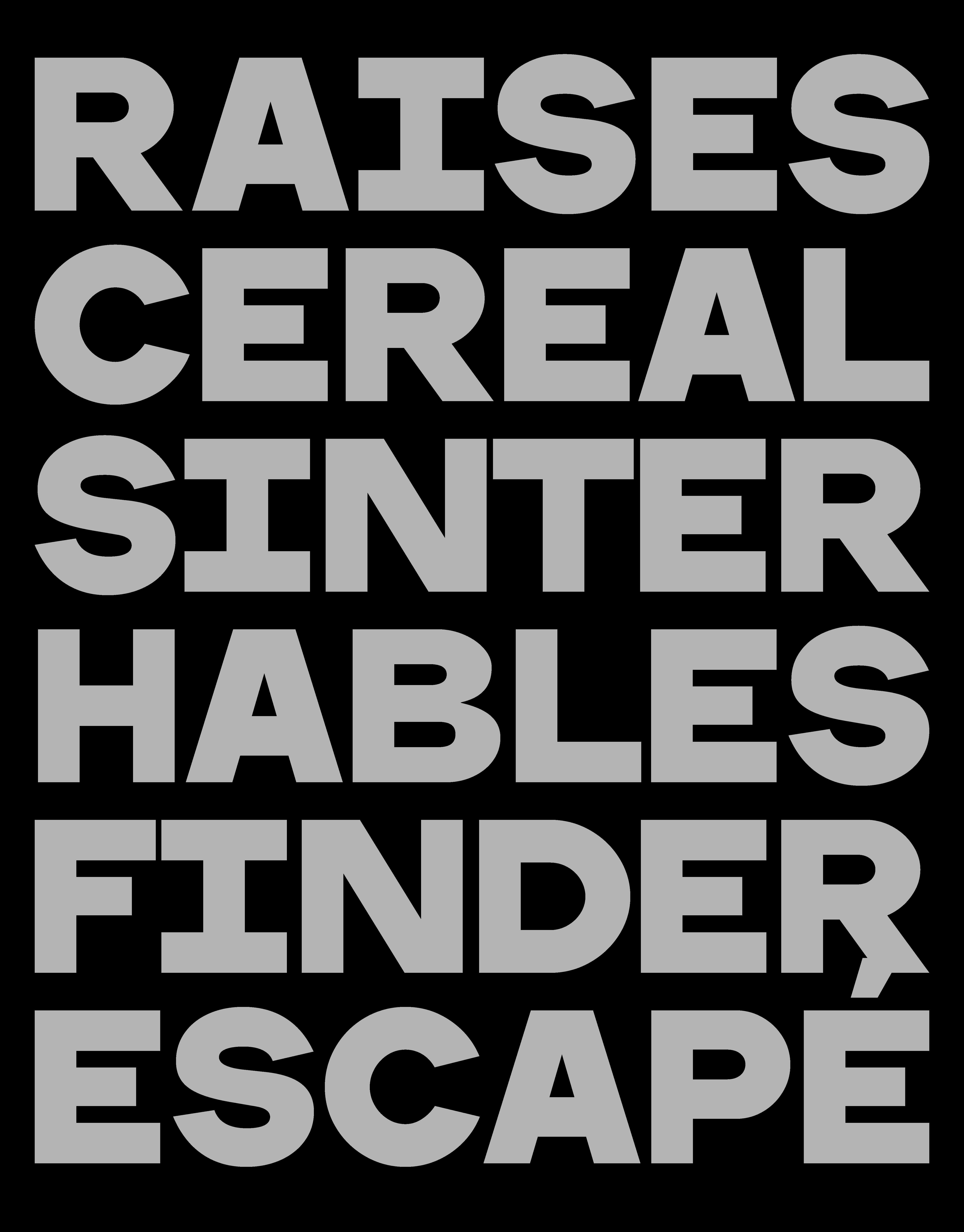
halone is bold, low in contrast, and has a compact x-height. It draws from seventies warmth and eighties geometry—an era where clarity met experimentation. It’s designed in a single, punchy weight, ideal for big statements, logos, and identities that need both structure and soul.
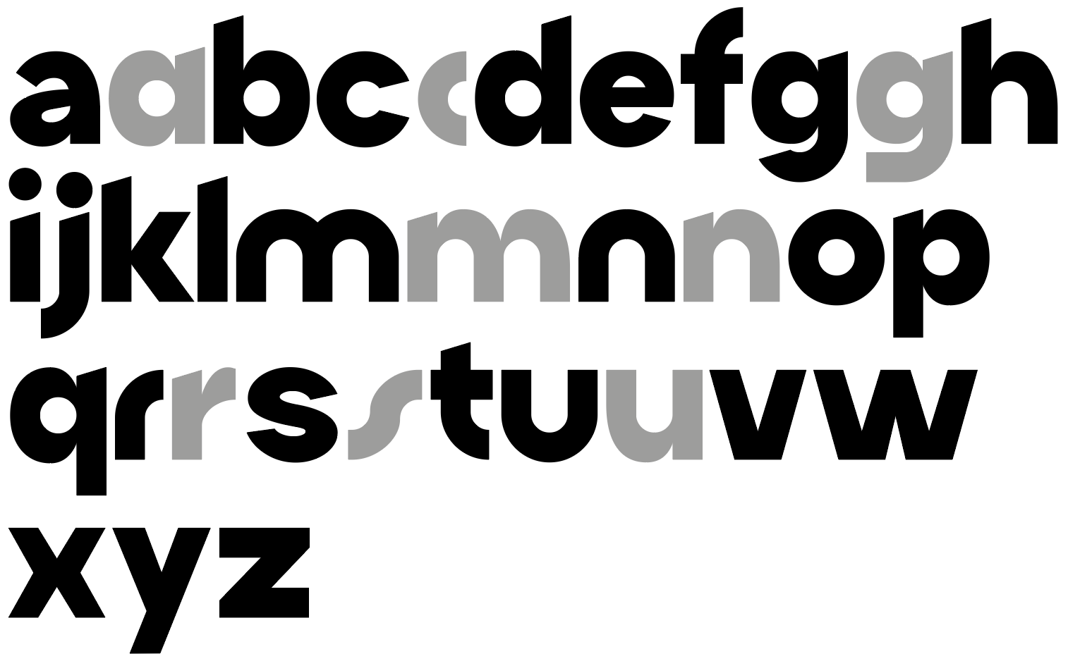

I always like to leave room for the designer—to offer possibilities rather than impose decisions. One way to do that is through OpenType features. They allow for variation, for choice. In halone, that meant keeping two alternate designs for certain characters: one a bit more pop, the other more restrained and less geometric. I didn’t want to let go of either. Instead, I turned them into tools—small switches the designer can use to shift the tone of a word or a whole composition.