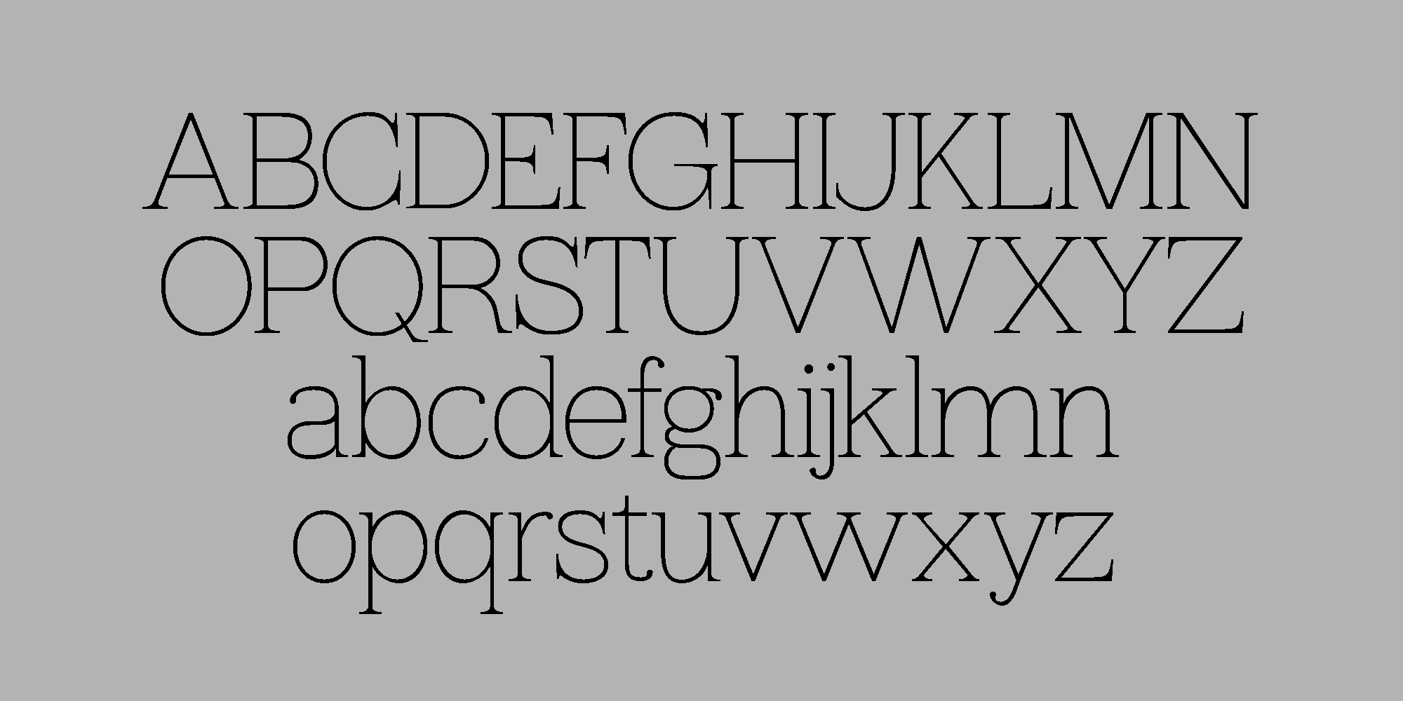
This month, I wanted to start experimenting with designing a typeface with serifs. I’ve always been fascinated by how well some type designers do it—Klim Type, Commercial Type… A friend of mine once told me that if I don’t design a serif, I’m not running a “serious” type foundry. So here’s my first attempt: Blankita.
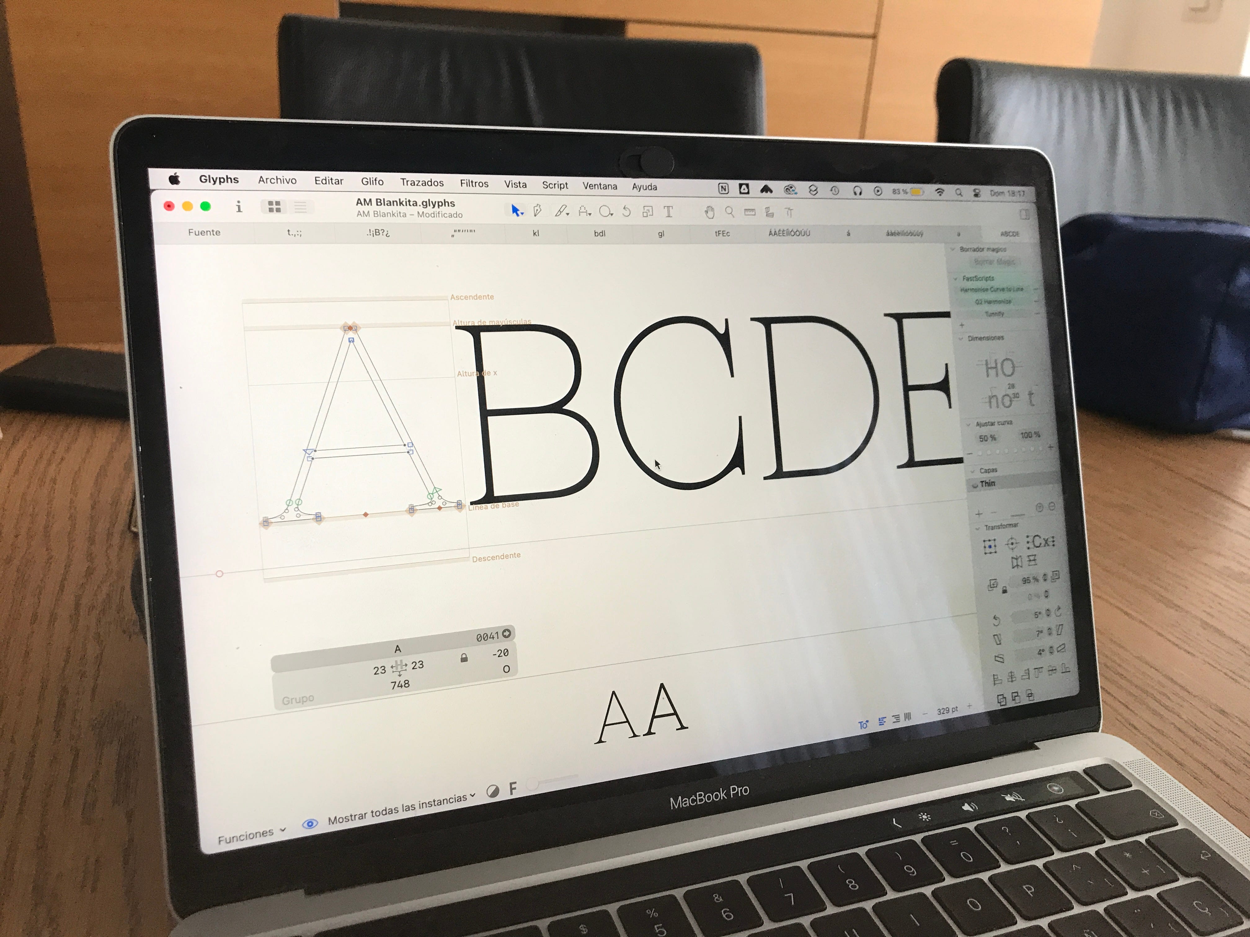
This typeface started as a revision of the very first one I designed years ago, when I was just starting out. It was called Blanca and was an attempt to blend sans and serif. But in reality, it was more of a search for a typographic skeleton that could work as both a sans and a serif.
As I began working on this serif, I wanted to update that initial version and reinterpret it with fresh eyes.
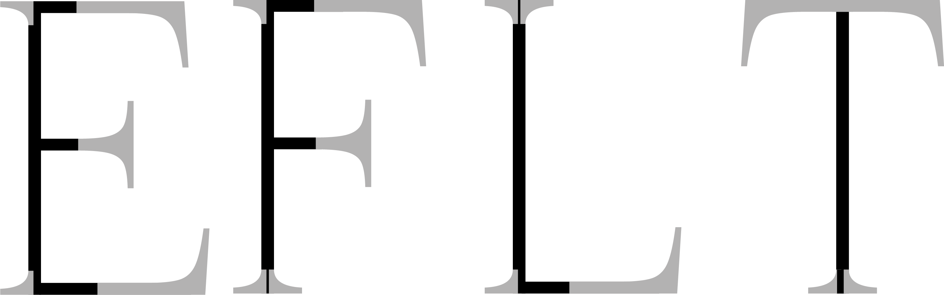
I studied common letterforms: which shapes could be reused to maintain consistency and make the process more efficient? Which ones needed to be redrawn? Some forms could be carried over almost unchanged. Through this process, I found a set of shapes that allowed me to play and explore.

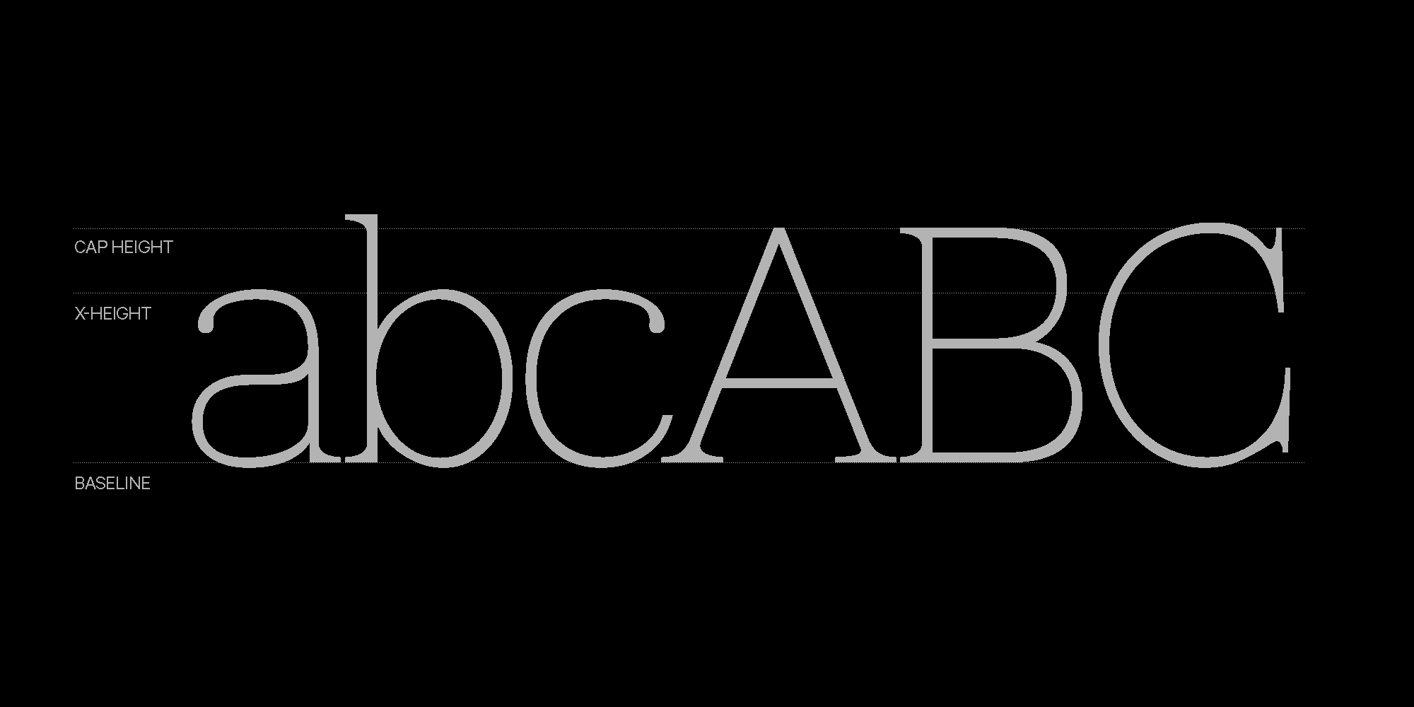
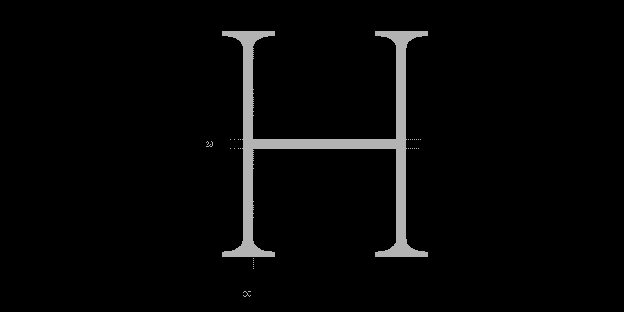
Blankita is a sans typeface that, in this first version, comes in a single thin weight. Its design seeks a balance between delicacy and strength. Unlike other serif typefaces, Blankita minimizes contrast, achieving a uniform stroke thickness that gives it a clean and contemporary character.
Blankita is an evolving typeface, with plans to expand into more weights and styles in future versions. The name is a small tribute to my sister—that’s what we affectionately call her in our family. It’s also a nod to the first typeface I ever created—a subtle yet meaningful evolution.