Dema is a serif with wide proportions. For now, it exists in a single regular weight and lowercase only.
Funny enough, it all began with uppercase letters—but the typeface didn’t really find its voice until I started drawing the lowercase. That’s when everything shifted. The design pushed back. It wanted space. So I followed that impulse and let the shapes stretch out, breathe, and speak in their own tone.
🎁 Download Dema (Trial License)
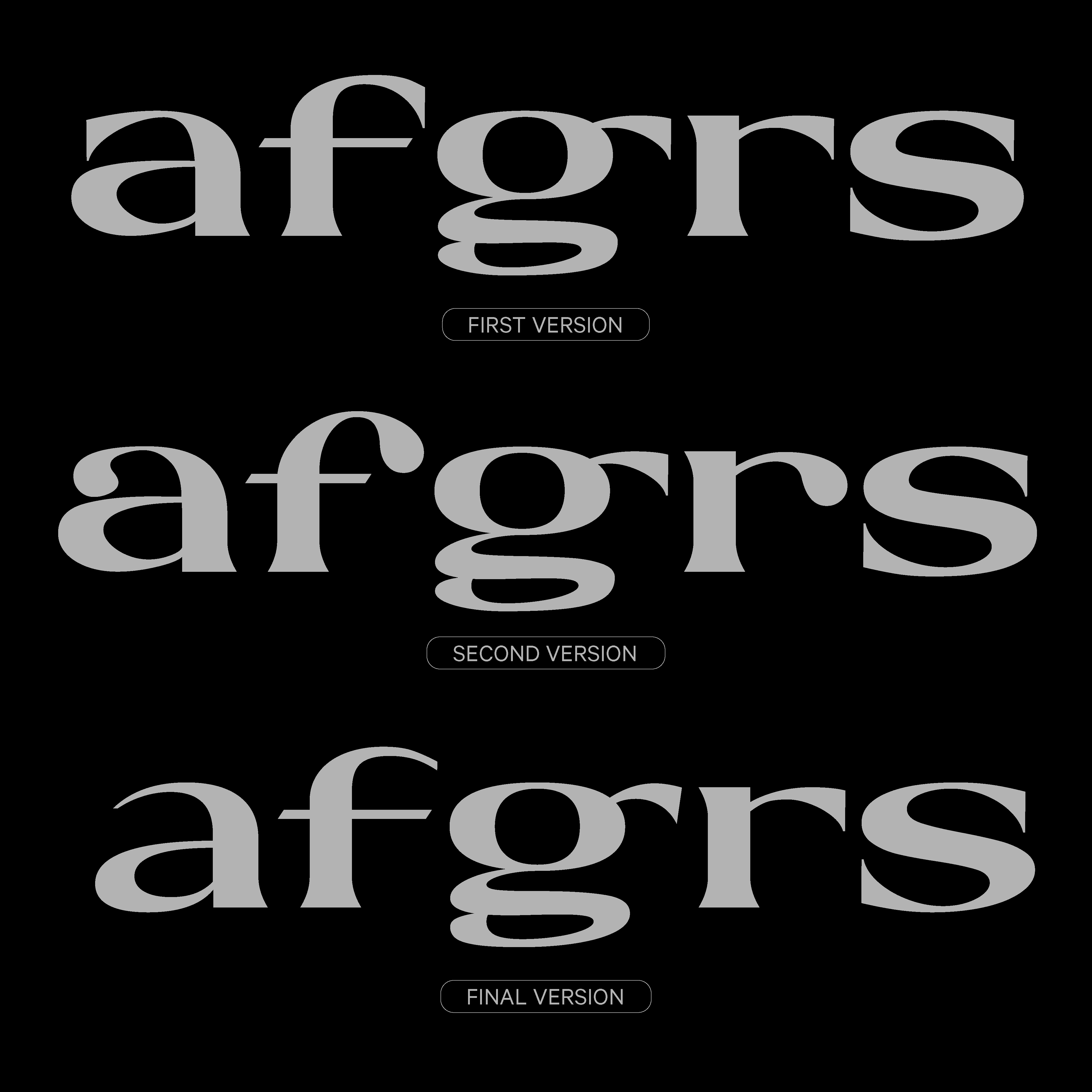
What I struggled with the most was figuring out how the system should work. I’m sharing a few early sketches here—see how, at the beginning, I wasn’t sure if the ashould follow the same logic as the sor the c? This back-and-forth is where a lot of the identity started to take shape.
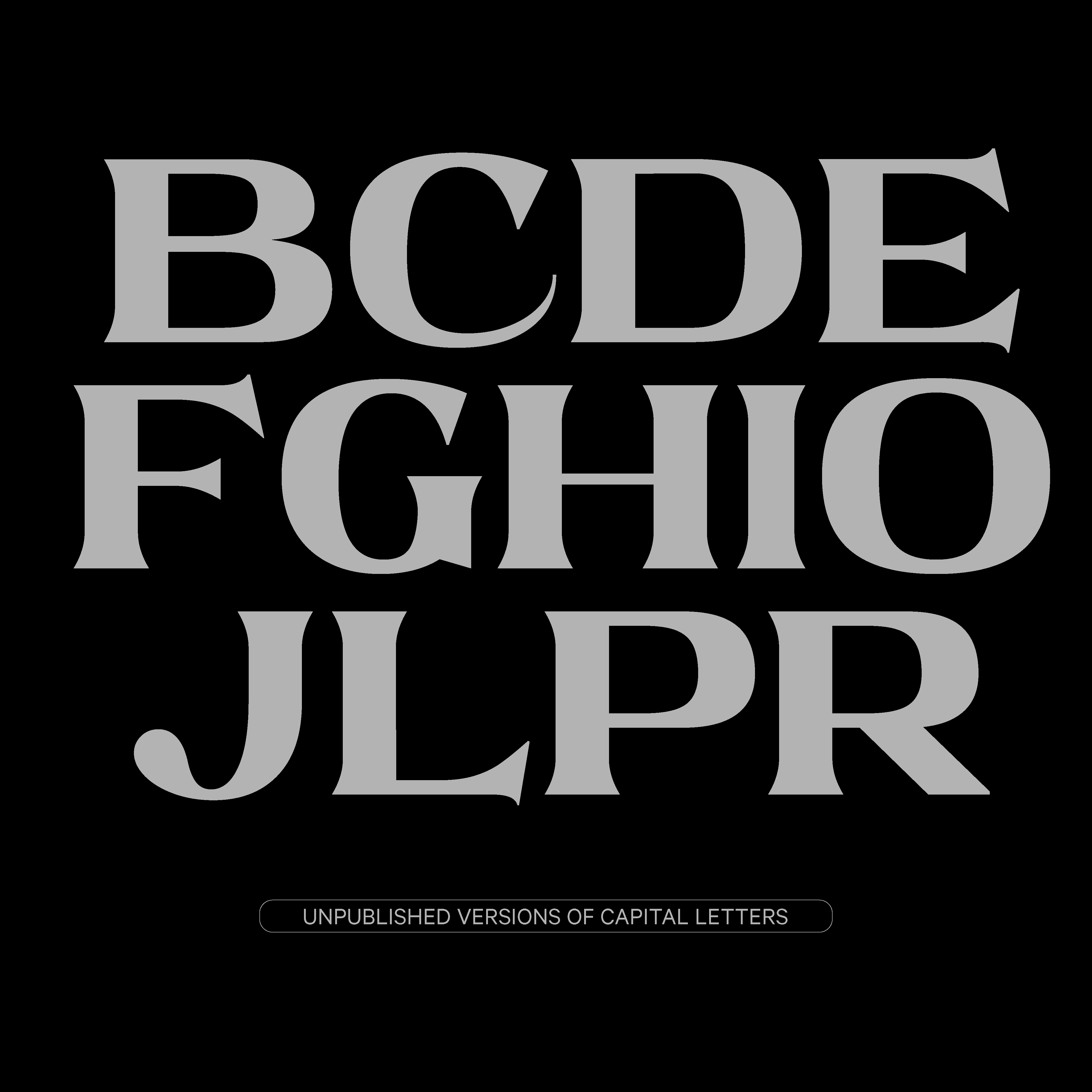
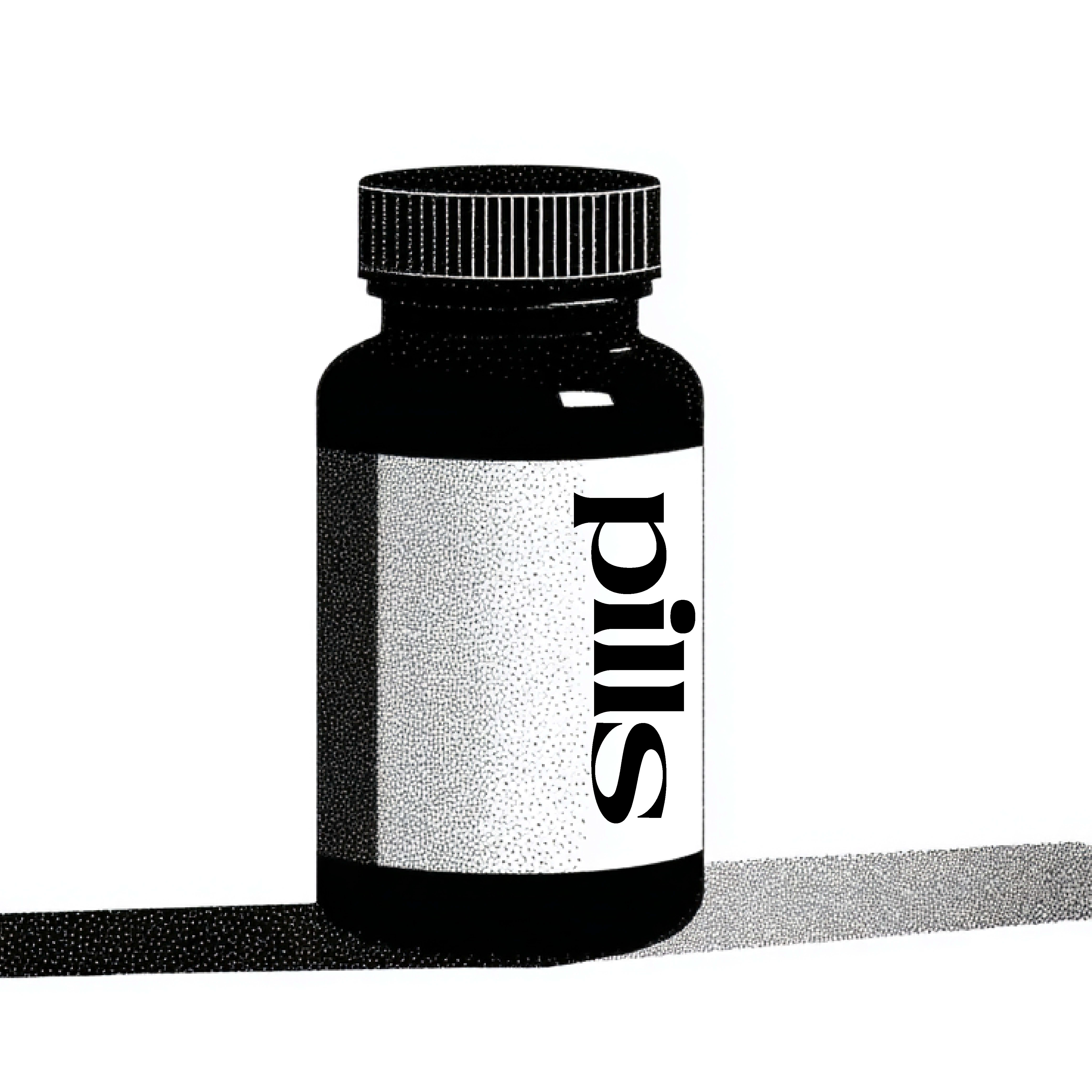
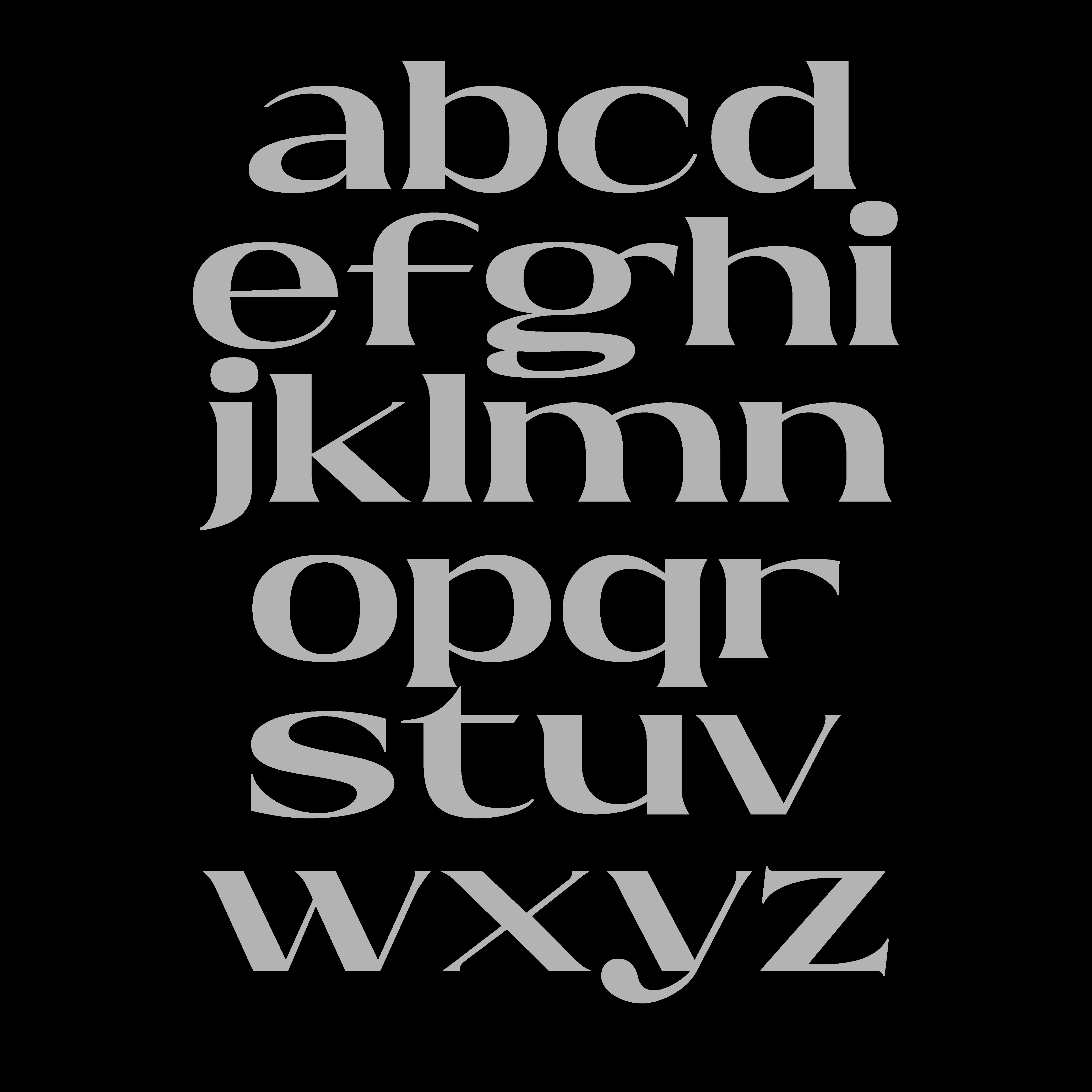
Dema is still evolving. It’s not finished—and that’s part of its charm. More styles and refinements will come with time, but this first version already sets a clear direction: open, grounded, and a little off the beaten path.
The name is a small nod to how time caught up with me. In Spain, there’s this running joke from comedian José Mota—whenever something urgent comes up, he replies: “hoy no, mañana“ (not today, tomorrow). It felt like the perfect fit. Demà means “tomorrow” in Catalan.