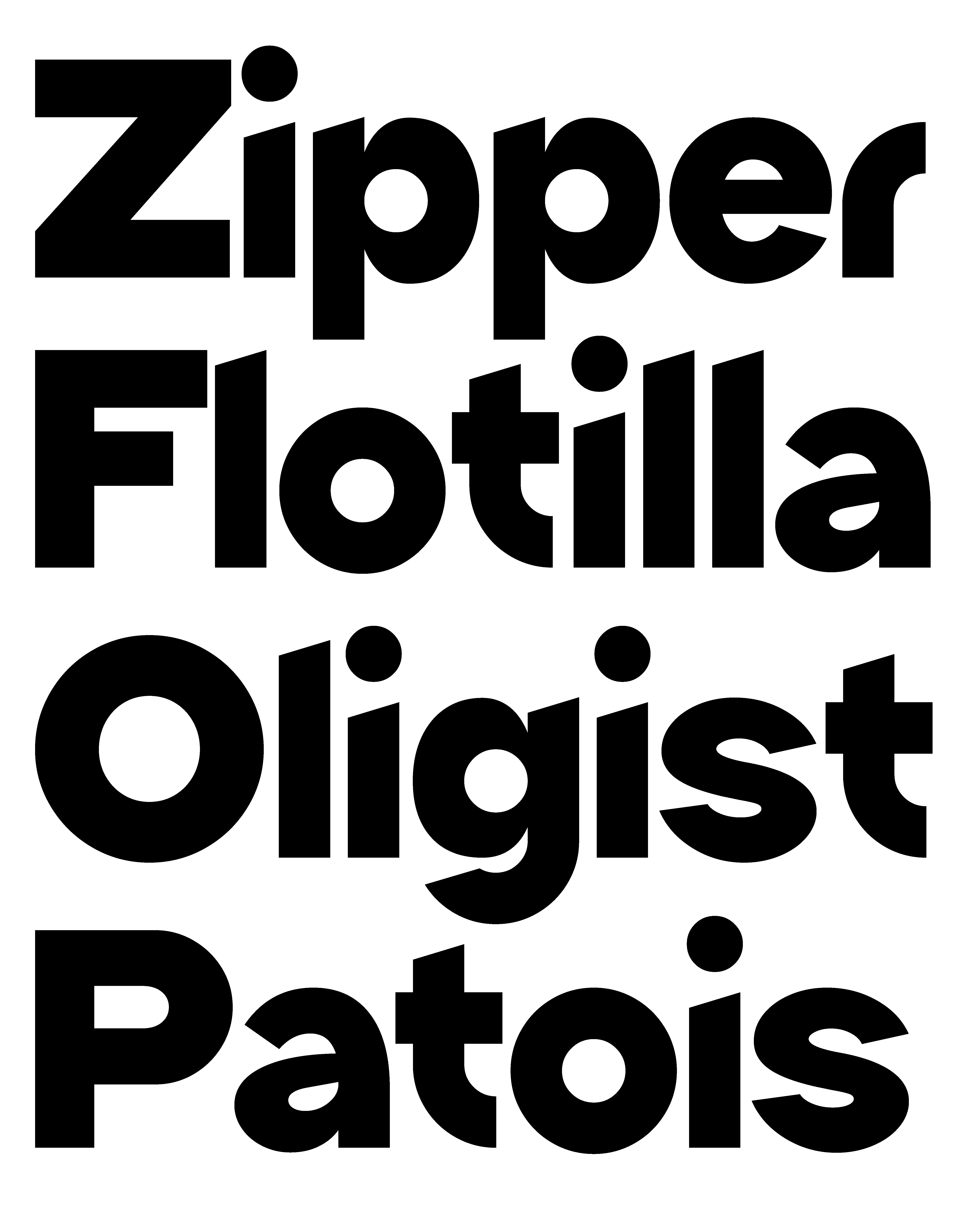
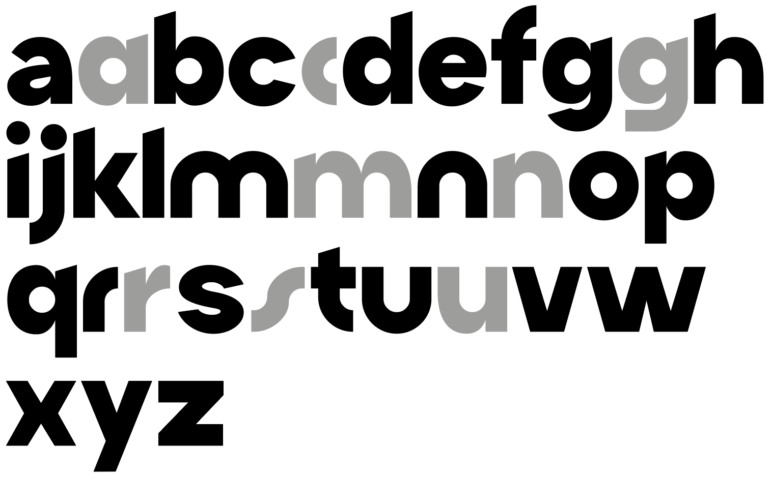
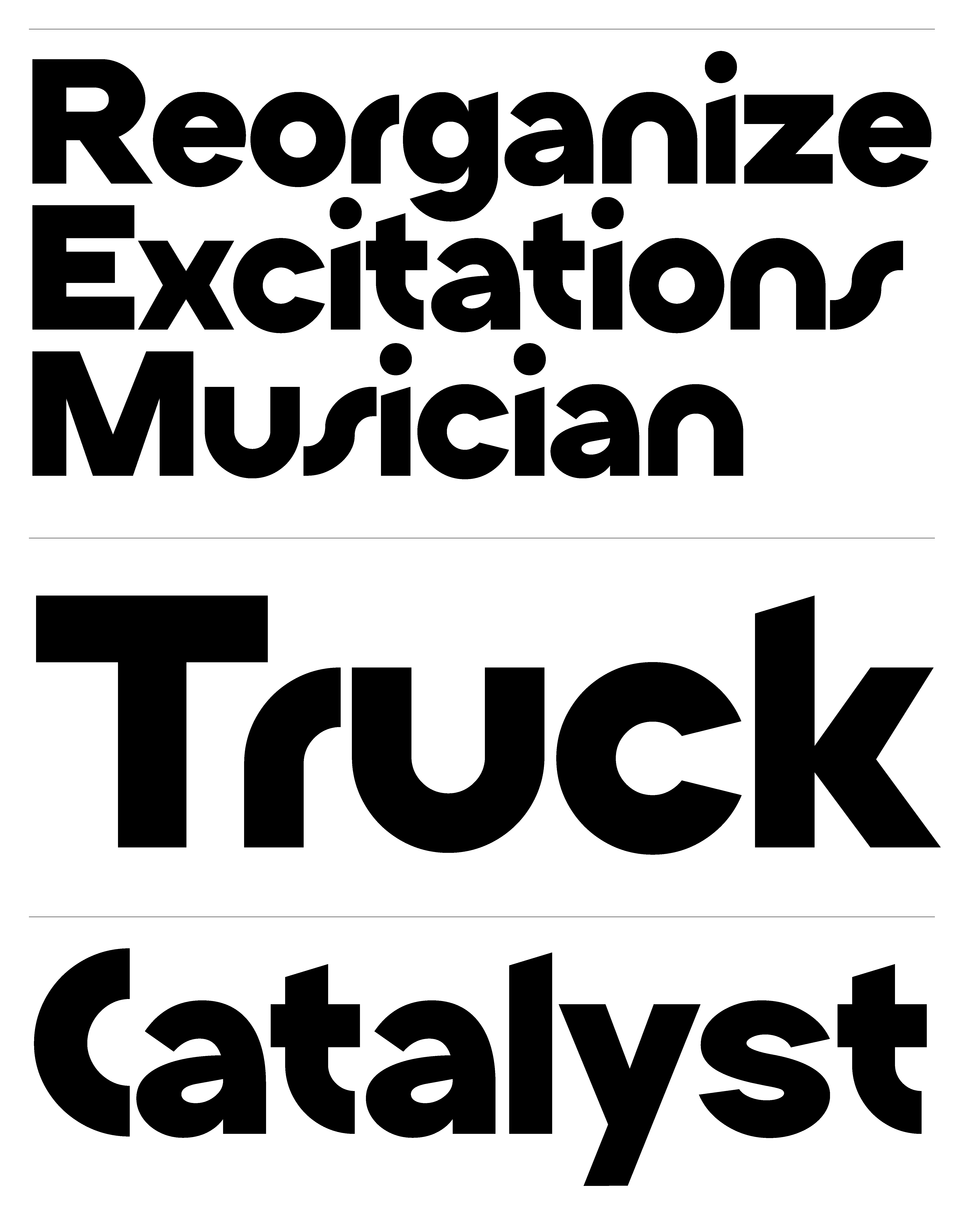
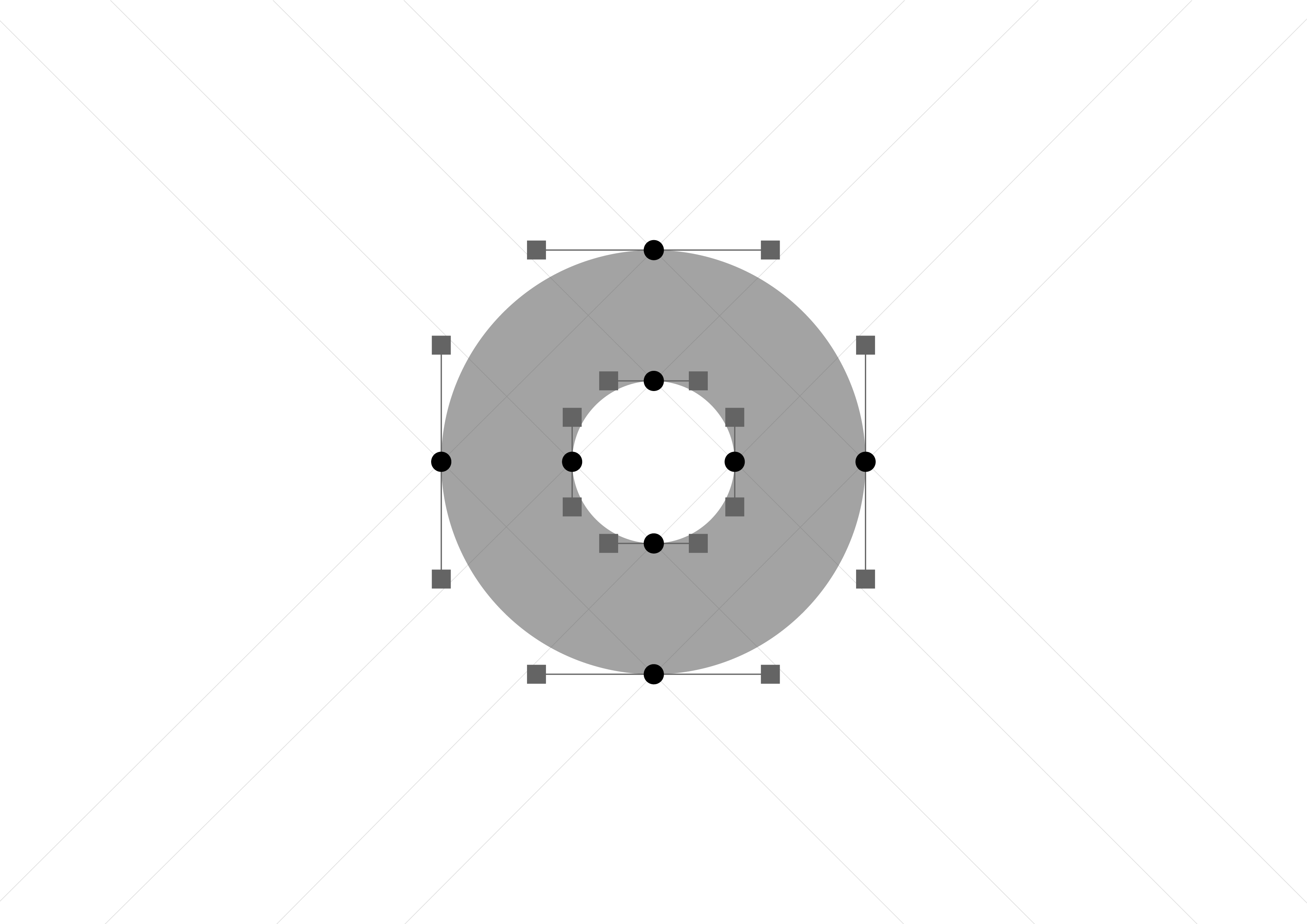
This month, I’ve been thinking about circles. Specifically, how much a single shape—the “o”—can influence the entire character of a typeface.
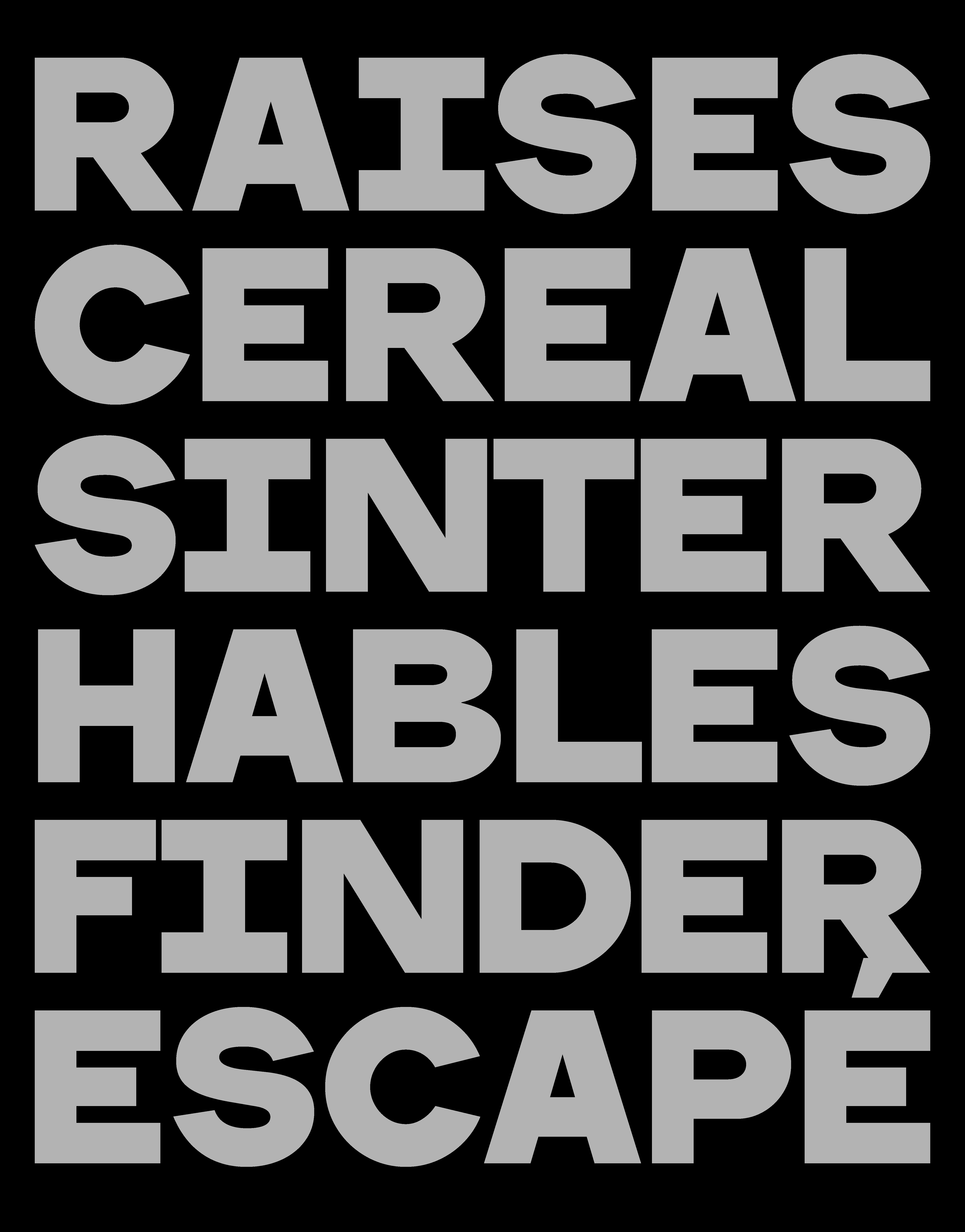
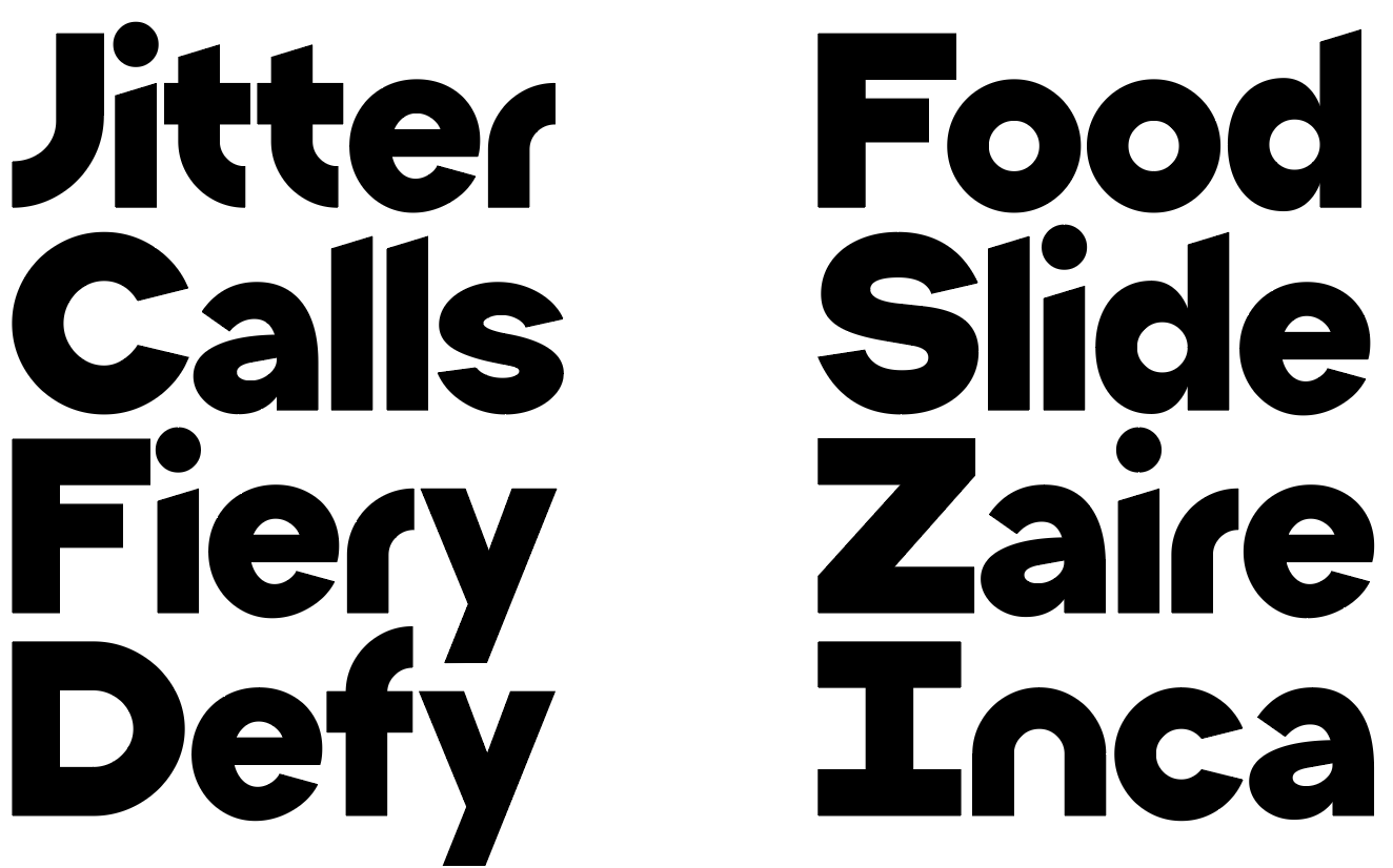
That’s how halone was born: from a geometric experiment where the “o” became the seed for everything else. I wanted to explore what happens when you treat one form as the core module, and let it guide the construction of every letter.
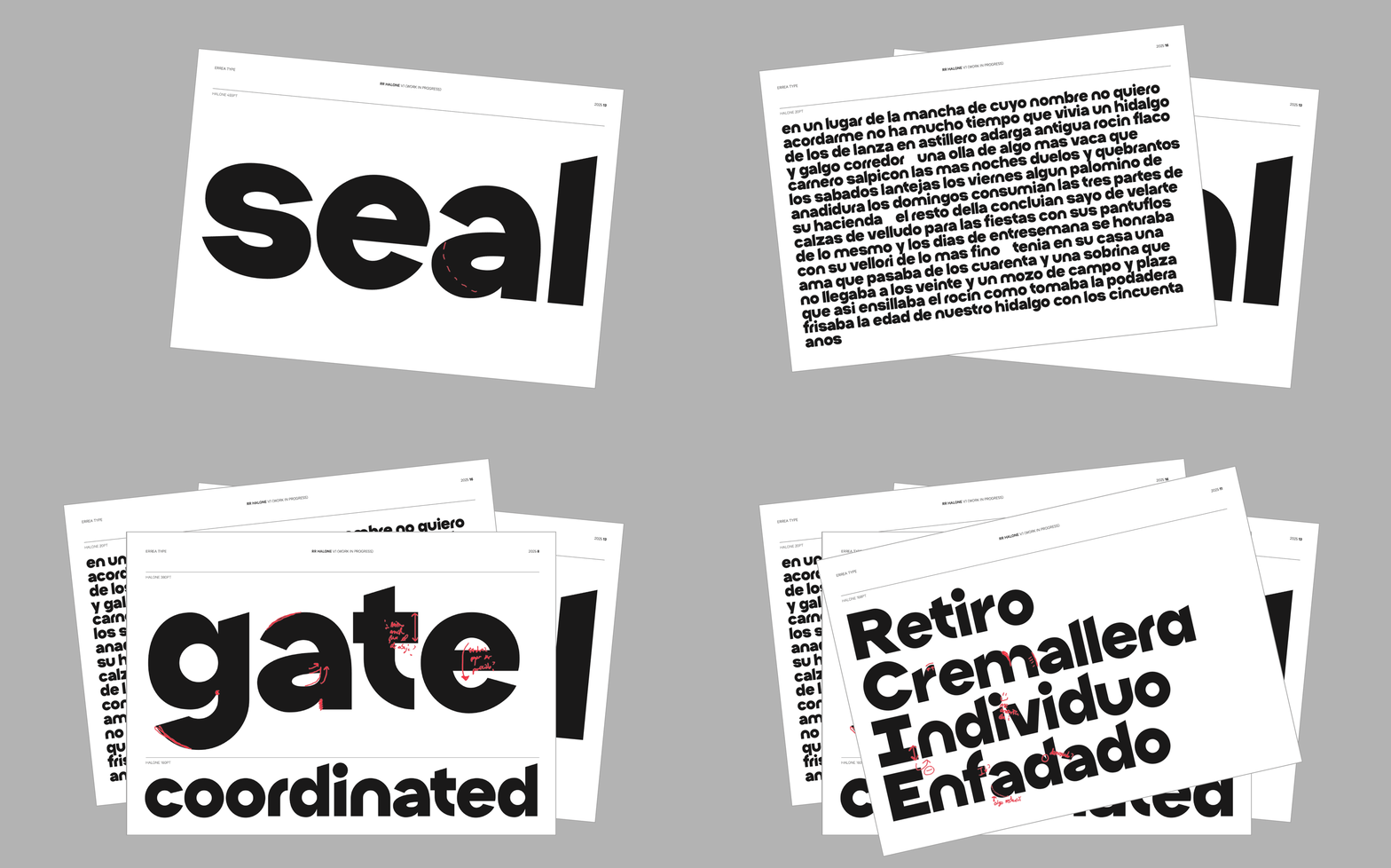
halone is bold, low in contrast, and has a compact x-height. It draws from seventies warmth and eighties geometry—an era where clarity met experimentation. It’s designed in a single, punchy weight, ideal for big statements, logos, and identities that need both structure and soul.