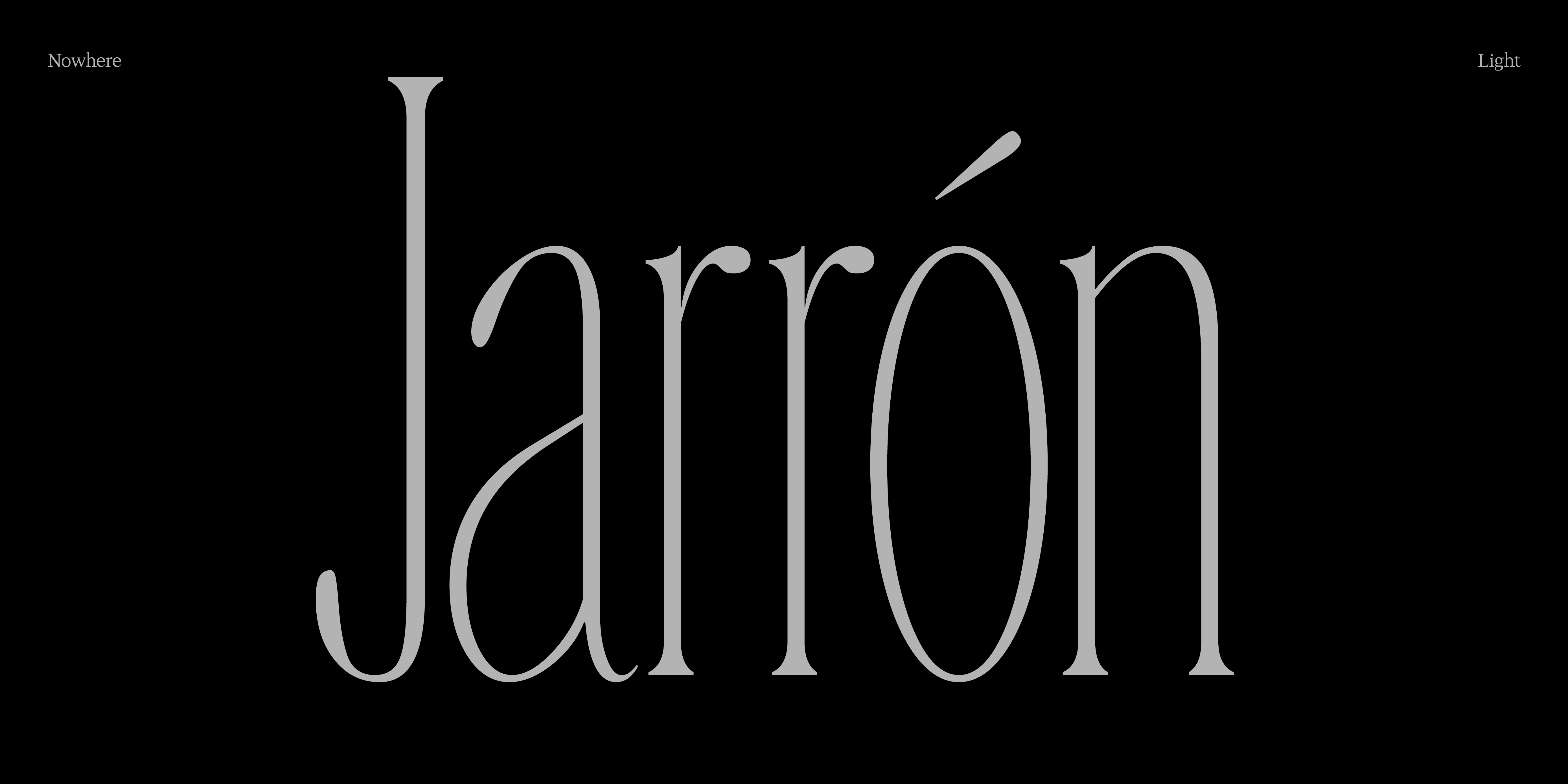
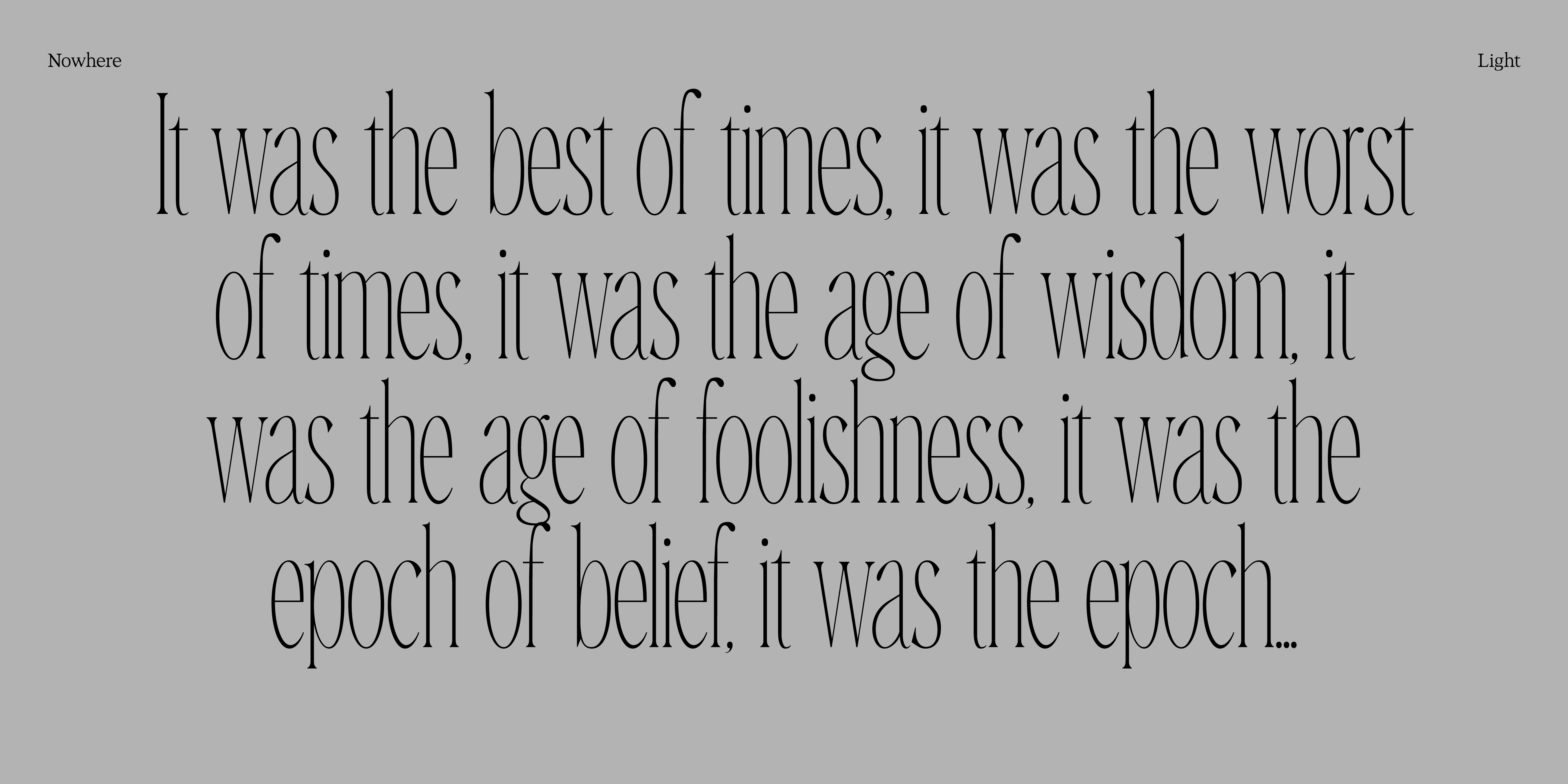
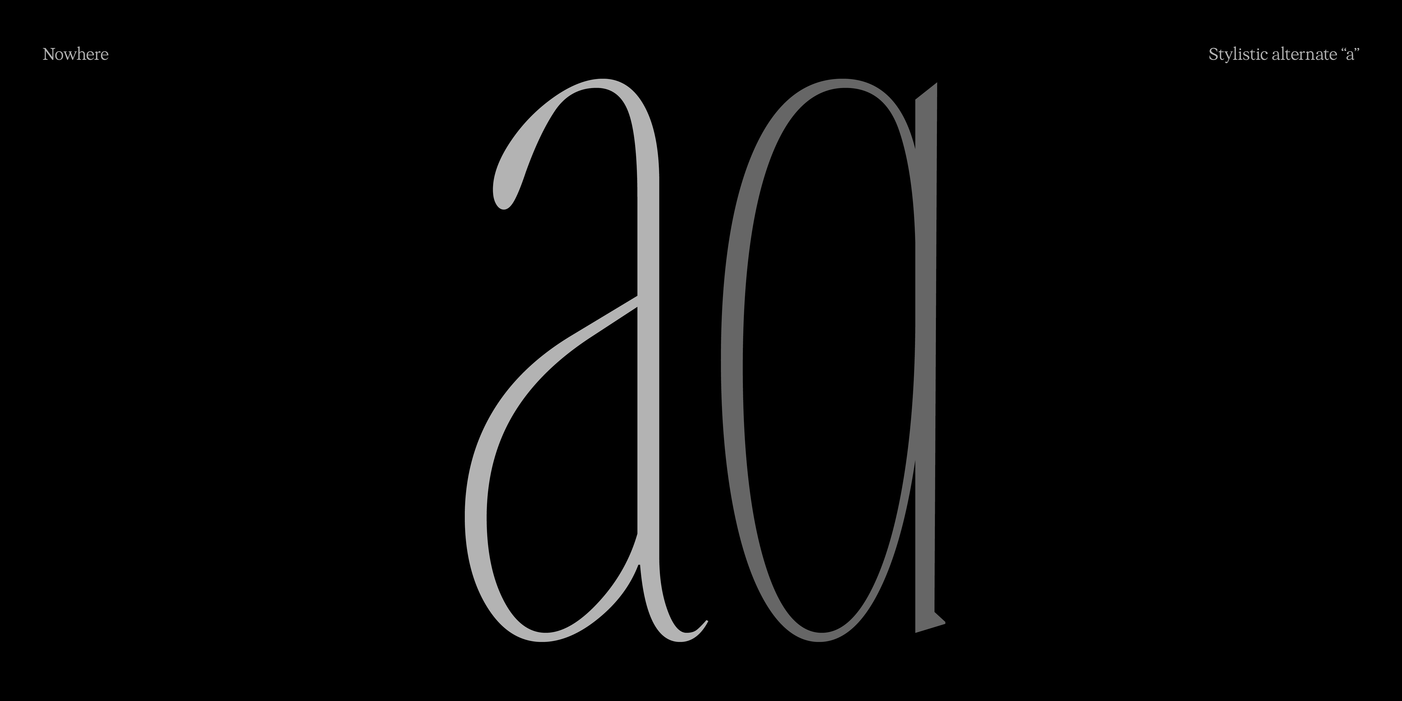
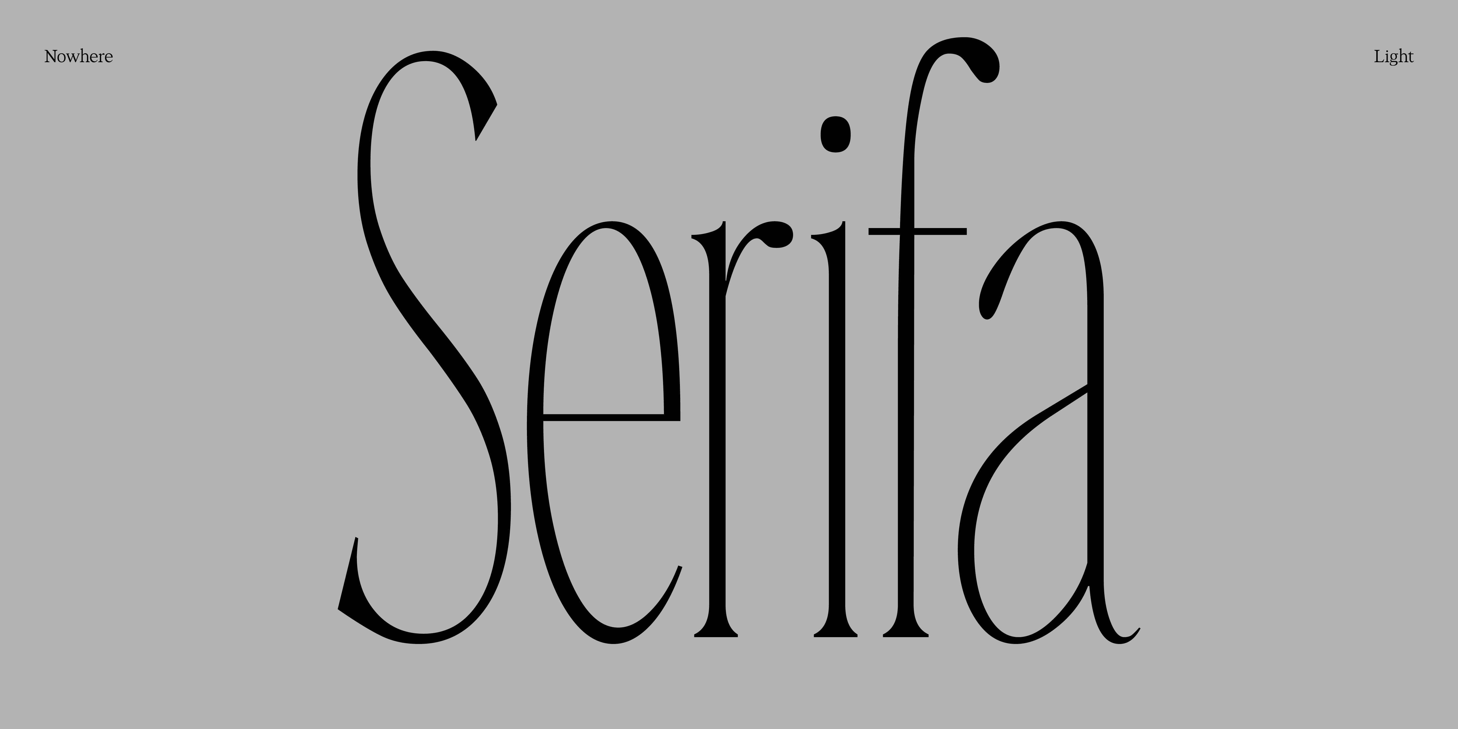
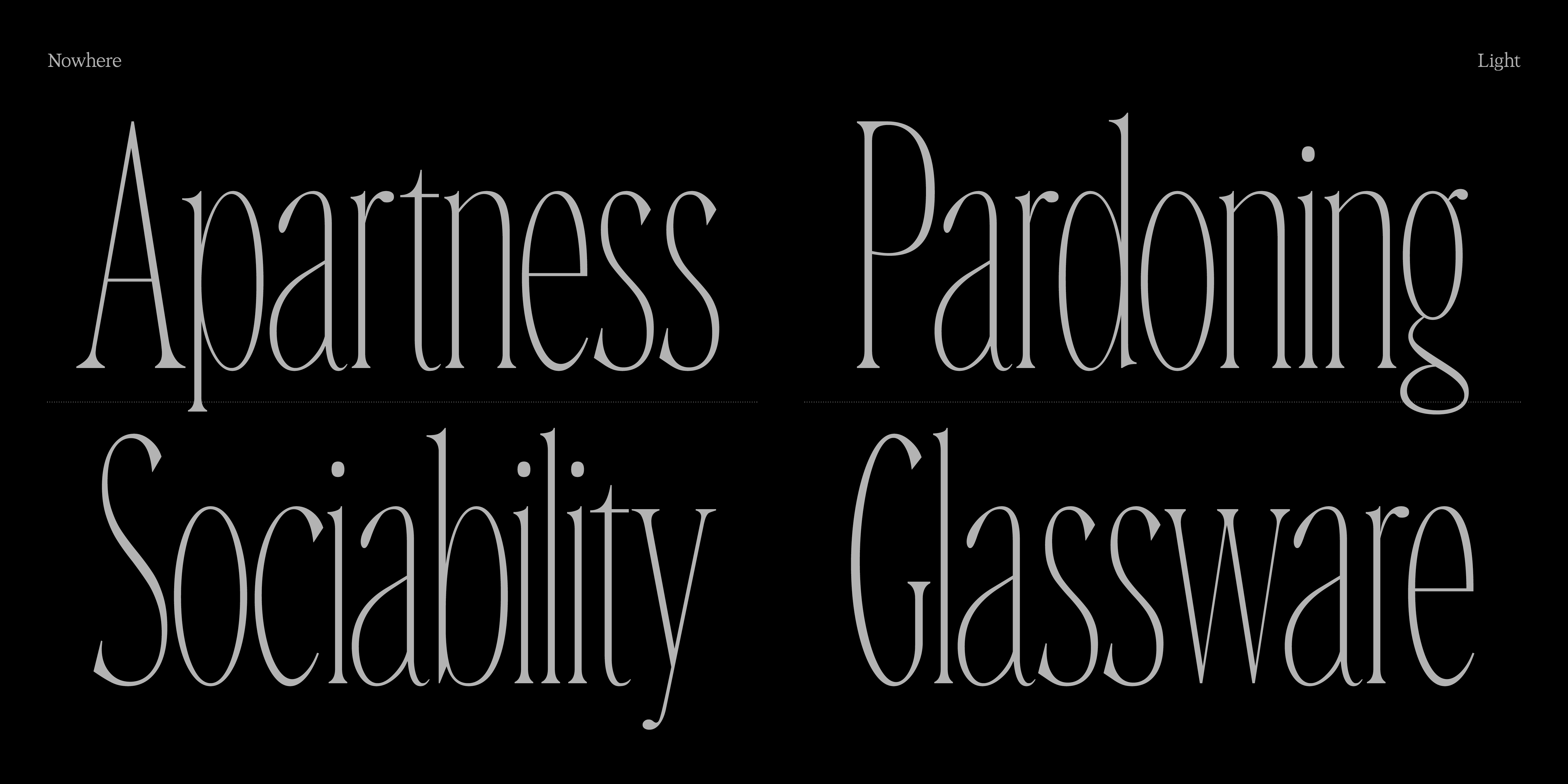
This month’s release is Nowhere — a high-contrast, condensed serif influenced by late 19th-century display types such as De Vinne and Bernase.
Designed with a vertical structure and compact proportions, Nowhere revisits the ornamental energy of that period through a more controlled, contemporary lens. Nowhere reduces those gestures to their essentials.
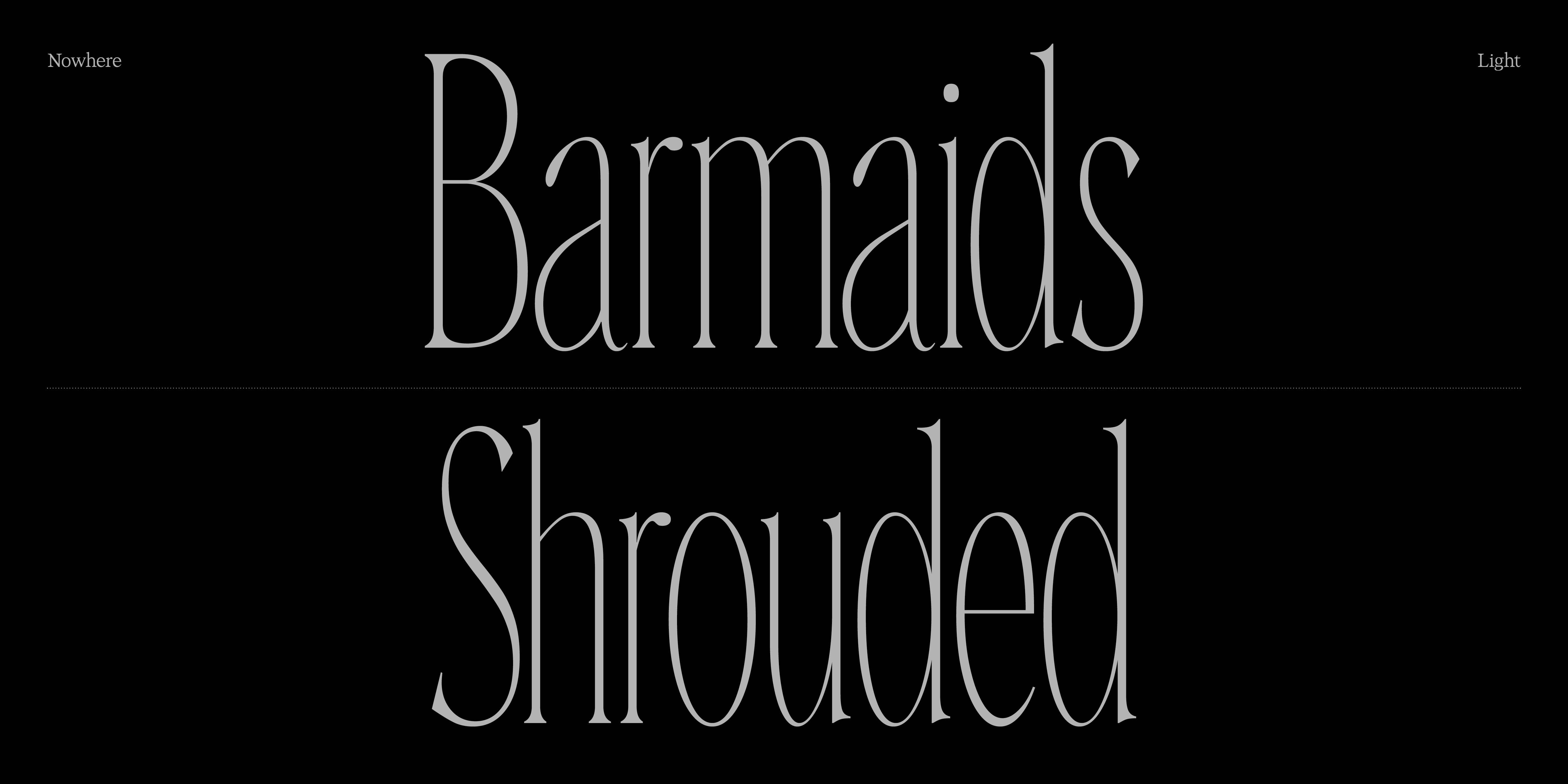
The result is a serif that feels deliberate and grounded — one that holds its place rather than seeking attention.
For me, Nowhere isn’t about nostalgia, but about stillness. It remembers where it came from, even when the world forgets.
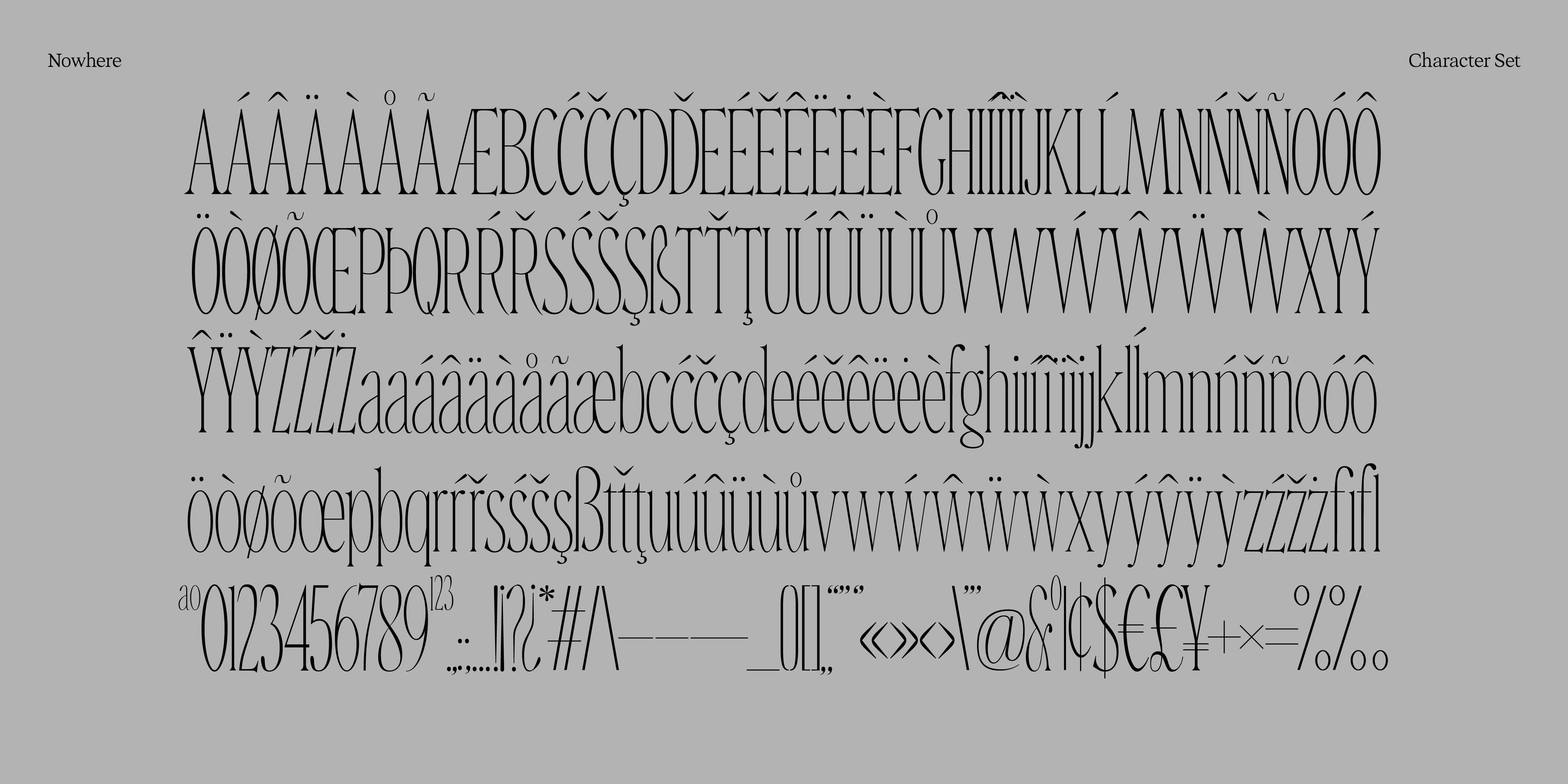
This first version includes 285 glyphs and comes in a single Light style — tall, condensed, and quiet.