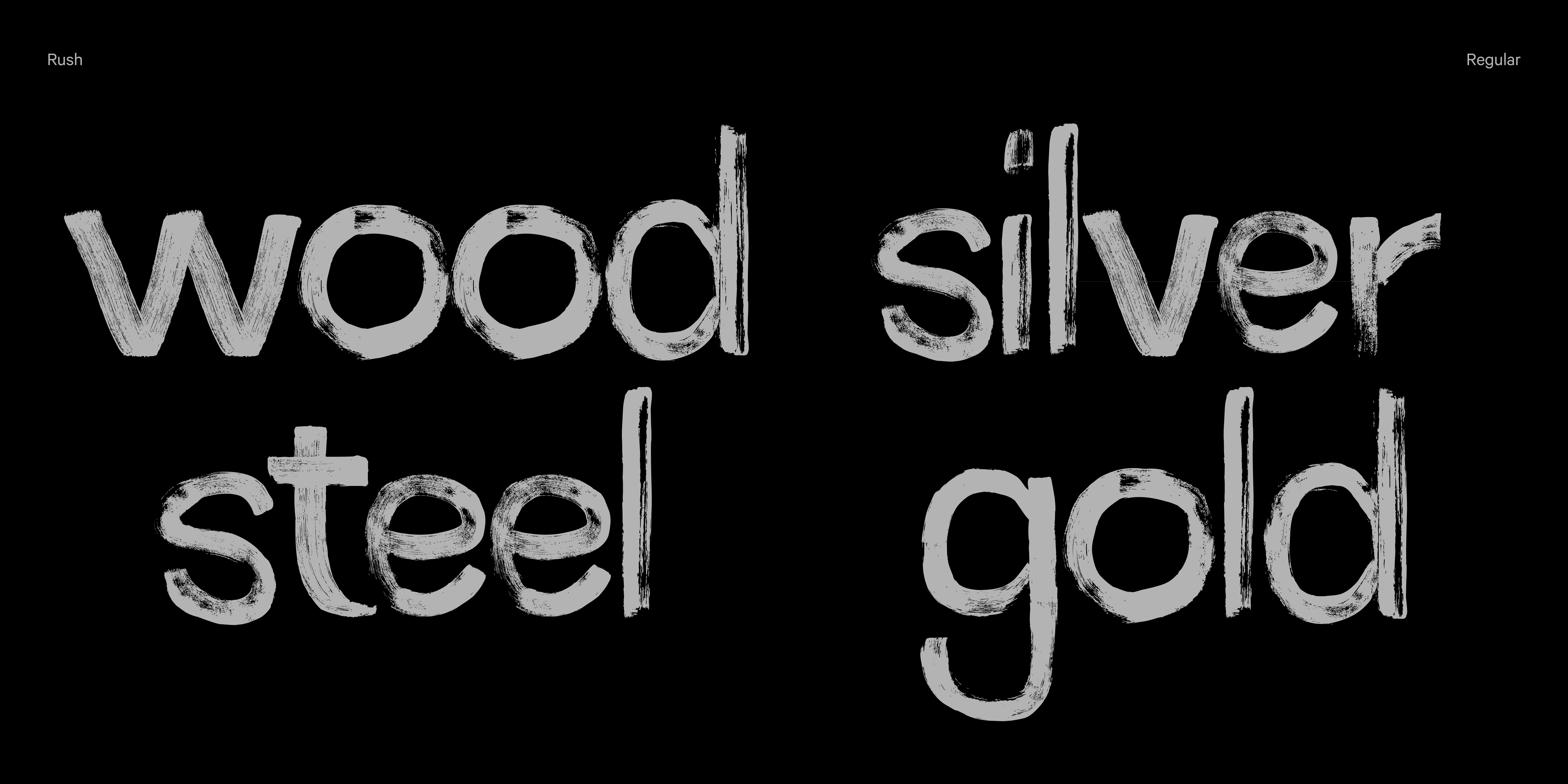
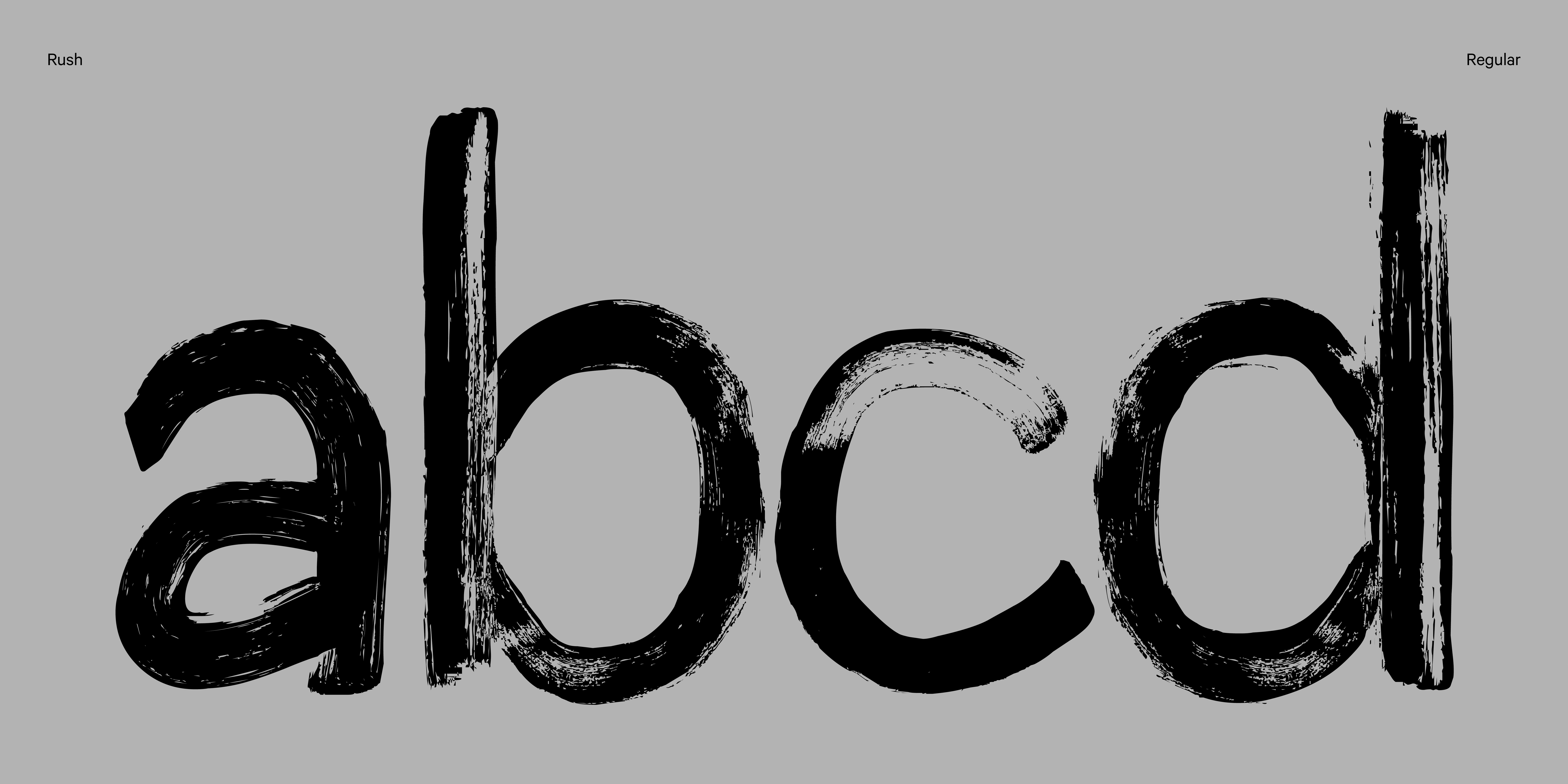
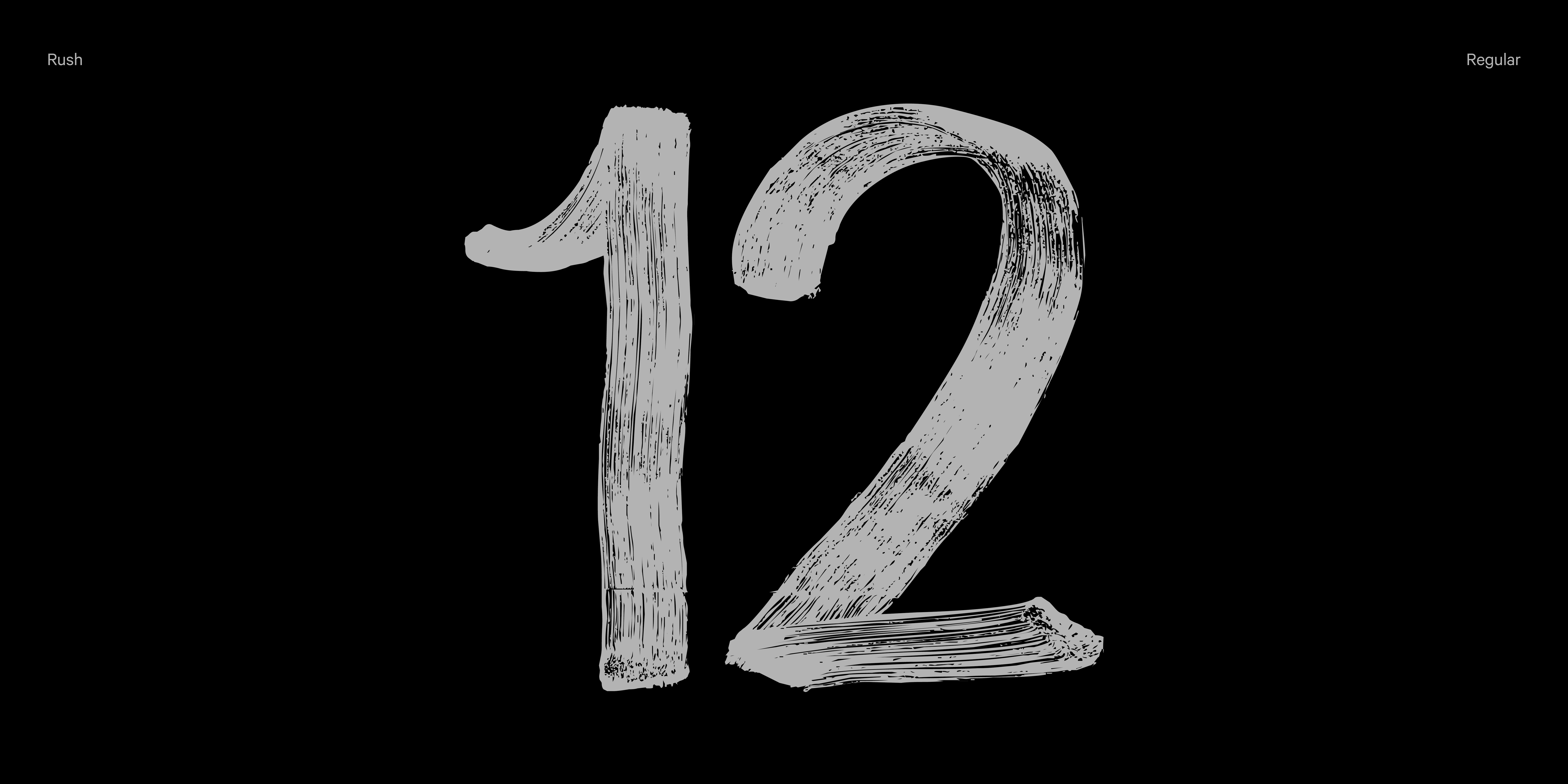
We’ve made it! Twelve typefaces in twelve months—one per month, without missing a single one. The typeface I’m sharing with you today is the 12th and final piece of this year-long journey.
FontMonth has been an experiment, a challenge, and a lot of fun, and there’s still a little surprise in store that I’m preparing for you. I hope you’ve enjoyed exploring the typefaces as much as I’ve enjoyed creating them.
For the past few weeks, I’ve been looking for an ending. How do you end a project like this? Does it even have to end? What typeface could it be? I thought about trying something with AI, but I couldn’t find the creative spark. I went back to some of the typefaces I had half-finished: a monotype, a pixel font, one using color technology… but nothing felt right.
I realized that, at this point—when the project is coming to a close and I’ve explored technologies like variable fonts and contextual alternates—I wanted to reflect on the process.
That’s why, for this month, I wanted to step away from the laptop.
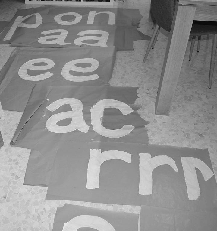
At first, I experimented with almost one-meter-high sheets of kraft paper, cutting and drawing on them. The problem was that, aside from being difficult to work with, the paint dried too quickly. What started as a drawing showing the roller’s texture quickly became something that looked like a sponge. The paper wrinkled, photography was tricky… In the end, I filled my house with test pieces that didn’t make the cut.
For the second round, I bought black A3 card stock, which allowed me to work at a more manageable scale. The roller effect stayed intact, and the paint dried better. Once I decided on the dimensions—uppercase, x-height, width—I started drawing with a 7 cm roller and white paint.
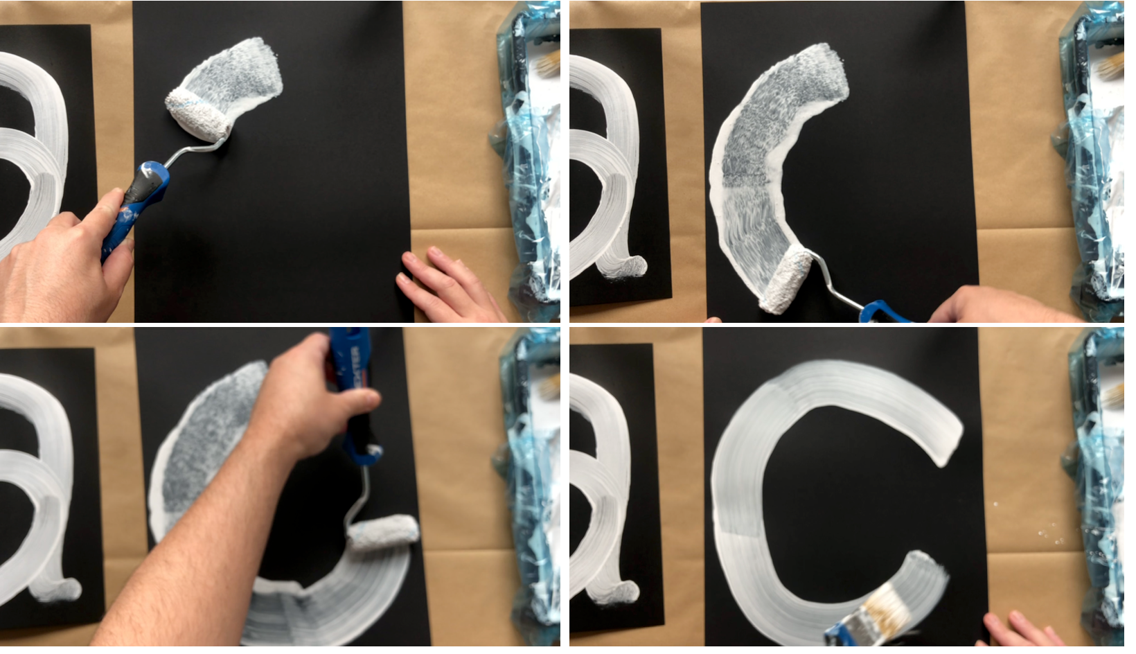
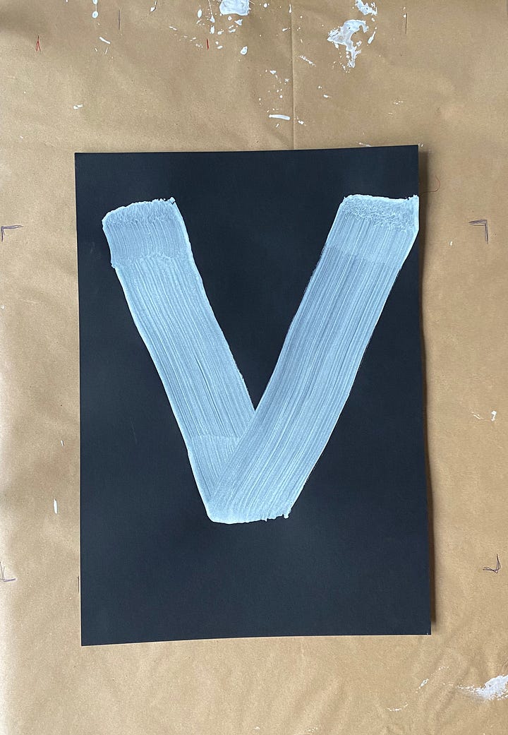
After painting each character, I photographed them from above, sent the images to my laptop, prepped them in Photoshop, traced them in Illustrator, and finally imported them into Glyphs. I made minor adjustments, refined the kerning, and added punctuation. This video summarizes the process:
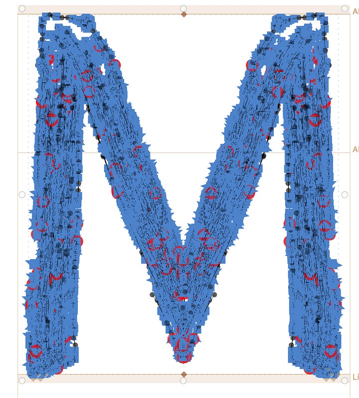
One challenge was preserving the brush style. When importing the characters into Glyphs, I had to simplify some points so the font could process correctly and stay under 3MB (which is already quite large). The image below shows a comparison: on the left, before simplification; on the right, simplified.
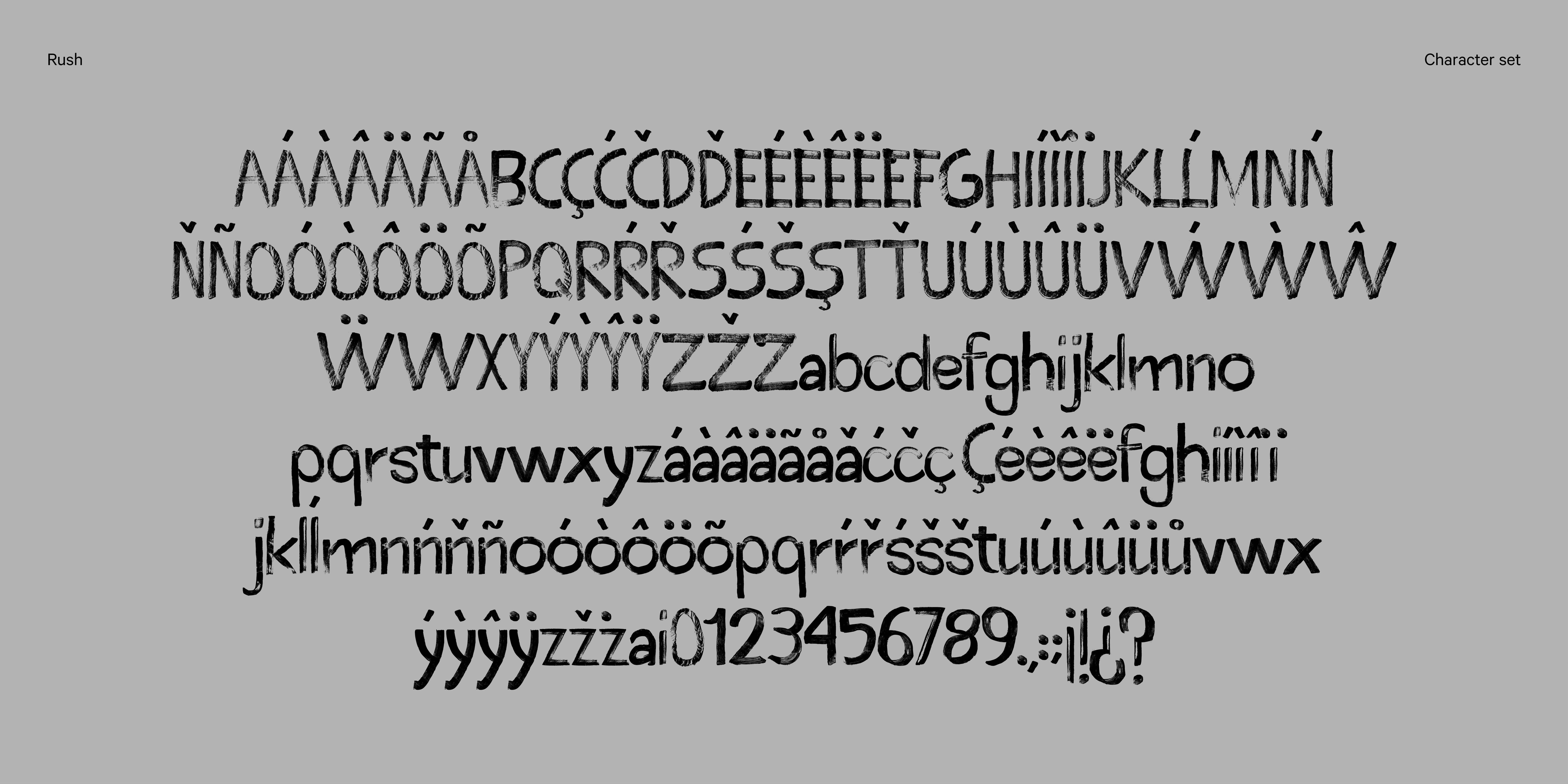
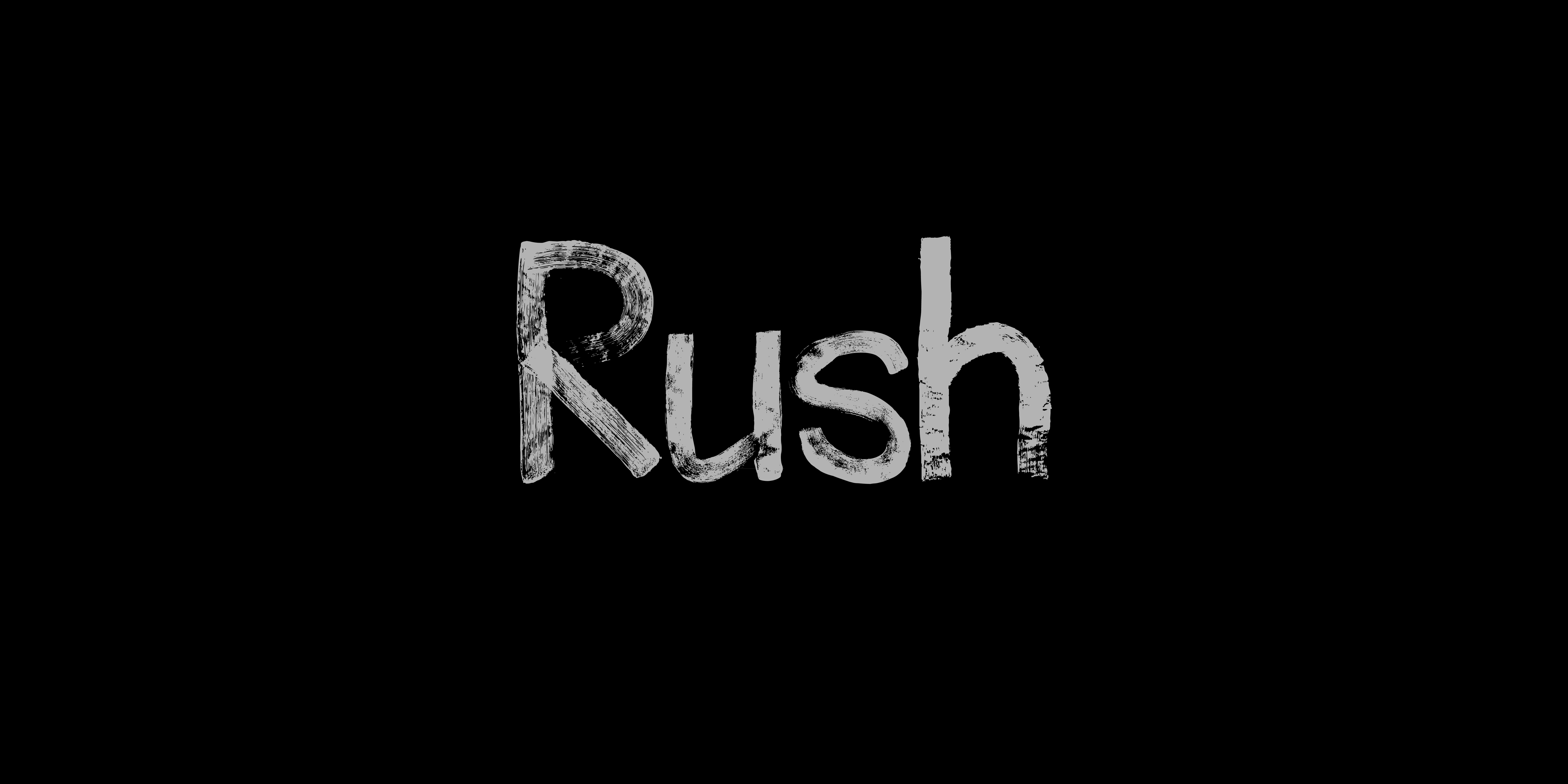
The result is Rush—a brush typeface with 188 glyphs, born from experimentation, persistence, and a desire to explore the boundaries between handcraft and digital design.