FontMonth Project

FontMonth

Personal Typographic Laboratory

Challenge

The challenge designer Alberto Molina set himself — build a brand-new typeface every month for an entire year — wasn’t conceived as a portfolio move or a commercial release. The real difficulty was sustaining that discipline for twelve straight months without the project collapsing into either repetition or pure technical exercise, and without losing sight of voice in favor of consistency.

Result

Twelve typefaces emerged, each born from a different method: structural constraints (Sira’s width variation, Agulla’s stencil logic), pure intuitive drawing (Frannie, Nowhere, Halone), research into everyday and historical references (Unstop from Spanish road signage, Evertimes reinterpreting Times New Roman), deeply personal sources (Fina, vectorized from his grandmother’s handwritten recipes), and even physical, off-screen mark-making (Rush, built from paint-roller strokes on cardstock). Documented monthly through a newsletter of sketches and false starts, the year produced more than two thousand glyphs.

AIN. An industry with a future. A future with industry

AIN

Industry with a Future, Future with Industry

Problem

AIN brings together 160 companies that account for almost half of Navarra’s industrial turnover, and its annual assembly needed a visual identity strong enough to carry a claim through an entire year of activity, not just a single event. This year’s edition also raised the stakes by bringing together leading professionals from cutting-edge sectors — quantum, aerospace — meaning the identity had to speak to both grounded industrial tradition and forward-looking innovation, without losing the sense that what makes AIN work is the collective, not any single member.

Result

Errea designed the claim and visual identity for the assembly — «Industria con futuro, futuro con industria» — and built a graphic system around it: shapes that flow, cross, and connect, giving visual form to the idea of collective force moving forward together. That identity will preside over all of AIN’s activity through spring 2026. It’s also the latest chapter in a strategic communication partnership between Errea and AIN running since 2019, aimed at strengthening the association’s brand perception among its members.

Pamplona City Branding

Pamplona City Branding

Plural by nature, true by choice

Problem

Pamplona/Iruña City Council had no city brand of its own: institutional communication relied solely on the council’s coat of arms and corporate identity, with no shared narrative to bring together a plural citizenry (two official languages, neighborhoods with very different identities, diverse economic and generational sectors) or to project an external image that went beyond San Fermín. Any solution had to avoid two risks: replacing or competing with the council’s own institutional identity, and falling into a contrived, touristy, or empty-slogan tone, in a city that sees itself as discreet and not given to «selling smoke.»

Result

Through a participatory process (interviews with key figures, sector roundtables, sessions with community groups, benchmarking against other city brands) eight key findings were defined, and from them, a complete brand platform: vision, mission, values, personality and narrative. The chosen territory — a proud city with a will to let its hair down — crystallized into the tagline De verdad / Bagara, conceived not as a translation but as a real interlocking of Spanish and Basque.

A brand architecture was also designed with six legitimate use cases, allowing the city brand to coexist with the institutional identity rather than replace it, along with a relevance test to decide when it should apply to third-party initiatives. The strategy further recommended giving the brand its own typeface, a recommendation that led to commissioning the «Pamplona» typeface family.

Authorship note: this work was carried out at Errea, where I work under contract.

Cornerstone

Cornerstone

Growth with purpose

Challenge

Cornerstone had a catalog, not a story. They’d accumulated services without accumulating meaning, responding to what the market asked for without ever asking what place they wanted to hold in their clients’ lives. That showed up as three concrete misalignments. The visual identity hadn’t been worked on: strip away the logo and a document became unidentifiable, the typeface (Montserrat) and generic corporate blue blended them into every other firm in the sector.

The story wasn’t cohesive: every deck, every pitch, every email told a different version of who they were. And nothing was aligned, not the name («Cornerstone Ventures» risked locking them into a venture-capital imagination they didn’t fully want), not the tone, not the brand promise actually matched what they did with clients day to day.

Process

Three phases, three deliverables.

The diagnostic started by understanding what they already were before projecting what they needed to become: market analysis (80% of Spanish SMEs lack strategic financial planning), benchmarking against Big Four firms and M&A boutiques, and an empathy exercise with their two real audiences, the founder looking for a true partner instead of a vendor, the SME that wants to «play in a different league» without hiring a Champions League squad. From there came the brand platform: purpose, vision, mission, positioning, beliefs, and a tagline built to hold up in every sales close.

The visual identity was treated as a decision, not a coat of paint: two creative routes were presented, a sober signature built around a serif and a diamond mark («our cornerstone»), and a more constructive proposal, a logotype assembled from three geometric pieces.

Result

Build. Manage. Grow. The tagline isn’t decoration, it’s the spine holding everything else up. The three verbs organize the positioning («the boutique firm that makes the complex easy, and the possible profitable»), the service architecture (financial model definition, outsourced CFO, fundraising strategy), and the logotype itself, where each geometric piece corresponds to a verb.

The typography (Source Serif 4 for headlines, DM Sans for body) and a palette that trades corporate blue for orange, yellow, and beige, progress, opportunity, balance, close the system. Cornerstone stops being a name that needs explaining and starts being a promise that’s recognizable without the logo.

Vax4ASF

Freakverse

Freakverse

Desde los pasillos de Hogwarts hasta el espacio exterior, pasando por los intrincados juegos de poder de la tierra media, este podcast se sumerge en los temas más geeks de la literatura y el cine. En este contexto, la identidad visual de Freakverse se convierte en un elemento clave para destacar entre la multitud de podcast y capturar (de alguna manera) ese punto «friki» en una tipografía. 

Narrativa
Aplicaciones de marca
Diseño de tipografía
Identidad visual

Reto

Crear una identidad visual única y representativa para el podcast Freakverse, que aborda una variedad de temas populares como Harry Potter, Star Wars y Juego de Tronos. El desafío radica en capturar la esencia multifacética del contenido del podcast y transmitirla de manera efectiva a través de una identidad visual cohesiva y atractiva.

Solución

Desarrollar una tipografía ad hoc que refleje la diversidad y la esencia de los temas tratados en el podcast. Esta tipografía se diseñará teniendo en cuenta las características distintivas de cada universo, integrando elementos visuales que evocan la magia de Harry Potter, la épica de Star Wars y la intriga de Juego de Tronos. La combinación de estos elementos en la tipografía ofrecerá una identidad visual única y reconocible que captará la atención del público objetivo y transmitirá la esencia del contenido del podcast Freakverse de manera efectiva.

Another Sans

Tipografía en progreso.

Redefining the brand architecture of the public sector in Navarre

En 2021, el Gobierno de Navarra se enfrentó al desafío de mejorar la visibilidad, consolidación y crecimiento del sector empresarial público a través de su matriz que agrupaba a todas las empresas: la Corporación Pública Empresarial de Navarra (CPEN). Sin embargo, la falta de reconocimiento de CPEN y la compleja convivencia con las 16 sociedades públicas bajo su matriz generaban confusión y debilitaban la identidad de unión.

Trabajo Realizado

Se llevó a cabo un exhaustivo diagnóstico que incluyó entrevistas, talleres y análisis de la arquitectura de marca. Se exploraron diversas opciones para construir una nueva identidad corporativa que simplificara la gestión, unificara visualmente a las sociedades bajo CPEN y mejorara la comunicación sobre el sector público navarro. Se evaluaron modelos de multimarca con endoso, unificación visual con matices diferenciadores y un enfoque monolítico total.

Solución

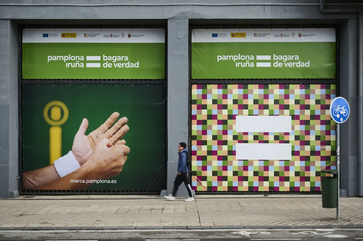
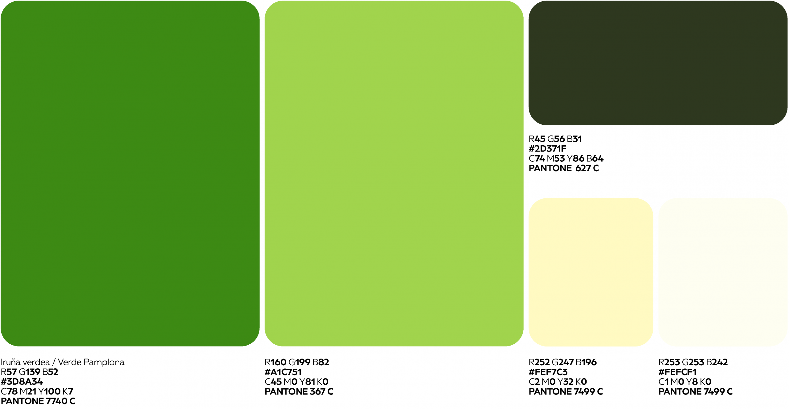
Tras evaluar diversas opciones, se recomendó una estrategia ambiciosa que implicaba una profunda transformación del sector público. Se propuso la creación de una nueva marca común corporativa que se añadiría a cada sociedad, fortaleciendo el reconocimiento del grupo. CPEN optó por implementar la nueva identidad de manera gradual, conviviendo inicialmente con las identidades visuales existentes. El proceso incluyó la actualización de la gama cromática, tipografías, logotipo y sistema visual. La estrategia busca ser una facilitadora del trabajo de las sociedades, destacando el papel de CPEN como impulsora del desarrollo de Navarra desde lo público.

StorHy