FontMonth Project

FontMonth

Personal Typographic Laboratory

Challenge

The challenge designer Alberto Molina set himself — build a brand-new typeface every month for an entire year — wasn’t conceived as a portfolio move or a commercial release. The real difficulty was sustaining that discipline for twelve straight months without the project collapsing into either repetition or pure technical exercise, and without losing sight of voice in favor of consistency.

Result

Twelve typefaces emerged, each born from a different method: structural constraints (Sira’s width variation, Agulla’s stencil logic), pure intuitive drawing (Frannie, Nowhere, Halone), research into everyday and historical references (Unstop from Spanish road signage, Evertimes reinterpreting Times New Roman), deeply personal sources (Fina, vectorized from his grandmother’s handwritten recipes), and even physical, off-screen mark-making (Rush, built from paint-roller strokes on cardstock). Documented monthly through a newsletter of sketches and false starts, the year produced more than two thousand glyphs.

AIN. An industry with a future. A future with industry

AIN

Industry with a Future, Future with Industry

Problem

AIN brings together 160 companies that account for almost half of Navarra’s industrial turnover, and its annual assembly needed a visual identity strong enough to carry a claim through an entire year of activity, not just a single event. This year’s edition also raised the stakes by bringing together leading professionals from cutting-edge sectors — quantum, aerospace — meaning the identity had to speak to both grounded industrial tradition and forward-looking innovation, without losing the sense that what makes AIN work is the collective, not any single member.

Result

Errea designed the claim and visual identity for the assembly — «Industria con futuro, futuro con industria» — and built a graphic system around it: shapes that flow, cross, and connect, giving visual form to the idea of collective force moving forward together. That identity will preside over all of AIN’s activity through spring 2026. It’s also the latest chapter in a strategic communication partnership between Errea and AIN running since 2019, aimed at strengthening the association’s brand perception among its members.

Pamplona City Branding

Pamplona City Branding

Plural by nature, true by choice

Problem

Pamplona/Iruña City Council had no city brand of its own: institutional communication relied solely on the council’s coat of arms and corporate identity, with no shared narrative to bring together a plural citizenry (two official languages, neighborhoods with very different identities, diverse economic and generational sectors) or to project an external image that went beyond San Fermín. Any solution had to avoid two risks: replacing or competing with the council’s own institutional identity, and falling into a contrived, touristy, or empty-slogan tone, in a city that sees itself as discreet and not given to «selling smoke.»

Result

Through a participatory process (interviews with key figures, sector roundtables, sessions with community groups, benchmarking against other city brands) eight key findings were defined, and from them, a complete brand platform: vision, mission, values, personality and narrative. The chosen territory — a proud city with a will to let its hair down — crystallized into the tagline De verdad / Bagara, conceived not as a translation but as a real interlocking of Spanish and Basque.

A brand architecture was also designed with six legitimate use cases, allowing the city brand to coexist with the institutional identity rather than replace it, along with a relevance test to decide when it should apply to third-party initiatives. The strategy further recommended giving the brand its own typeface, a recommendation that led to commissioning the «Pamplona» typeface family.

Authorship note: this work was carried out at Errea, where I work under contract.

Cornerstone

Cornerstone

Growth with purpose

Challenge

Cornerstone had a catalog, not a story. They’d accumulated services without accumulating meaning, responding to what the market asked for without ever asking what place they wanted to hold in their clients’ lives. That showed up as three concrete misalignments. The visual identity hadn’t been worked on: strip away the logo and a document became unidentifiable, the typeface (Montserrat) and generic corporate blue blended them into every other firm in the sector.

The story wasn’t cohesive: every deck, every pitch, every email told a different version of who they were. And nothing was aligned, not the name («Cornerstone Ventures» risked locking them into a venture-capital imagination they didn’t fully want), not the tone, not the brand promise actually matched what they did with clients day to day.

Process

Three phases, three deliverables.

The diagnostic started by understanding what they already were before projecting what they needed to become: market analysis (80% of Spanish SMEs lack strategic financial planning), benchmarking against Big Four firms and M&A boutiques, and an empathy exercise with their two real audiences, the founder looking for a true partner instead of a vendor, the SME that wants to «play in a different league» without hiring a Champions League squad. From there came the brand platform: purpose, vision, mission, positioning, beliefs, and a tagline built to hold up in every sales close.

The visual identity was treated as a decision, not a coat of paint: two creative routes were presented, a sober signature built around a serif and a diamond mark («our cornerstone»), and a more constructive proposal, a logotype assembled from three geometric pieces.

Result

Build. Manage. Grow. The tagline isn’t decoration, it’s the spine holding everything else up. The three verbs organize the positioning («the boutique firm that makes the complex easy, and the possible profitable»), the service architecture (financial model definition, outsourced CFO, fundraising strategy), and the logotype itself, where each geometric piece corresponds to a verb.

The typography (Source Serif 4 for headlines, DM Sans for body) and a palette that trades corporate blue for orange, yellow, and beige, progress, opportunity, balance, close the system. Cornerstone stops being a name that needs explaining and starts being a promise that’s recognizable without the logo.

Mutua Navarra — Rethinking a Tagline

Mutua Navarra

Rethinking a Tagline

Challenge

Mutua Navarra is the leading workers’ compensation mutual insurer in Navarra, with a 36.1% market share and over 105,000 protected workers. Its tagline «Somos azules» had anchored internal and external communication since 2008, born from a pioneering commitment to workplace health that was distinctive at the time but no longer is. Over recent years the organization had gone through a significant transformation — new teams, digitalization, telecare, growth — without a tagline that reflected it. The challenge wasn’t choosing new words, but first getting the organization itself to look honestly at where it actually stood today.

Result

Workshops with the communication and customer-service teams revisited the brand platform the organization had developed internally, validating findings and surfacing a clearer picture of how the entity is perceived by institutions, companies, and society — and how it imagines itself in five or ten years. A benchmark of other Spanish mutual insurers’ taglines showed that almost all of them describe what they do, with none explaining why or how: a clear opportunity. Several directions are now being developed, each held to the same two requirements: honesty and concreteness. The process is still ongoing.

Authorship note: this work was carried out at Errea, where I work under contract.

The Red News

The Red News

A Newspaper for the Most Inopportune Campaign

Context

An electoral campaign launched on July 7th, right as San Fermín hits its stride — the day no one in Pamplona is thinking about candidates, posters, or rallies, only about the bull run, breakfast, the procession, giants and big-heads, kalimotxo, the peñas, dancing, the hangover. The timing itself was the problem: a campaign genuinely out of place, out of season, beside the point. The challenge was how to comment on that absurdity without becoming another piece of political noise — using humor as a way to push back intelligently and peacefully, without wounding anyone, in the tradition of satirical press like Charlie Hebdo, Le Canard Enchaîné, El Jueves, or Mongolia.

Authorship note: this work was carried out at Errea, where I work under contract.

Result

The studio printed and distributed an ephemeral street newspaper, The Red News: tabloid format, 16 pages, a single color — red, the color of San Fermín — and sized to be carried the way runners traditionally carry a rolled newspaper to gauge their distance from the bulls during the encierro. Printed on July 3rd and handed out free in Pamplona’s streets on July 7th, the day the campaign began, it mixed illustrated comics and galaxies, a real (if not entirely serious) political conversation between two philosophers-turned-politicians, contributions from local writers and photographers, satirical horoscopes for the candidates written by ChatGPT, and infographics comparing party headquarters’ proximity to bars and the relative noise levels of politics versus the fiestas — a deliberate, cheerful mess, fitting for the moment it was mocking.

Creative coding

Turia TypeComposer

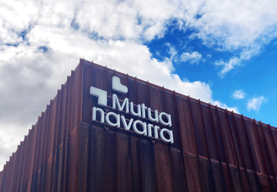
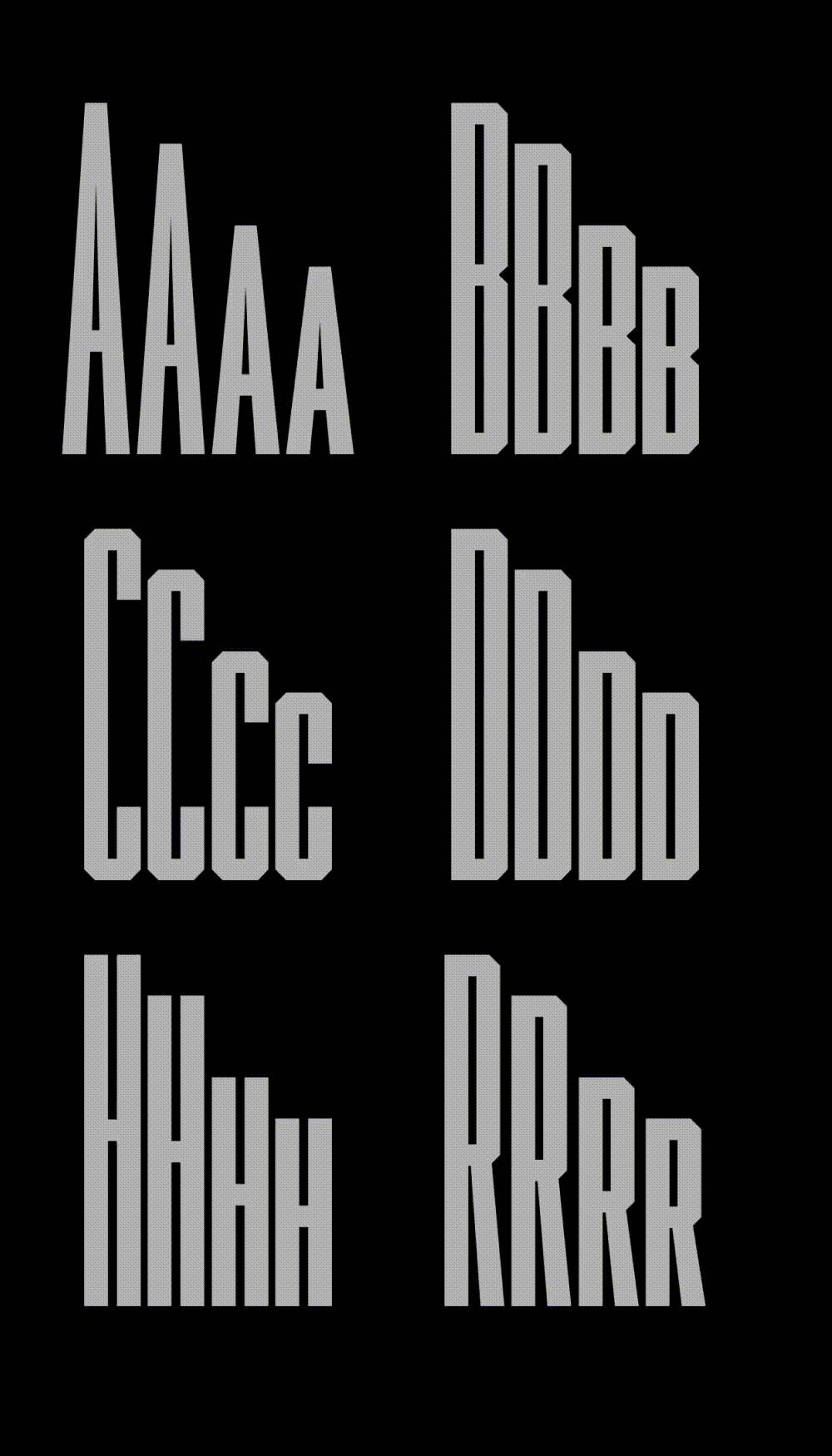
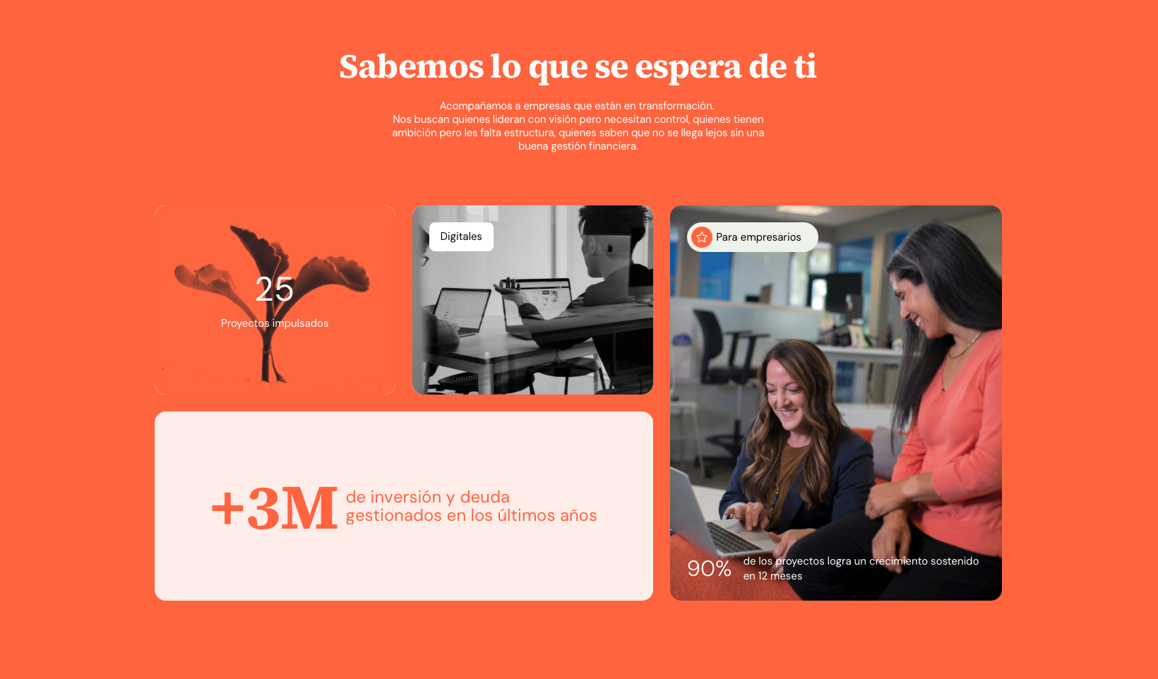
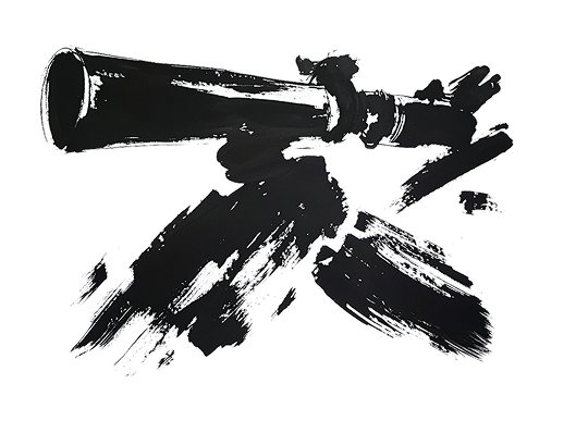
Generative Typography for Dynamic Brand Expression

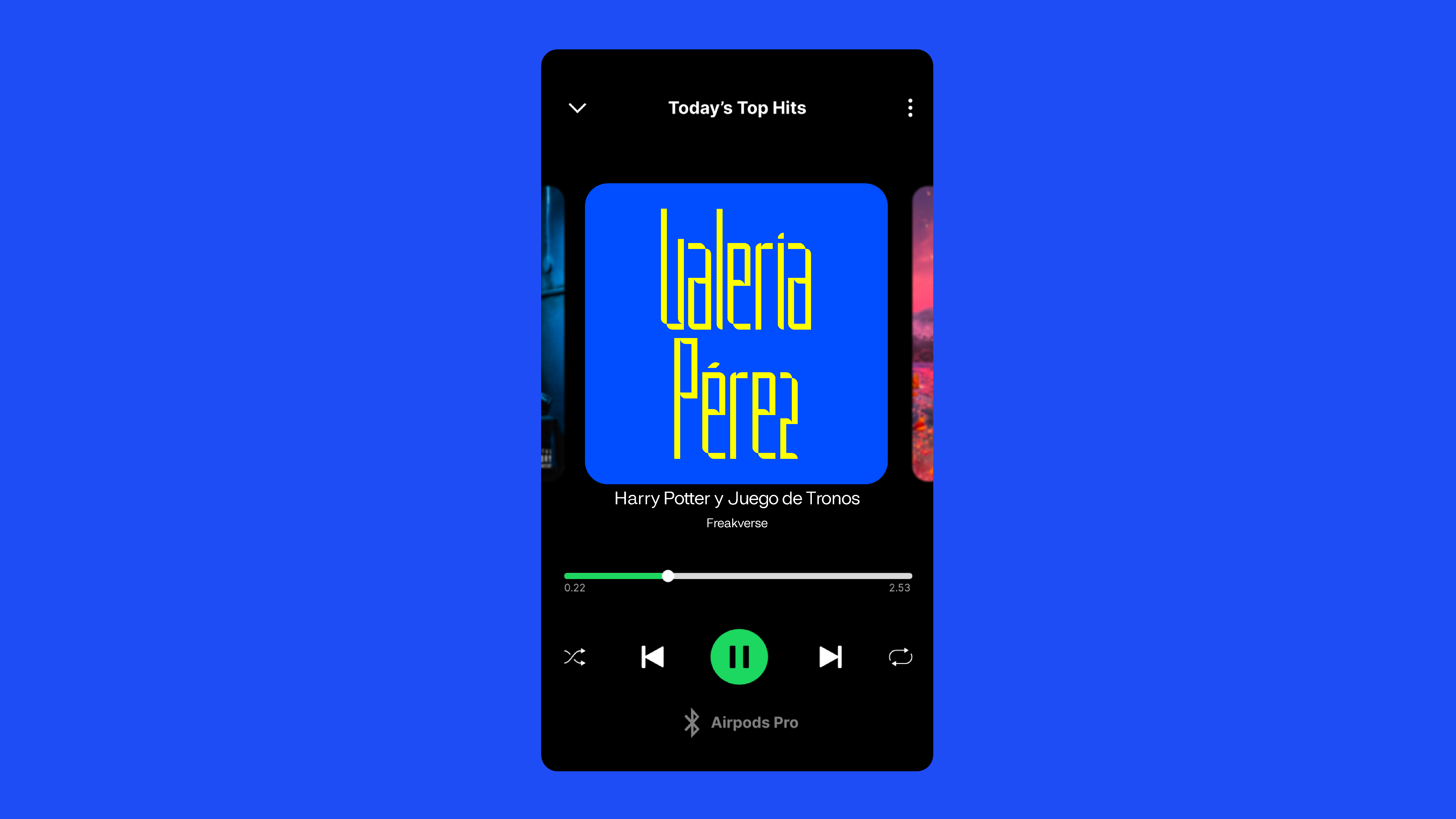
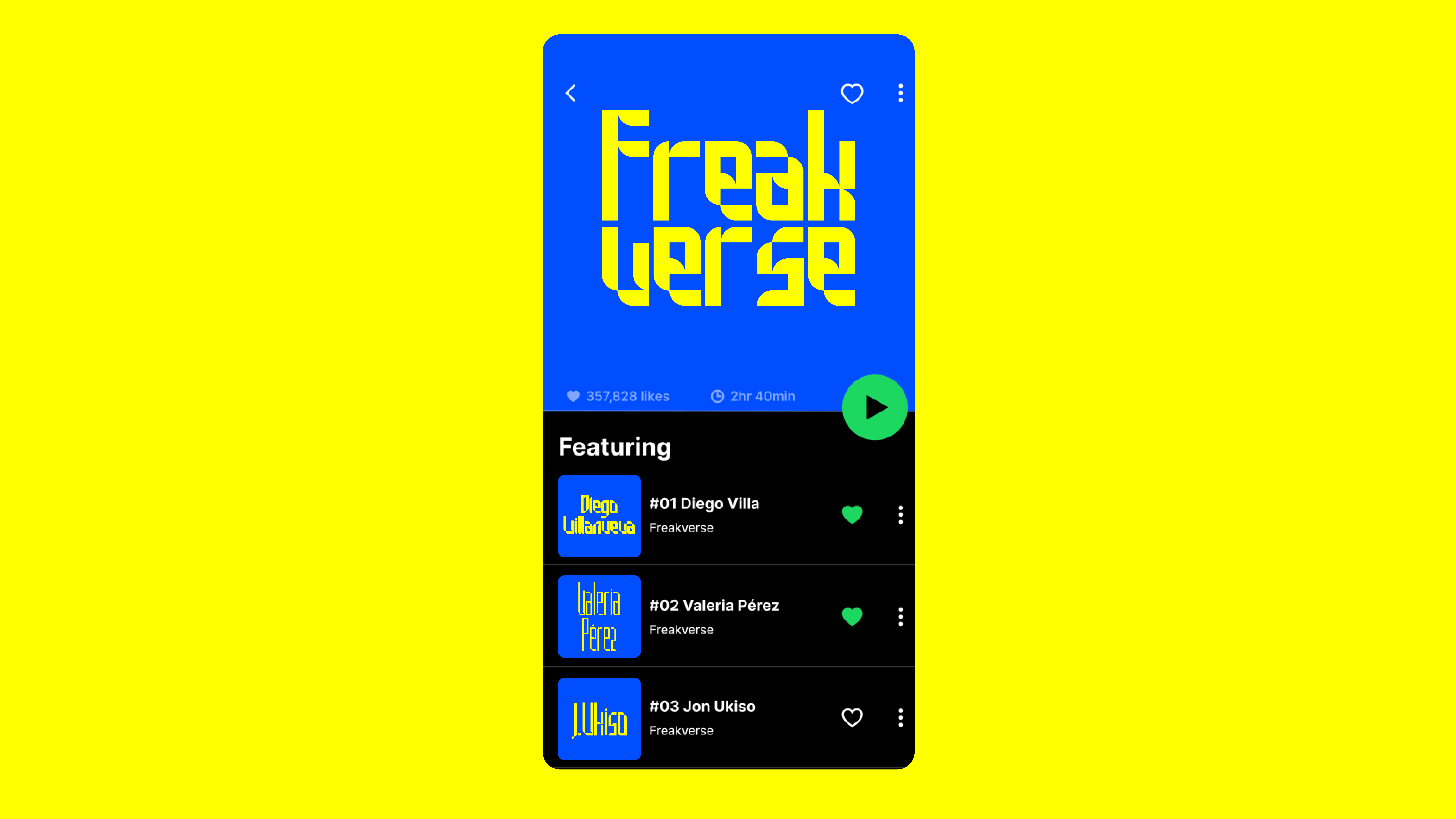
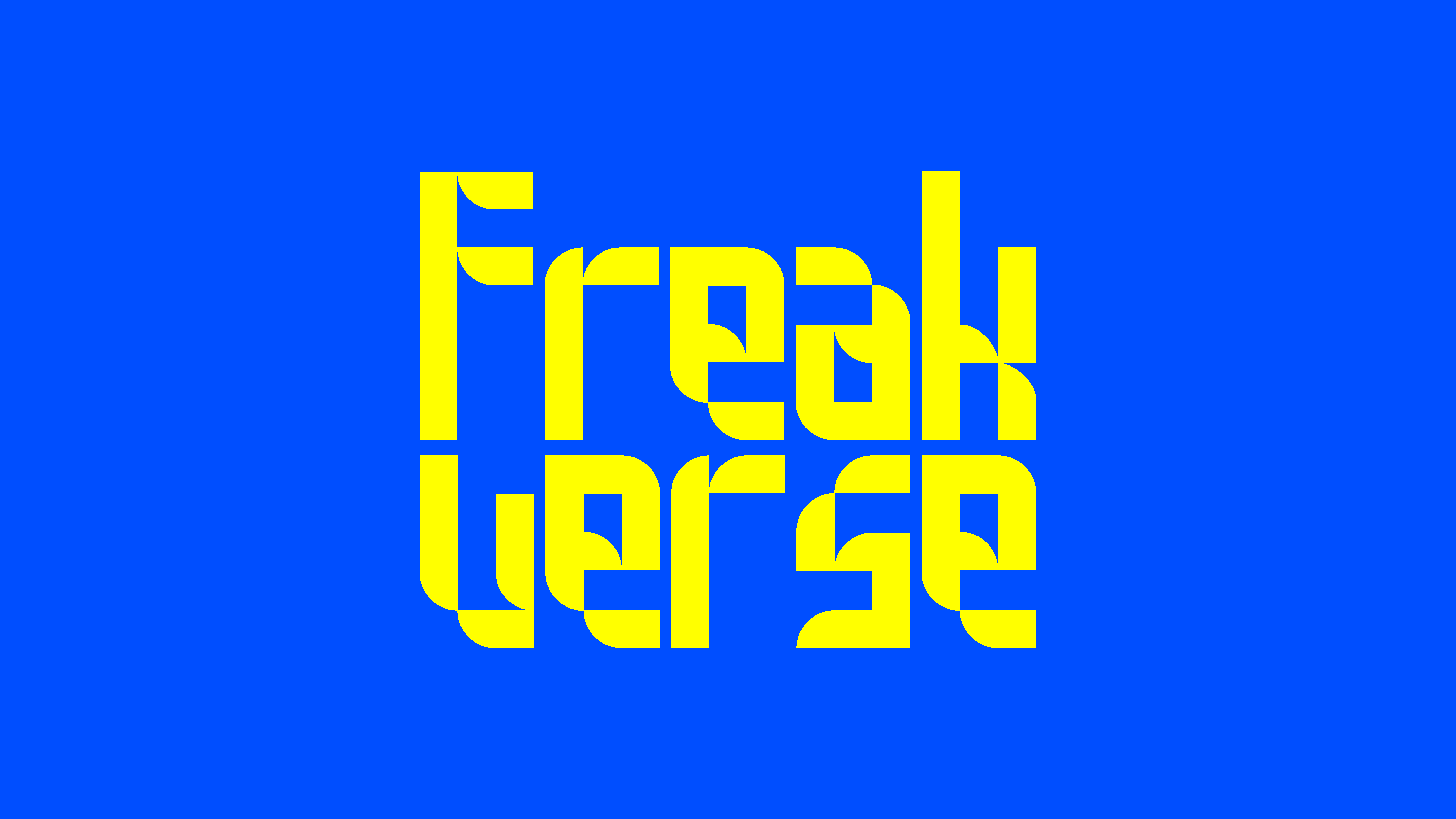
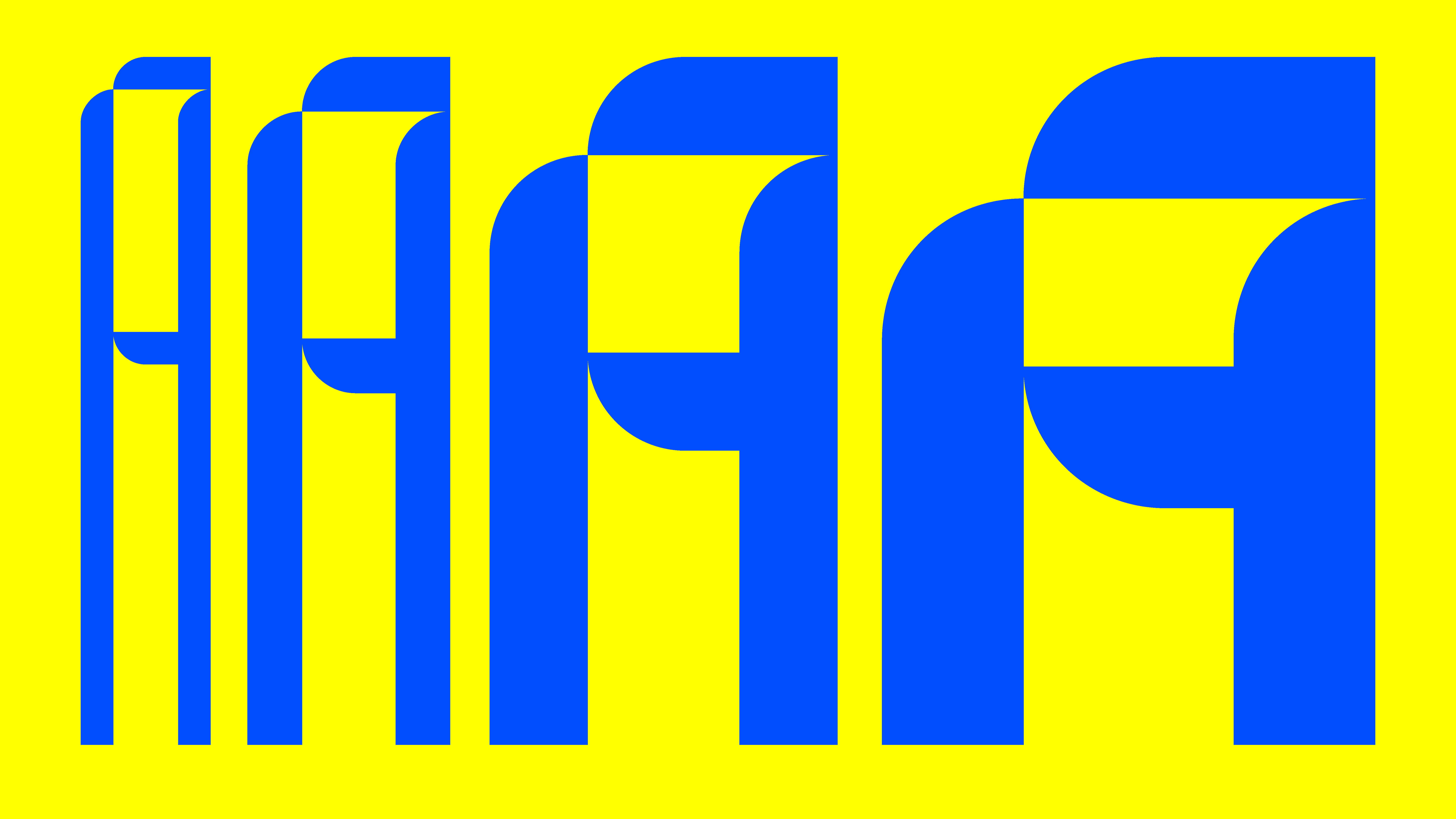
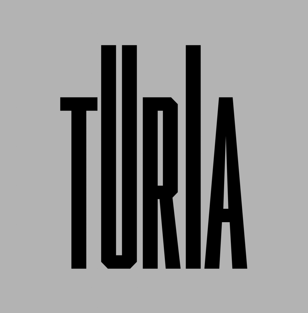
For Turia, we developed TypeComposer, a custom tool built around the Turia typeface. The typeface features two variable axes: height and slant, allowing for a wide range of visual expressions.

Using creative coding, we created a generative composition system that automatically arranges text following different behaviours and patterns — including waves, curves, random distributions, and other dynamic structures. The tool enables the client to generate unique compositions on demand and download them directly, extending the visual identity through an accessible and flexible creative platform.

Website


Alyo Brand Index

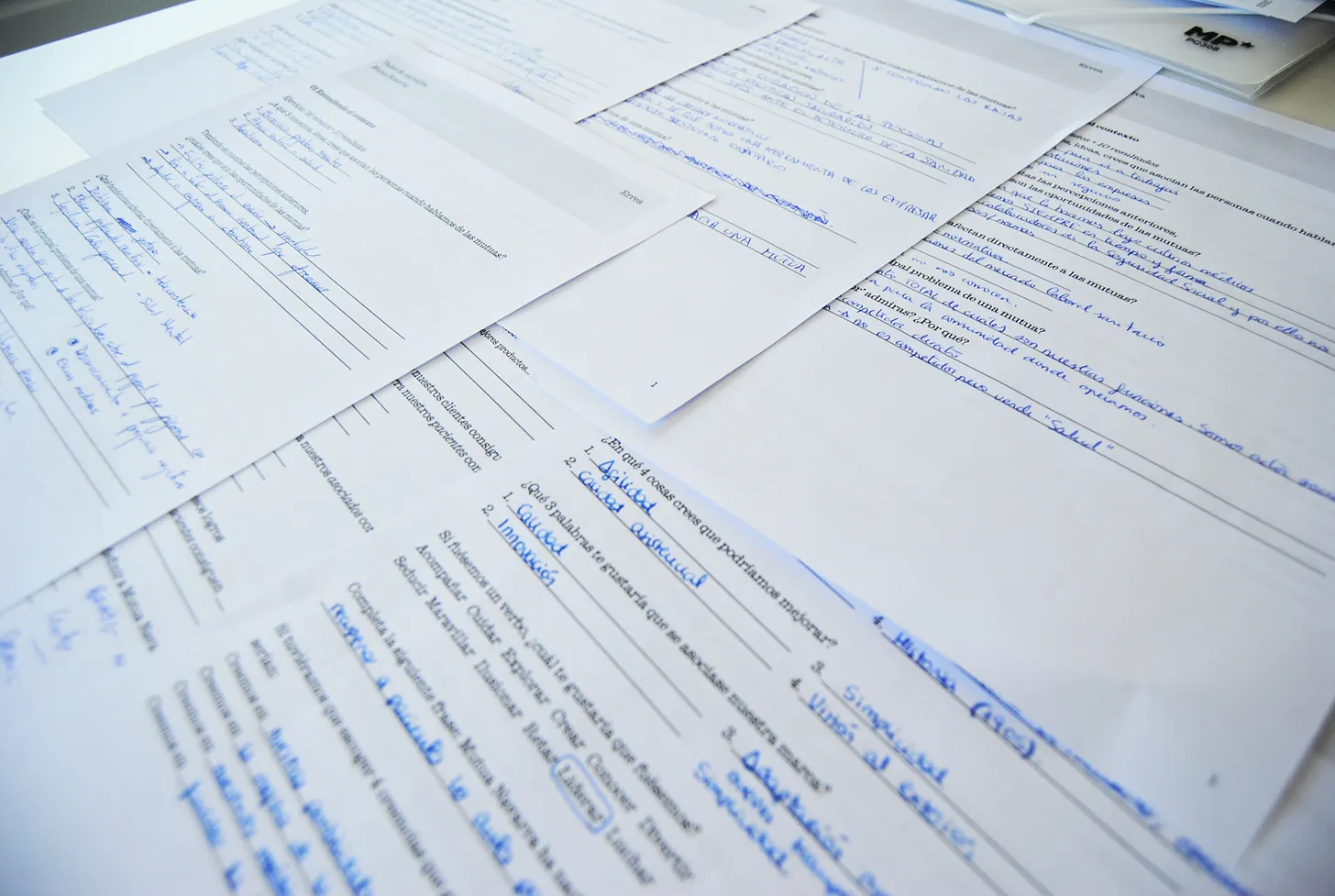
Measuring Brand Health and Competitiveness

Alyo is a diagnostic questionnaire designed to evaluate the overall health and competitiveness of a brand. Through a structured set of questions, it helps organizations identify strengths, uncover opportunities for improvement, and gain a clearer understanding of their brand’s position in the market.


AI Visual Systems

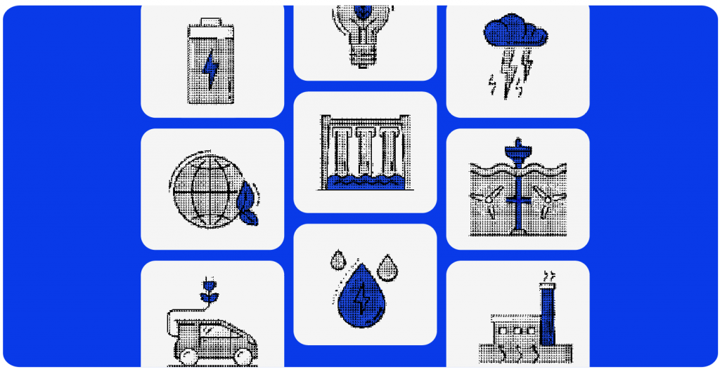
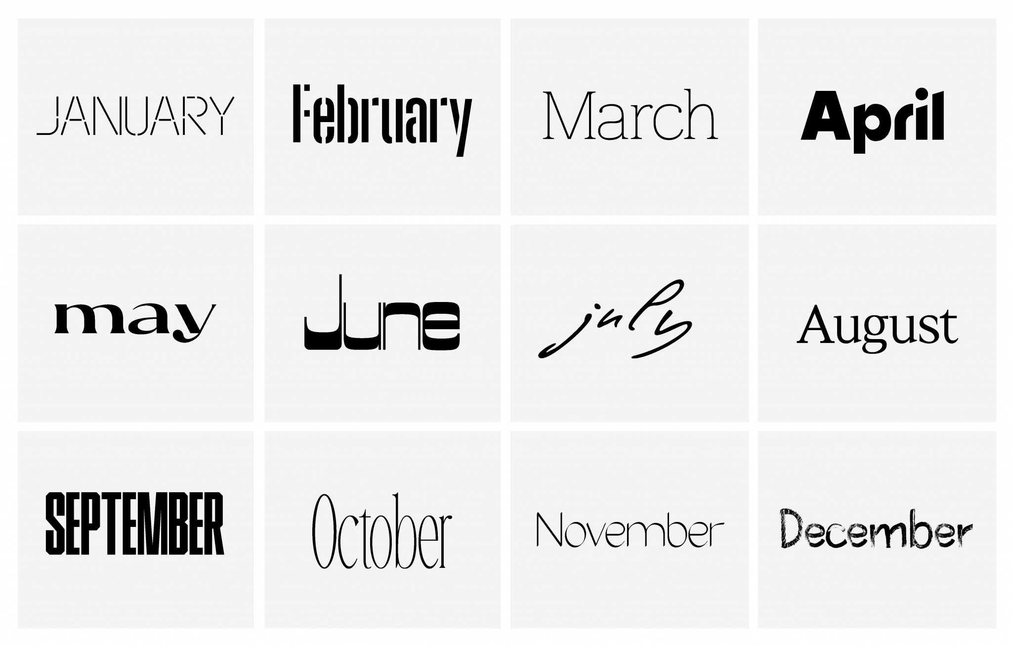
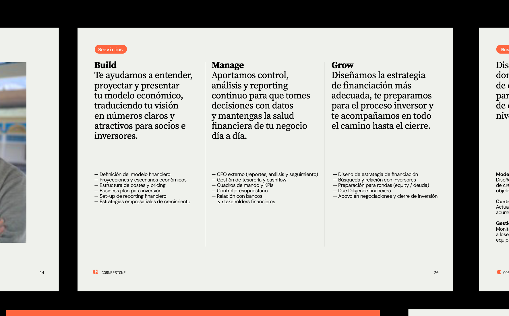
Building Consistency Across Generative Imagery

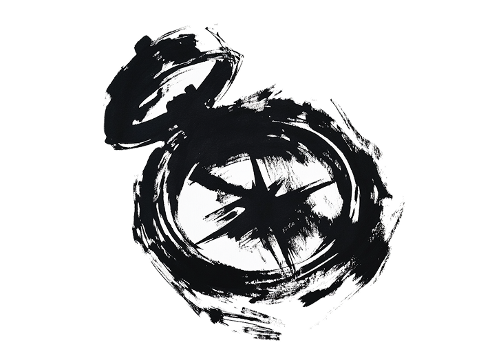
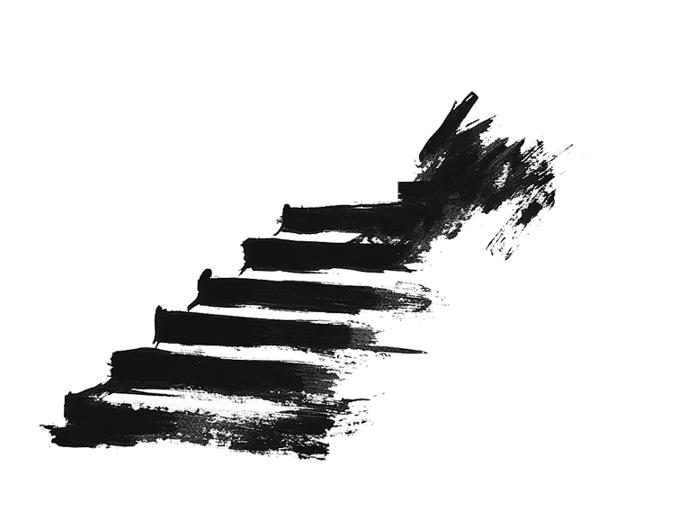
A research-driven exploration into the use of generative AI tools—including Midjourney, OpenAI’s ChatGPT, and Google Gemini—to create coherent visual systems for brands.

The project focuses on developing methods to achieve visual consistency across image series, illustrations, and concept explorations. Through prompt design, style frameworks, reference systems, and iterative workflows, we investigate how AI-generated imagery can move beyond isolated outputs to become a reliable tool for brand communication.

The outcome is a collection of visual experiments and practical approaches that help clients generate illustrations, campaign assets, and concept imagery while maintaining a recognizable and consistent visual language.

Vax4ASF

Freakverse

Freakverse

Desde los pasillos de Hogwarts hasta el espacio exterior, pasando por los intrincados juegos de poder de la tierra media, este podcast se sumerge en los temas más geeks de la literatura y el cine. En este contexto, la identidad visual de Freakverse se convierte en un elemento clave para destacar entre la multitud de podcast y capturar (de alguna manera) ese punto «friki» en una tipografía. 

Narrativa
Aplicaciones de marca
Diseño de tipografía
Identidad visual

Reto

Crear una identidad visual única y representativa para el podcast Freakverse, que aborda una variedad de temas populares como Harry Potter, Star Wars y Juego de Tronos. El desafío radica en capturar la esencia multifacética del contenido del podcast y transmitirla de manera efectiva a través de una identidad visual cohesiva y atractiva.

Solución

Desarrollar una tipografía ad hoc que refleje la diversidad y la esencia de los temas tratados en el podcast. Esta tipografía se diseñará teniendo en cuenta las características distintivas de cada universo, integrando elementos visuales que evocan la magia de Harry Potter, la épica de Star Wars y la intriga de Juego de Tronos. La combinación de estos elementos en la tipografía ofrecerá una identidad visual única y reconocible que captará la atención del público objetivo y transmitirá la esencia del contenido del podcast Freakverse de manera efectiva.

Kress infographics 🔗