AIN. An industry with a future. A future with industry

AIN

Industry with a Future, Future with Industry

Problem

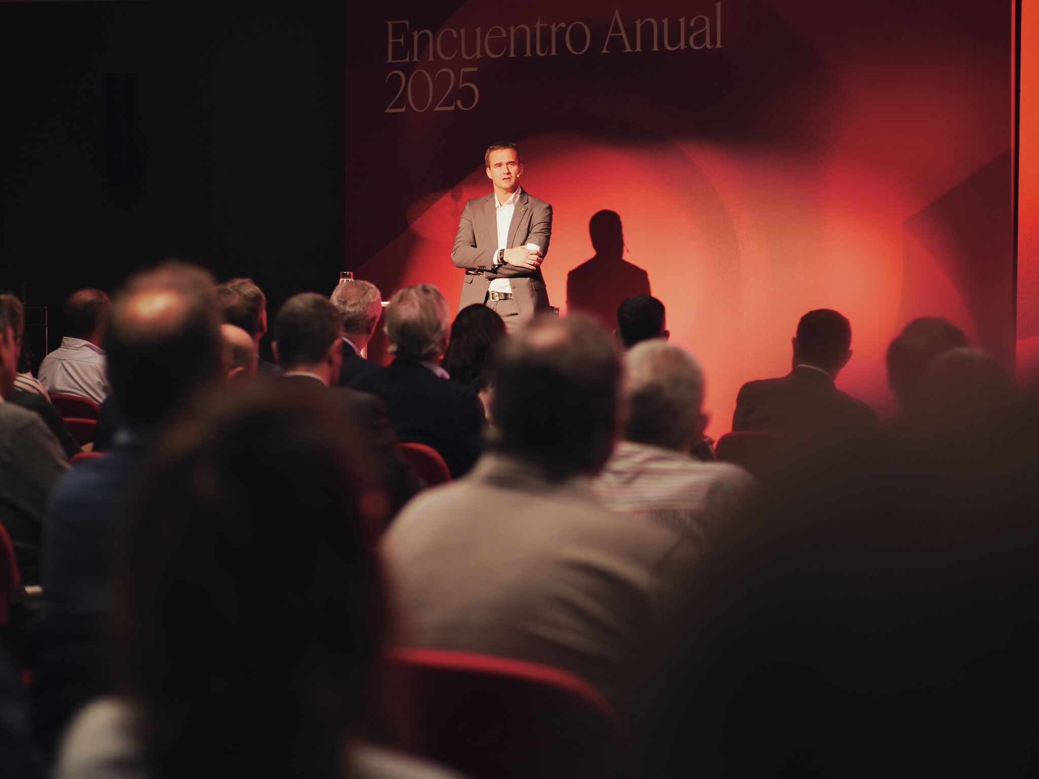
AIN brings together 160 companies that account for almost half of Navarra’s industrial turnover, and its annual assembly needed a visual identity strong enough to carry a claim through an entire year of activity, not just a single event. This year’s edition also raised the stakes by bringing together leading professionals from cutting-edge sectors — quantum, aerospace — meaning the identity had to speak to both grounded industrial tradition and forward-looking innovation, without losing the sense that what makes AIN work is the collective, not any single member.

Result

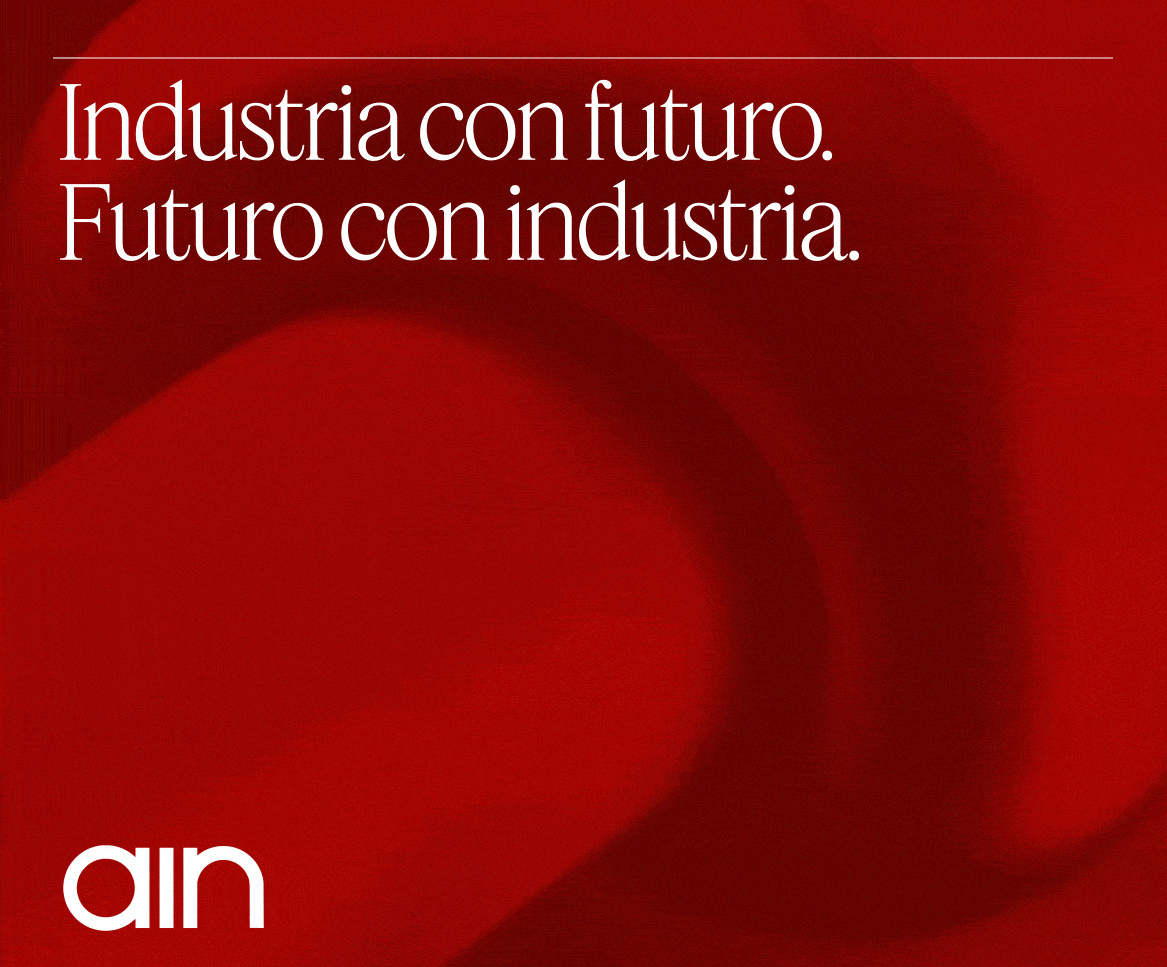
Errea designed the claim and visual identity for the assembly — «Industria con futuro, futuro con industria» — and built a graphic system around it: shapes that flow, cross, and connect, giving visual form to the idea of collective force moving forward together. That identity will preside over all of AIN’s activity through spring 2026. It’s also the latest chapter in a strategic communication partnership between Errea and AIN running since 2019, aimed at strengthening the association’s brand perception among its members.

Pamplona City Branding

Pamplona City Branding

Plural by nature, true by choice

Problem

Pamplona/Iruña City Council had no city brand of its own: institutional communication relied solely on the council’s coat of arms and corporate identity, with no shared narrative to bring together a plural citizenry (two official languages, neighborhoods with very different identities, diverse economic and generational sectors) or to project an external image that went beyond San Fermín. Any solution had to avoid two risks: replacing or competing with the council’s own institutional identity, and falling into a contrived, touristy, or empty-slogan tone, in a city that sees itself as discreet and not given to «selling smoke.»

Result

Through a participatory process (interviews with key figures, sector roundtables, sessions with community groups, benchmarking against other city brands) eight key findings were defined, and from them, a complete brand platform: vision, mission, values, personality and narrative. The chosen territory — a proud city with a will to let its hair down — crystallized into the tagline De verdad / Bagara, conceived not as a translation but as a real interlocking of Spanish and Basque.

A brand architecture was also designed with six legitimate use cases, allowing the city brand to coexist with the institutional identity rather than replace it, along with a relevance test to decide when it should apply to third-party initiatives. The strategy further recommended giving the brand its own typeface, a recommendation that led to commissioning the «Pamplona» typeface family.

Authorship note: this work was carried out at Errea, where I work under contract.

Mutua Navarra — Rethinking a Tagline

Mutua Navarra

Rethinking a Tagline

Challenge

Mutua Navarra is the leading workers’ compensation mutual insurer in Navarra, with a 36.1% market share and over 105,000 protected workers. Its tagline «Somos azules» had anchored internal and external communication since 2008, born from a pioneering commitment to workplace health that was distinctive at the time but no longer is. Over recent years the organization had gone through a significant transformation — new teams, digitalization, telecare, growth — without a tagline that reflected it. The challenge wasn’t choosing new words, but first getting the organization itself to look honestly at where it actually stood today.

Result

Workshops with the communication and customer-service teams revisited the brand platform the organization had developed internally, validating findings and surfacing a clearer picture of how the entity is perceived by institutions, companies, and society — and how it imagines itself in five or ten years. A benchmark of other Spanish mutual insurers’ taglines showed that almost all of them describe what they do, with none explaining why or how: a clear opportunity. Several directions are now being developed, each held to the same two requirements: honesty and concreteness. The process is still ongoing.

Authorship note: this work was carried out at Errea, where I work under contract.

The Red News

The Red News

A Newspaper for the Most Inopportune Campaign

Context

An electoral campaign launched on July 7th, right as San Fermín hits its stride — the day no one in Pamplona is thinking about candidates, posters, or rallies, only about the bull run, breakfast, the procession, giants and big-heads, kalimotxo, the peñas, dancing, the hangover. The timing itself was the problem: a campaign genuinely out of place, out of season, beside the point. The challenge was how to comment on that absurdity without becoming another piece of political noise — using humor as a way to push back intelligently and peacefully, without wounding anyone, in the tradition of satirical press like Charlie Hebdo, Le Canard Enchaîné, El Jueves, or Mongolia.

Authorship note: this work was carried out at Errea, where I work under contract.

Result

The studio printed and distributed an ephemeral street newspaper, The Red News: tabloid format, 16 pages, a single color — red, the color of San Fermín — and sized to be carried the way runners traditionally carry a rolled newspaper to gauge their distance from the bulls during the encierro. Printed on July 3rd and handed out free in Pamplona’s streets on July 7th, the day the campaign began, it mixed illustrated comics and galaxies, a real (if not entirely serious) political conversation between two philosophers-turned-politicians, contributions from local writers and photographers, satirical horoscopes for the candidates written by ChatGPT, and infographics comparing party headquarters’ proximity to bars and the relative noise levels of politics versus the fiestas — a deliberate, cheerful mess, fitting for the moment it was mocking.

Vax4ASF

Kress infographics 🔗

Redefining the brand architecture of the public sector in Navarre

En 2021, el Gobierno de Navarra se enfrentó al desafío de mejorar la visibilidad, consolidación y crecimiento del sector empresarial público a través de su matriz que agrupaba a todas las empresas: la Corporación Pública Empresarial de Navarra (CPEN). Sin embargo, la falta de reconocimiento de CPEN y la compleja convivencia con las 16 sociedades públicas bajo su matriz generaban confusión y debilitaban la identidad de unión.

Trabajo Realizado

Se llevó a cabo un exhaustivo diagnóstico que incluyó entrevistas, talleres y análisis de la arquitectura de marca. Se exploraron diversas opciones para construir una nueva identidad corporativa que simplificara la gestión, unificara visualmente a las sociedades bajo CPEN y mejorara la comunicación sobre el sector público navarro. Se evaluaron modelos de multimarca con endoso, unificación visual con matices diferenciadores y un enfoque monolítico total.

Solución

Tras evaluar diversas opciones, se recomendó una estrategia ambiciosa que implicaba una profunda transformación del sector público. Se propuso la creación de una nueva marca común corporativa que se añadiría a cada sociedad, fortaleciendo el reconocimiento del grupo. CPEN optó por implementar la nueva identidad de manera gradual, conviviendo inicialmente con las identidades visuales existentes. El proceso incluyó la actualización de la gama cromática, tipografías, logotipo y sistema visual. La estrategia busca ser una facilitadora del trabajo de las sociedades, destacando el papel de CPEN como impulsora del desarrollo de Navarra desde lo público.

StorHy

Visual Diary of the Quarantine 🔗